
Autumn Color Analysis: The Palette That Makes You Glow
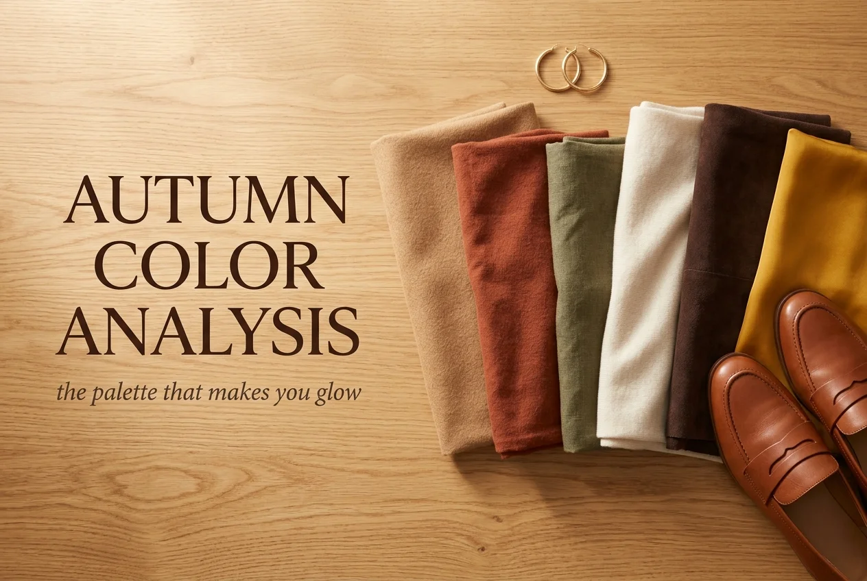
There’s a specific kind of frustration that comes from owning a closet full of clothes you chose on purpose and still looking washed out in every single one. Autumn color analysis explains that gap better than almost anything else in style. Your coloring runs warm, golden, and slightly muted. Most of what sells in stores runs cool, gray, and stark. By the end of this you’ll know which of the three autumns you are, which neutrals to build your closet on, and what to buy first.
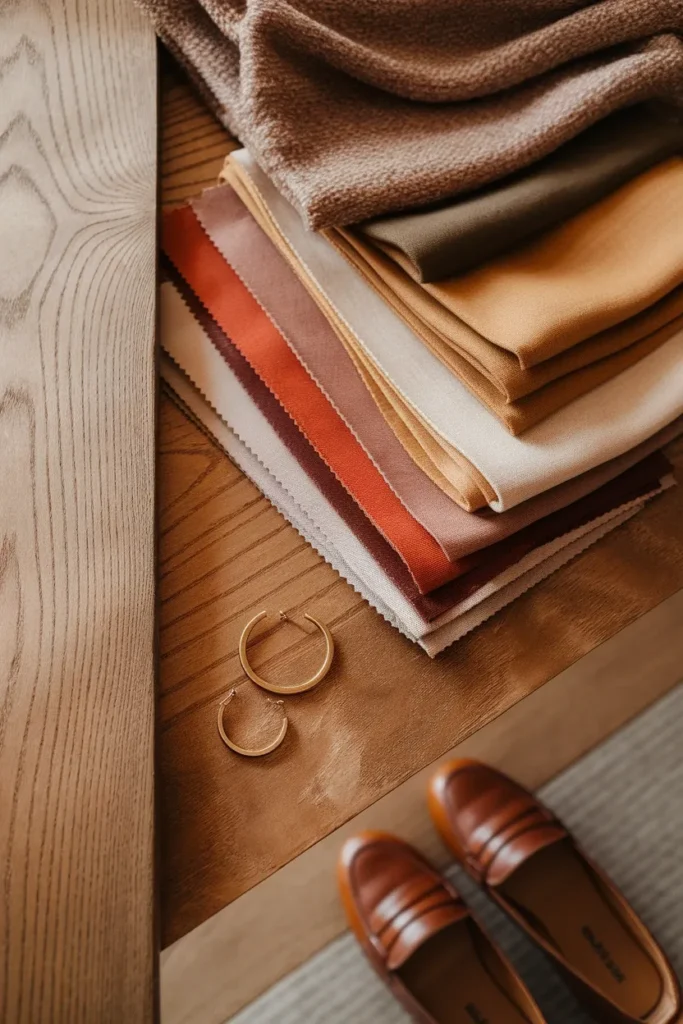
Most guides stop at the swatch grid. That’s the part that feels satisfying and the part that changes nothing. Knowing that rust is your color does not tell you how many rust pieces belong in a closet of twenty. So we’re going to do both halves: the diagnosis, quickly, then the build, thoroughly.
Fair warning on one thing. Prices here are honest US ranges as of this writing, and retail moves constantly. Treat every number as a ballpark and check the current tag.
What Autumn Color Analysis Is Actually Measuring
Three dimensions decide your season. Once you can name them, everything else in this article gets easier.
Hue is warm versus cool. It’s the yellow or blue running underneath a color. Autumn sits at the warmest end of the whole system, which is why gold looks right on you and cold silver can look a little dead.
Value is light versus dark. Autumn spans a wide range, from pale wheat to almost black espresso, with the bulk of the palette sitting mid to deep.
Chroma is bright versus muted, and it’s the one nobody explains well. Chroma is how much gray is folded into a color. Think of a fresh traffic cone orange next to a terracotta pot. Same family. Wildly different chroma. Autumn colors carry a little gray in them, which is why they read as rich instead of loud.
Put those three together and you get the autumn signature: warm, medium to deep, and muted. Every autumn shade is some combination of those three settings. Pumpkin, moss, brick, bronze, olive, caramel, teal. They all pass the same test.
If the vocabulary is new, it’s worth understanding how the twelve season system works from the ground up before you go further. The autumn family is one quarter of a much larger map, and the map makes the quarter make sense.
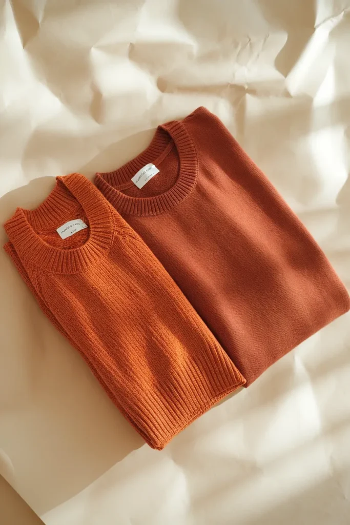
The Three Question Autumn Sort
Before you build anything, confirm you’re actually in the autumn family. Plenty of women land here because they love fall colors, which is a preference, not a diagnosis.
Stand near a window in daylight. No overhead bulbs, no makeup, hair pushed back.
Question one: gold or silver? Hold a gold chain against your jaw, then a silver one. On an autumn, gold warms the skin and the silver leaves a faint grayish cast underneath. If silver is the one that looks crisp and clean, you’re likely in the cool half of the system and this palette isn’t yours.
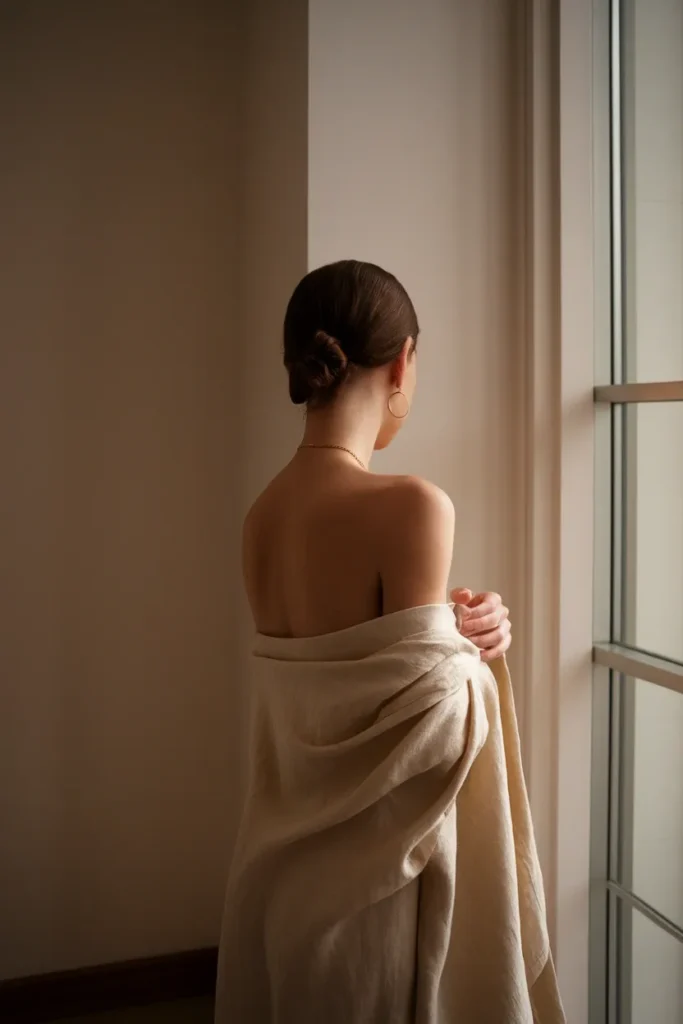
Question two: cream or white? Hold a piece of pure optic white paper under your chin, then a warm cream or oat colored fabric. Autumns almost always look better in the cream. The optic white tends to make you look tired around the eyes and slightly ruddy.
Question three: bright or muted? Hold a fire engine red against your face, then a brick or rust red. If the bright one seems to take over and your features recede behind it, your chroma is muted, and muted is autumn territory.
Two out of three pointing warm and muted puts you in the autumn family with reasonable confidence. If you split evenly, you may be a neighbor season instead, most commonly Soft Summer (cooler and muted) or True Spring (warm but bright). You can run a full color analysis test at home with no kit to sort that out properly.
Here’s the free diagnostic nobody mentions. Go pull the three pieces you get complimented on most, then think about the last three things you returned or never wore. Line them up. There’s usually an obvious pattern in undertone and brightness, and it’s real evidence from real light and real days, which is worth more than a quiz.
Soft, True, and Deep Autumn, Side by Side
All three are warm and muted. What separates them is where they sit on value and chroma, and that difference decides your entire closet.
Soft Autumn
The gentlest of the three. Soft Autumn borrows from Summer, so the warmth is quieter and the whole palette is dustier. Think sage, oatmeal, dusty rose taken warm, soft teal, mushroom, and a faded terracotta. Contrast between your hair, skin, and eyes is low. Your face has a blended quality rather than a sharp one.
Soft Autumn gets ruined by intensity faster than the other two. A saturated rust that looks incredible on a True Autumn can flatten a Soft Autumn completely.
True Autumn
The warmest point in the entire twelve season system. This is the palette people picture when they say “fall colors”: pumpkin, moss, mustard, camel, brick, bronze, deep teal, chocolate. Value runs mid to deep. Chroma is medium, so the colors have real richness without going neon.
True Autumn coloring often shows golden or coppery highlights in the hair after sun exposure, and green, hazel, amber, or golden brown eyes. Freckles are common.
Deep Autumn
Autumn borrowing from Winter. The warmth is still there, but everything drops in value and gains intensity. Aubergine, espresso, deep forest, dark teal, burgundy taken warm, black coffee brown, and a genuinely dark olive. Contrast between hair and skin tends to be high.
Deep Autumn is the only one of the three that can wear near black comfortably, and even then, a soft black or an espresso reads better than a true jet black.
Fastest way to tell them apart: ask what breaks first. If bright colors overwhelm you, you’re Soft. If light pastel colors wash you out and dark colors look strong, you’re Deep. If you look best in colors that feel neither pale nor severe, you’re True.
If you’d rather look at it visually, see all twelve color seasons side by side on one chart and find where your three answers land you.
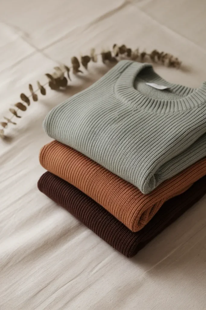
Your Autumn Neutrals Do Most of the Work
Here’s where the palette becomes a closet. Your neutrals are the pieces you’ll wear four times a week for six years, so getting them right matters more than any accent color you’ll ever buy.
Swap black for espresso brown, dark olive, or charcoal with a warm cast. Black isn’t forbidden, it just isn’t doing you any favors near your face. Keep it in trousers and boots where it sits far from your skin.
Swap optic white for cream, ecru, oat, or a warm off white. This one matters more than usual right now, because Pantone named a pure white its color of the year for 2026, a lofty white called Cloud Dancer. Stores will be full of it. It is a beautiful color and it is not your best white. Buy the same silhouette in cream and you get the trend without the drain.
Your other core neutrals: camel, taupe with warm depth, khaki, tobacco, and a warm navy if you want something that behaves like a dark neutral without going brown.
That last one surprises people. Navy is usually filed under cool, but a warm leaning navy with a hint of ink rather than ice works well across all three autumns, particularly Deep.
A camel coat is the single highest leverage neutral purchase an autumn can make. It goes over every color in your palette, it reads expensive at almost every price tier, and the color is close to permanent. If you’re weighing options, the best wool coats for a capsule wardrobe breaks down what actually separates a $200 coat from a $600 one, and the answer is mostly fabric composition.
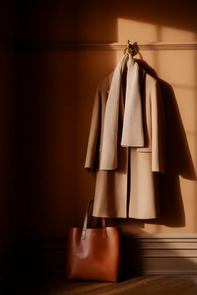
The Autumn 60/30/10 Build
This is the part the swatch grids leave out. You know your colors. How many of each do you actually buy?
Use a 60/30/10 split across your whole closet:
- 60 percent neutrals. Camel, espresso, cream, olive, taupe. These are your trousers, coats, denim, knitwear base, and shoes.
- 30 percent secondary palette colors. Rust, moss, mustard, deep teal, tobacco. Sweaters, blouses, a dress, a skirt.
- 10 percent accent. One or two pieces in your strongest color. For most autumns that’s a saturated rust, a burnt orange, or a deep teal.
In a 20 piece capsule, that’s 12 neutrals, 6 secondary, and 2 accent. The ratio is what stops a wardrobe from turning into a pile of gorgeous single pieces that refuse to talk to each other.
The Autumn Palette Build Chart (screenshot this one):
| Closet size | Neutrals (60%) | Secondary (30%) | Accent (10%) |
|---|---|---|---|
| 12 pieces | 7 | 4 | 1 |
| 20 pieces | 12 | 6 | 2 |
| 30 pieces | 18 | 9 | 3 |
| 40 pieces | 24 | 12 | 4 |
Two rules keep the math honest.
Rule one: the accent slot is a slot, not a category. When you buy a new rust sweater and you already own two accent pieces, something leaves. Otherwise accents multiply quietly until 40 percent of your closet is competing for attention.
Rule two: every secondary color needs three neutral partners already hanging in your closet. If that moss green blouse only works with one pair of pants you own, it hasn’t earned its hanger space yet. Three partners minimum. This one rule has saved more money than any budget I could write down.
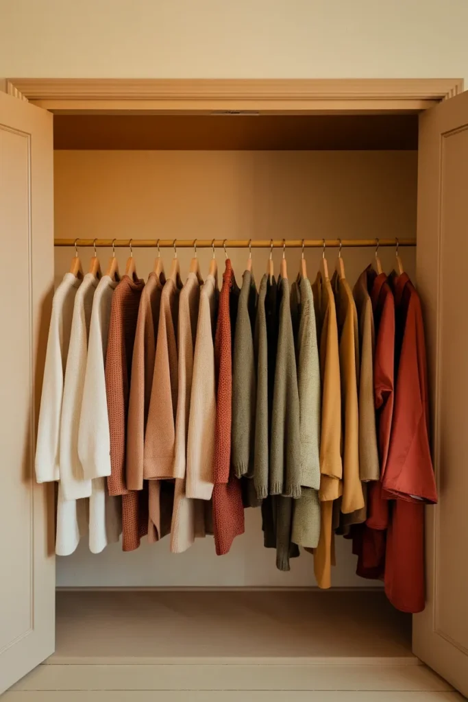
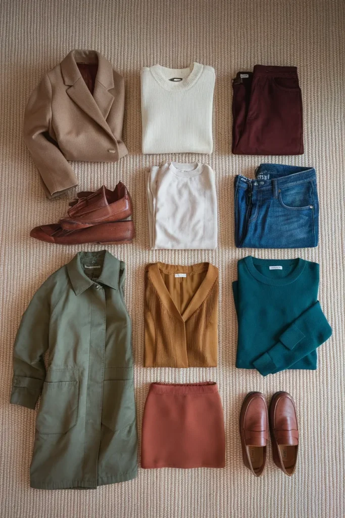
The 12 Piece Autumn Color Capsule
A working starting point, built to the ratio above. Seven neutrals, four secondary, one accent. Every piece here has at least three partners inside this list.
The seven neutrals
- Camel wool coat. The anchor. Mid tier at Everlane or Banana Republic typically runs $200 to $350. Contemporary at COS or Sezane climbs toward $400 to $600, and the jump usually buys you wool content and a better shoulder.
- Cream crewneck sweater. Uniqlo merino sits around $50 to $60. Quince cashmere typically runs $60 to $80. J.Crew cashmere lands nearer $150 to $250. The cheaper cashmere is thinner, so check the gauge before you commit.
- Espresso brown trousers. Wide leg or straight. Everlane and Banana Republic typically fall in the $90 to $150 range.
- Warm white or ecru button down. Skip optic white. Uniqlo and Gap run $40 to $70, Frank & Eileen sits well north of that at $250 plus and is a genuinely different fabric.
- Straight leg denim in a warm mid wash. Madewell typically runs $98 to $148. Avoid stark blue black washes with a cool cast, they fight the rest of the palette.
- Olive utility jacket or chore coat. Old Navy and Gap around $60 to $100, Madewell and J.Crew around $130 to $200.
- Cognac leather ankle boots or loafers. Cognac replaces black as your default shoe. Target and Old Navy under $60 with synthetic uppers, Madewell and Everlane $150 to $250 in real leather.
The four secondary colors
- Moss green knit. Pairs with camel, cream, espresso, and denim. Four partners, which is exactly what you want.
- Mustard or ochre blouse. Silky or cotton, depending on how you dress.
- Deep teal sweater or dress. The one color in the palette that reads slightly unexpected and still belongs.
- Tobacco or caramel midi skirt. Bridges casual and dressed up better than any other piece on this list.
The one accent
- Rust or burnt orange sweater. Your strongest color. One piece, worn often, is more effective than four worn occasionally.
Tops carry most of the weight in a color led capsule because they sit nearest your face. If you want to get the top layer right before you spend anywhere else, the eight capsule wardrobe tops that anchor every outfit covers the silhouettes worth owning in these colors.
One honest note on price tiers. If you buy the $50 cream sweater, expect thinner fiber and some pilling by the second season. If you buy the $250 version, expect it to last five or six years with care. Neither choice is wrong. Just decide which one you’re making.
When 2026 Trend Colors Fight Your Palette
This is the section every other guide skips, and it’s the one that will actually save you money this year.
Pinterest’s own 2026 color forecast named five colors driving searches: Cool Blue, Jade, Plum Noir, Wasabi, and Persimmon. Two of those are gifts to an autumn. Two are trouble. One depends entirely on which autumn you are.
The 2026 Trend Translation Table
| Trend color | Verdict for autumn | What to buy instead |
|---|---|---|
| Persimmon (part orange, part red) | Excellent, especially True Autumn | Buy it directly, it’s practically a True Autumn accent already |
| Plum Noir (deep purple with burnt burgundy) | Excellent for Deep Autumn, workable for True | Deep Autumn buy as is; Soft Autumn go a shade warmer and dustier |
| Jade (muted sage green) | Good, particularly Soft Autumn | Buy as is, or shift toward moss if you’re True or Deep |
| Wasabi (electric chartreuse) | Difficult, the chroma is far too high | Take it down to a mustard, ochre, or olive tinged gold |
| Cool Blue (frosty, stone cold) | Poor near the face | Swap to deep teal or a warm leaning navy |
| Cloud Dancer (Pantone’s pure white) | Poor near the face | Cream, ecru, or oat in the same silhouette |
The pattern is simple once you see it. Trend colors that fail an autumn fail on chroma or temperature, almost never on the color family itself. There’s a wearable version of nearly everything.
Two workarounds when you love a color that isn’t yours. Move it away from your face: shoes, a bag, trousers, a skirt. Or keep it small: a scarf edge, a stripe, a print where your best color still dominates. A frosty blue trouser with a camel sweater above it is a completely different outcome than a frosty blue turtleneck.

The Colors Quietly Working Against You
Nothing here is banned. These are the shades that cost you something near your face, and the version that costs you nothing.
Icy pastels. Baby pink, mint, powder blue, lavender. Too cool and too light for the warmth in your skin. Swap to salmon, warm coral, apricot, or a dusty warm rose.
Optic white. Covered above. Cream instead. Every time.
Jet black near your face. It drains autumns and adds years around the eyes. Espresso, dark olive, or deep chocolate does the same job with none of the cost. Deep Autumns can push closer to black than the others.
Fuchsia, magenta, and cool purple. Too cool and too bright. Take purple toward aubergine or plum with a warm base, and take pink toward terracotta.
Cool gray. Especially the silvery ones. Warm taupe, mushroom, or stone does the same neutral work without the flat cast.
Two things worth saying plainly. This isn’t a set of rules you’re breaking if you wear a pink sweater. It’s information about where your face looks most alive, and you get to spend that however you want. And the distance rule handles almost every exception: a cool gray shoe is invisible, a cool gray turtleneck is not.
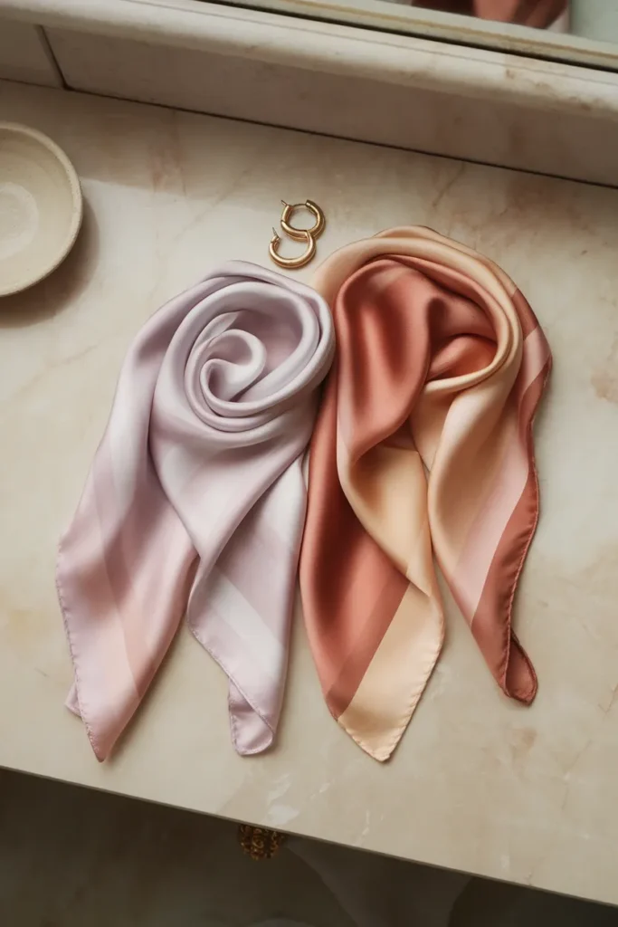
Metals, Denim, and the Details Most People Skip
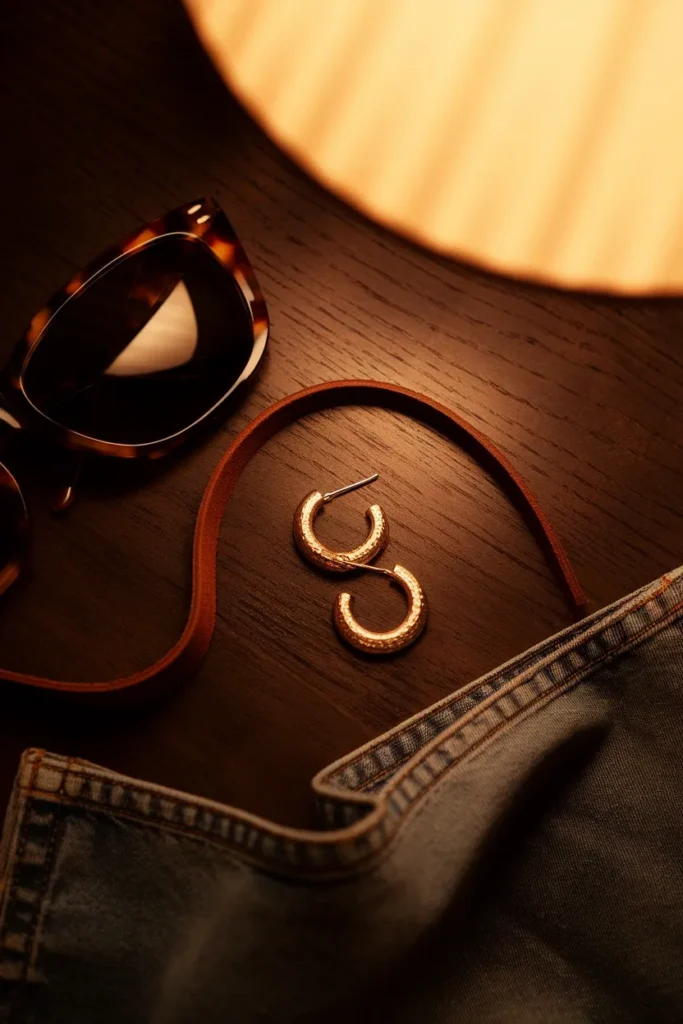
Metals. Gold, brass, bronze, and copper. Antiqued and hammered finishes suit autumns better than high polish, because a mirror finish reads as high chroma. If you own silver you love, keep it and wear it as a bracelet or a ring where it sits away from your face. Mixed metal pieces with a gold dominance work fine.
Denim. Warm mid washes and honey toned washes sit best. Stark blue black and icy light washes both fight the palette. A slightly faded, slightly warm indigo is the safest denim an autumn can own.
Leather. Cognac, tan, and dark chocolate. This one change alone shifts a wardrobe more than most people expect, because bags and shoes appear in every single outfit. Swapping a black bag for a cognac one quietly warms up everything you own.
Prints. Autumn suits organic, slightly irregular patterns: animal print, paisley, tortoiseshell, plaid in warm tones, batik, and anything that looks pulled from a natural material. Sharp geometrics with high contrast belong to Winter.
Sunglasses. Tortoiseshell frames over black ones. They sit directly on your face, which makes them one of the highest impact swaps on this whole list.
Small pieces move the needle more than they should, and which capsule wardrobe accessories actually change an outfit goes deeper on the ones worth owning.
How to Test All of This Without Spending a Dollar
Give it one week before you buy anything.
Days one and two: wear only what you already own in cream, camel, olive, or brown near your face. Take a photo each morning in the same spot with the same light.
Days three and four: wear your cool or bright pieces. Same photo, same spot, same light.
Day five: put the photos side by side on your phone.
The difference is usually obvious once the images are next to each other, in a way it never is standing at a mirror. Look at the skin under your eyes and along your jaw. On your colors, that area looks even and lit. On the wrong ones, it looks shadowed and slightly gray.
Then run the smallest possible test purchase. One cream sweater, worn a dozen times, tells you more than a full palette overhaul you can’t return.
Frequently Asked Questions
Is autumn warm or cool toned?
Warm. Autumn sits at the warmest end of the twelve season system, with yellow and gold undertones running through the entire palette and essentially no blue base. If cool colors consistently look better on you, you’re likely Summer or Winter.
What colors look best on autumn skin tones?
Warm, medium to deep, muted shades. Camel, olive, rust, mustard, moss, terracotta, deep teal, bronze, and chocolate brown. The common thread is a touch of gray folded into the color, which is what separates autumn shades from bright spring ones.
Should autumn wear gold or silver?
Gold, along with brass, bronze, and copper. Antiqued or hammered finishes suit the muted quality of the palette better than a bright mirror polish. Silver near the face tends to leave a slight gray cast, but silver worn as a ring or bracelet is completely fine.
Can autumn skin tones wear black?
Yes, just not right against your face. Black is high contrast and cool, which is the opposite of autumn coloring, so it tends to drain you and emphasize shadows. Use espresso brown, dark olive, or deep chocolate near your face and keep black for trousers, skirts, and shoes. Deep Autumns handle it best of the three.
Can autumn wear pink?
Absolutely, with a warm one. Salmon, coral, terracotta rose, and apricot all sit inside the palette. What doesn’t work is cool pink: fuchsia, baby pink, and anything with a blue base.
Am I soft autumn or true autumn?
It comes down to chroma. If saturated colors overwhelm your features and you look best in dusty, blended shades, you’re Soft Autumn. If richer, more saturated colors like pumpkin and moss make you look more alive rather than less, you’re True Autumn. The quickest test is holding a saturated rust next to a dusty terracotta and watching which one keeps your face as the focus.
How do you tell if you’re a spring or an autumn?
Both are warm, so hue won’t separate them. Chroma will. Spring colors are clear and bright, like a fresh peach or a grass green. Autumn colors are muted and earthy. Hold a bright coral against a brick red: if the bright one looks fresh and the muted one looks heavy, you’re likely Spring. If the bright one takes over and the muted one lets your face come forward, you’re an autumn.
Can an autumn have blue eyes?
Yes, though it’s less common. Autumn eyes tend toward green, hazel, amber, and golden brown, but a warm teal leaning blue with golden flecks does appear. Eye color is only one input. Skin undertone and overall contrast level matter more.
Where to Start This Week
If you take one thing from all of this, take the ratio. Twelve neutrals, six secondary colors, two accents in a closet of twenty. That’s the structure that turns a palette into a wardrobe you can dress from in ninety seconds.
And start with the neutrals, not the exciting colors. A cream sweater and a pair of espresso trousers will get worn a hundred times before that rust piece gets worn twenty. The base is what makes everything else possible.
Go stand by a window with a cream fabric and a white one. Five minutes. You’ll know more about your closet than you did this morning, and you can build from there at whatever pace your budget allows.
Keep reading
13 Ways to Wear Sage Green for Plus-Size Women
Sage green is the color women buy on impulse and then leave on the hanger. It looks calm and expensive in the...

Sage Green Outfits for Women Over 50: 10 Ways to Wear It Well
Sage green is the one color women keep asking me about and then leave hanging in the closet. It looks calm and...

10 Sage Green Outfit Ideas for Fall (and Exactly What to Pair Them With)
Sage green outfits look easy on a pin and confusing in a closet. The color sits right between a neutral and a...