
The Color Analysis Chart: All 12 Seasons at a Glance
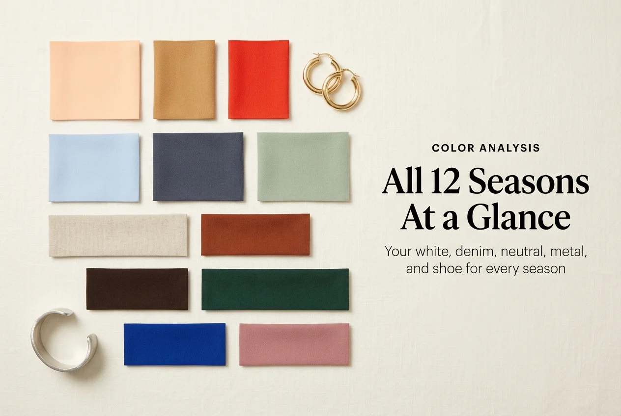
Most people meet a color analysis chart the same way: twelve tidy palettes, a hundred and forty little squares, and absolutely no idea which row is theirs. So they save the chart, admire it, and buy the same gray sweater that has been washing them out for six years. The chart is not the problem. The missing piece is a way to read it, place yourself on it, and turn it into actual clothes. That is what this page does, and it goes further than the palettes: for all 12 seasons you get the white, the denim wash, the neutral base, the metal, and the shoe color that go with it.
Here is the honest framing before you scroll. Seasonal color analysis is a styling system, not a medical test. It groups colors by how warm, how light, and how saturated they are, then matches those groups to the coloring you were born with. When it works, getting dressed gets faster and your closet stops fighting itself. When it is treated as a rulebook, it turns into one more reason to feel like you are doing style wrong. Use it as a filter. Not a fence.
How to Read a Color Analysis Chart in Sixty Seconds
Every color analysis chart, no matter who drew it, is built on three sliders. Learn the sliders and the whole grid stops looking like decoration.
Hue is warm or cool. Does the color lean golden or lean blue? Camel is warm. Slate is cool.
Value is light or deep. Powder blue and navy are the same hue family at opposite ends of the value slider.
Chroma is bright or muted. Emerald and sage are both green. Emerald is turned all the way up. Sage has gray mixed in.
Those three words are borrowed, almost exactly, from the Munsell system, which is the three dimensions color scientists actually measure when they describe a color numerically. Fashion did not invent them. It inherited them.
Your season is just your position on all three sliders at once. Warm plus light plus bright puts you in Light Spring. Cool plus deep plus moderate puts you in Deep Winter. Twelve seasons exist because three sliders with three or four meaningful settings produce roughly twelve useful combinations.
One slider always dominates. That is the piece most charts leave out. For every season, one of the three is the loud one, and it is the one you can trust when the other two get confusing under bad lighting. Warm Autumn is loudly warm. Soft Summer is loudly muted. Bright Winter is loudly bright. Find the loud slider first and you have narrowed twelve down to three in about a minute.
The Color Analysis Chart: All 12 Seasons at a Glance
Screenshot this one. It is the whole system in a single table, and the last five columns are the part you will actually use while shopping.
| Season | Sliders | Signature colors | Best white | Best denim | Best neutral base | Best metal | Best shoe |
|---|---|---|---|---|---|---|---|
| Light Spring | warm, light, fairly bright | peach, coral, butter yellow, light aqua | warm ivory | light warm wash | camel | gold, light | nude, tan |
| Warm Spring | strongly warm, medium, bright | tomato, golden yellow, warm turquoise, grass | soft cream | medium warm wash | camel, honey | yellow gold | tan, cognac |
| Bright Spring | warm-neutral, medium, very bright | bright coral, emerald, hot turquoise, true red | clean white | crisp medium wash | warm ivory, navy | bright gold | white sneaker, tan |
| Light Summer | cool-neutral, light, soft | powder blue, soft rose, lavender, mint | soft white | pale cool wash | dove gray | pale silver, rose gold | gray, soft taupe |
| Cool Summer | strongly cool, medium, medium | blue-red, medium blue, soft fuchsia, gray-navy | soft white | true blue wash | gray-navy | silver | navy, gray |
| Soft Summer | cool-neutral, medium, very muted | sage, dusty rose, slate blue, mushroom | oyster white | faded gray wash | mushroom, taupe | brushed silver | taupe, soft gray |
| Soft Autumn | warm-neutral, medium, very muted | sage, camel, dusty terracotta, soft teal | oatmeal | dusty medium wash | oatmeal, camel | brushed gold | cognac, taupe |
| Warm Autumn | strongly warm, medium-deep, medium | rust, olive, mustard, brick, chocolate | warm cream | warm dark wash | chocolate, olive | antique gold | cognac, brown |
| Deep Autumn | warm-neutral, deep, medium | espresso, burgundy, dark olive, marigold | warm ivory | deep indigo | espresso | dark gold, bronze | dark brown, black |
| Deep Winter | cool-neutral, deep, fairly bright | pine, true burgundy, deep purple, icy pink | bright white | dark rinse indigo | true black | polished silver, white gold | black |
| Cool Winter | strongly cool, medium-deep, bright | true red, cobalt, emerald, icy blue | stark white | blue-black rinse | charcoal, black | silver, platinum | black |
| Bright Winter | cool-neutral, medium-deep, very bright | hot pink, cobalt, emerald, true red | stark white | crisp dark rinse | true black, stark white | high-shine silver | black, white |
Two things worth noticing. Every warm season lands on cream or ivory rather than optic white, and every cool season lands on the crisper whites. That single column solves the white-tee problem that sends people back to the store three times.
The metal column matters more than its size suggests. It is the cheapest test of your own season, because you already own both. Hold silver next to your face, then gold, in daylight. One usually makes your skin look clearer and one usually makes it look slightly tired.
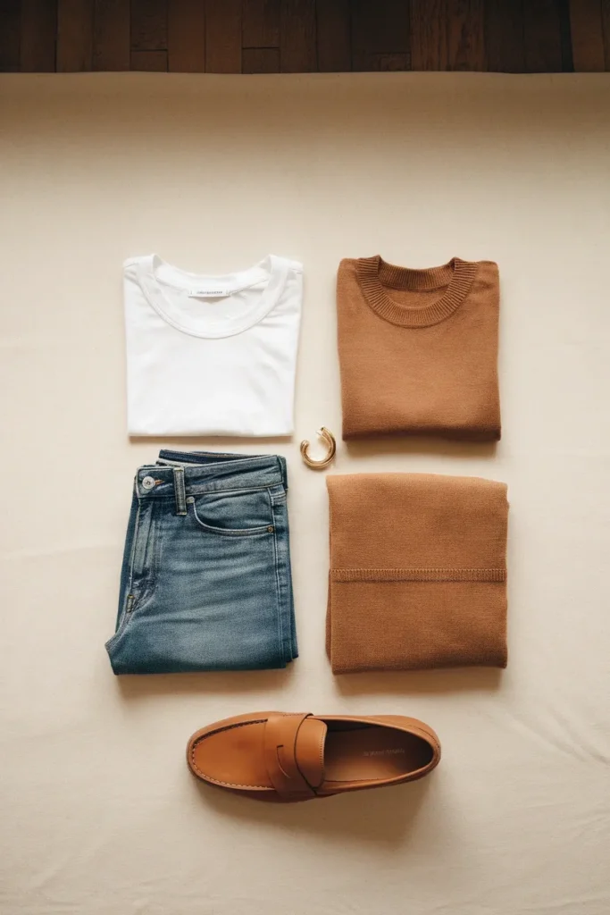
The Spring Seasons: Warm, Light, and Clear
Spring seasons run warm and clear. Think sunlight on skin rather than firelight. Golden, fresh, a little lit-from-within. If black makes you look like you borrowed someone else’s coat, you may live here.
Light Spring
Delicate warmth. Coloring is light overall, with soft golden or strawberry hair and light warm eyes. Your palette is a warm pastel set: peach, apricot, light coral, butter yellow, light warm aqua. Deep colors overwhelm you, so use camel and warm ivory where other people use black and white. Charcoal instead of true black is the single easiest upgrade.
Warm Spring
The most obviously golden of the twelve. Tomato red, golden yellow, warm turquoise, and grass green look like they were mixed for you. Cool pastels go chalky on you fast. Your best neutral is not gray, it is honey or camel, and a cognac belt does more for an outfit than a black one ever will.
Bright Spring
High saturation, warm lean. Bright coral, emerald, hot turquoise, and true red all hold up against your natural contrast. Muted colors are the risk here: sage and mushroom read as dusty on Bright Springs rather than soft. When in doubt, turn the color up rather than down.

The Summer Seasons: Cool, Soft, and Light
Summer runs cool and gentle. Nothing about a Summer palette shouts. The colors behave like sea glass: blue-based, slightly hazy, easy on each other. Summers usually have low natural contrast between hair, skin, and eyes, which is exactly why hard black-and-white outfits can look severe on them.
Light Summer
Cool and delicate. Powder blue, soft rose, lavender, and mint sit beautifully. Your version of a neutral base is dove gray rather than black, and soft white rather than stark white. Because your palette is light and your contrast is low, tonal dressing (three shades of the same soft color) looks intentional on you in a way it does not on everyone.
Cool Summer
The truest blue-based season of the three. Blue-red, medium blue, soft fuchsia, and gray-navy are your anchors. Silver over gold, always. Warm camel is the color most likely to be sitting in your closet doing nothing for you, and swapping it for gray-navy is a fast fix.
Soft Summer
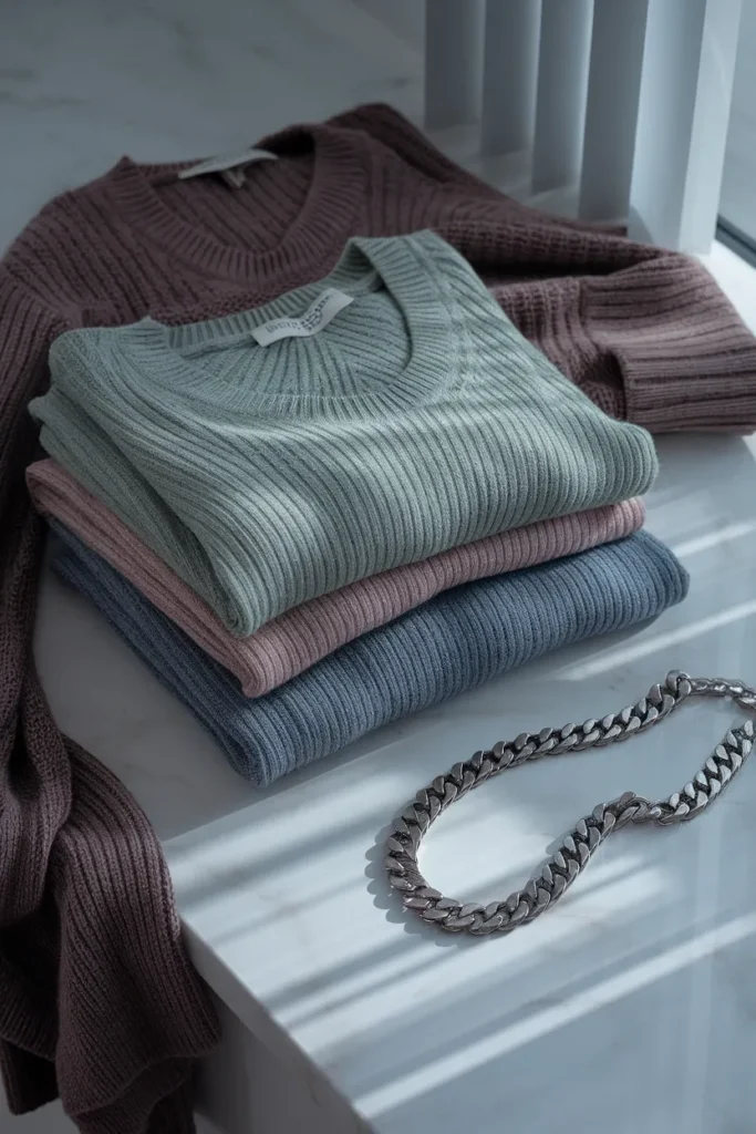
The most muted season on the entire chart, and the most common one to mistype. Sage, dusty rose, slate blue, mushroom, and cocoa. Anything highly saturated will wear you rather than the other way around. Soft Summers are also the group most likely to already own the right colors and not realize it, since dusty neutrals are everywhere in mass retail. If you are building from scratch, start with the eight tops that anchor every outfit and buy every one of them in your muted neutrals before you touch an accent color.
The Autumn Seasons: Warm, Muted, and Deep
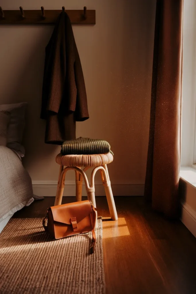
Autumn is warmth with weight to it. Where Spring is sunlight, Autumn is late afternoon. The palette is earthy and slightly dusty, and it is the palette that most often gets described as expensive-looking, because rust, olive, and chocolate photograph rich even at mass prices.
Soft Autumn
The blended one. Warm, but only just, and very muted. Sage, camel, dusty terracotta, soft teal, and oatmeal. Soft Autumn and Soft Summer overlap more than any other pair on the chart, which is covered in the twins section below. Your best white is oatmeal, and it will look more polished on you than optic white ever has.
Warm Autumn
Full golden warmth at medium depth. Rust, olive, mustard, brick, and chocolate. This is the season where camel outperforms gray, cognac outperforms black, and antique gold outperforms silver by a wide margin. Almost every fall trend cycle serves Warm Autumns well, which is a quiet budget advantage.
Deep Autumn
Warm, but deep enough to carry real intensity. Espresso, burgundy, dark olive, deep teal, marigold. You can wear black successfully, unlike other Autumns, as long as you break it up with a warm color near your face. Deep Autumn also tends to look better in richer fabrics, so a wool-blend coat earns its cost per wear faster here than in lighter seasons. If your coloring has deepened over the years, that is normal and worth planning around: a capsule wardrobe for women over 40 tends to lean into exactly these deeper warm neutrals.
The Winter Seasons: Cool, Deep, and Bright
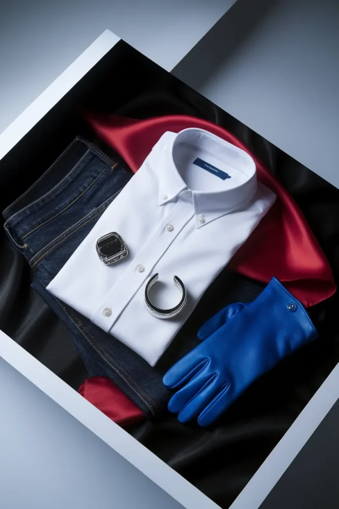
Winter is contrast. Clear, cool, and unafraid of black. Winters are the only seasons for whom stark white and true black are genuinely optimal rather than merely tolerable, which is a real advantage in a capsule wardrobe, since those two colors are the cheapest and most available on earth.
Deep Winter
Cool with real depth. Pine, true burgundy, deep purple, and icy pink. Black is a legitimate base for you. Deep Winter and Deep Autumn get confused constantly because both are dark; the difference is that yours stays blue-based and theirs goes golden.
Cool Winter
The purest cool season. True red, cobalt, emerald, icy blue, charcoal. Silver and platinum near your face. Warm browns and oranges are the two families to skip, and they are the ones that will keep tempting you every autumn when the whole internet goes rust.
Bright Winter
Maximum clarity. Hot pink, cobalt, emerald, true red, all against stark white or true black. Muted colors flatten you faster than they flatten anyone else on this chart. Two saturated colors plus one crisp neutral is your best outfit formula, and you can build a full year of outfits around a very small number of pieces. If you want a structure to build against, work from the free capsule wardrobe checklist and simply swap every neutral it names for its coldest version.
How to Find Your Color Season at Home
You do not need a professional draping session to get within one season of correct. You need daylight, a bare face, and about twenty minutes.
Step 1: Fix the light. Stand near a north-facing window in the middle of the day, no lamps on. Indoor bulbs push everything warm and will hand you a wrong answer with total confidence. Professionals standardize this on purpose; the color industry even has a standardized daylight reference for exactly this reason. Your window is the home version.
Step 2: Strip the variables. No makeup, hair pulled back, shoulders covered with a white towel. You are testing your skin, not your foundation.
Step 3: Run the metal test. Silver, then gold, held under your chin. Watch the area right below your jaw, not the jewelry. Warm seasons clear up under gold. Cool seasons clear up under silver. If both look fine, you are likely neutral-leaning, which puts you in one of the blended seasons (Light Spring, Bright Spring, Light Summer, Soft Summer, Soft Autumn, Deep Autumn, Deep Winter, Bright Winter).
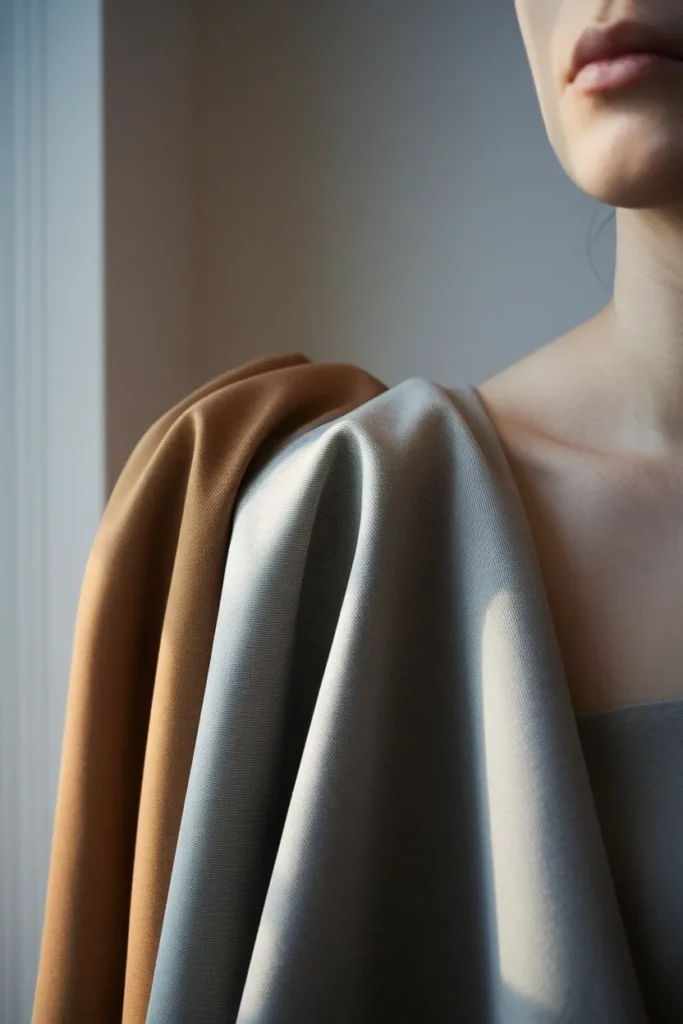
Step 4: Run the value test. Hold a stark white shirt to your face, then a camel one, then a black one. One of the three will make your features look defined instead of washed out or overpowered. That tells you whether you sit light, medium, or deep.
Step 5: Run the chroma test. Hold a saturated emerald against a muted sage. Bright seasons come alive next to saturation. Muted seasons look tired beside it and calm beside the sage.
Three answers, one season. Write down the three words (warm or cool, light or medium or deep, bright or muted) and read them straight off the chart above.
The Season Twins People Mix Up Most
Four pairs account for most mistyping. Here is the deciding question for each.
| Confused pair | What they share | The deciding question |
|---|---|---|
| Soft Summer vs Soft Autumn | Both very muted, medium value, low contrast | Does dusty rose or dusty terracotta look cleaner on you? Rose points Summer, terracotta points Autumn |
| Light Spring vs Light Summer | Both light, both delicate, both soft-ish | Peach or powder pink? Peach points Spring, powder pink points Summer |
| Deep Autumn vs Deep Winter | Both deep, both handle dark colors well | Espresso brown or true black near your face? Brown points Autumn, black points Winter |
| Warm Spring vs Warm Autumn | Both clearly warm, both golden | Tomato red or brick red? Tomato points Spring, brick points Autumn |
If a pair still feels like a coin flip after that, you are probably on the border, and the practical answer is to shop the overlap. Two neighboring seasons always share a handful of colors. Buy those first. They are correct under either answer, which makes them the lowest-risk purchases you can make while you figure it out.
Turn Your Season Into a Capsule Wardrobe
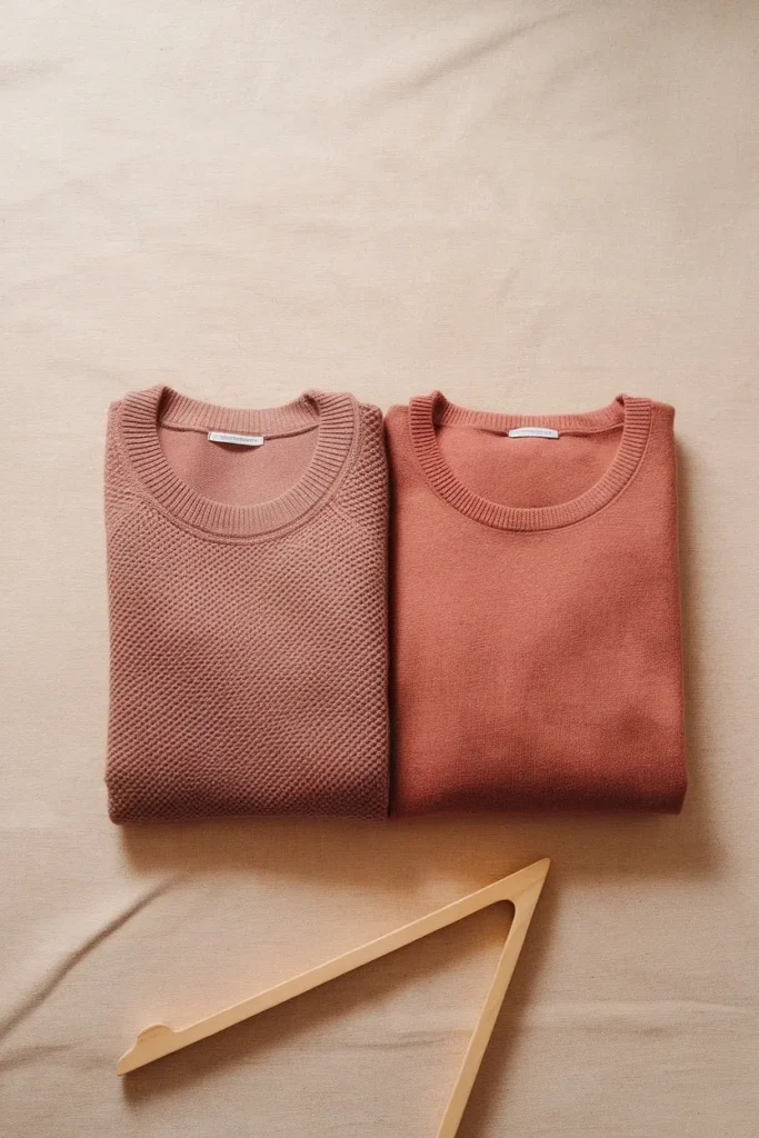
A palette is not a wardrobe. Here is the conversion, and it is smaller than people expect.
Take four neutrals from your season. These carry the weight: your white, your denim, your neutral base, and one deep grounding color. That is your foundation, and it should be roughly sixty percent of what you own.
Take three accents. Pull them straight from your signature colors column. Thirty percent. These go on tops, knits, and scarves, where they sit near your face and do the most work.
Take one wildcard. Ten percent. One color you love that lives at the edge of your palette. Wear it on a bag, a shoe, or a coat.
Twelve pieces built on that split will out-perform forty built on nothing. The mechanics of the build (which categories, how many of each) are the same regardless of season, and they are covered in the guide on how to build a capsule wardrobe from the ground up. Your season only changes the color inputs.
One practical note about placement. Color matters most within about twelve inches of your face. That is where the reflection lands. So spend your palette budget on tops, knitwear, scarves, and coat collars, and stop agonizing about trousers. A pair of gray-navy pants on a Warm Autumn is a non-event. A gray-navy sweater is not.
What to Do With the Closet You Already Own
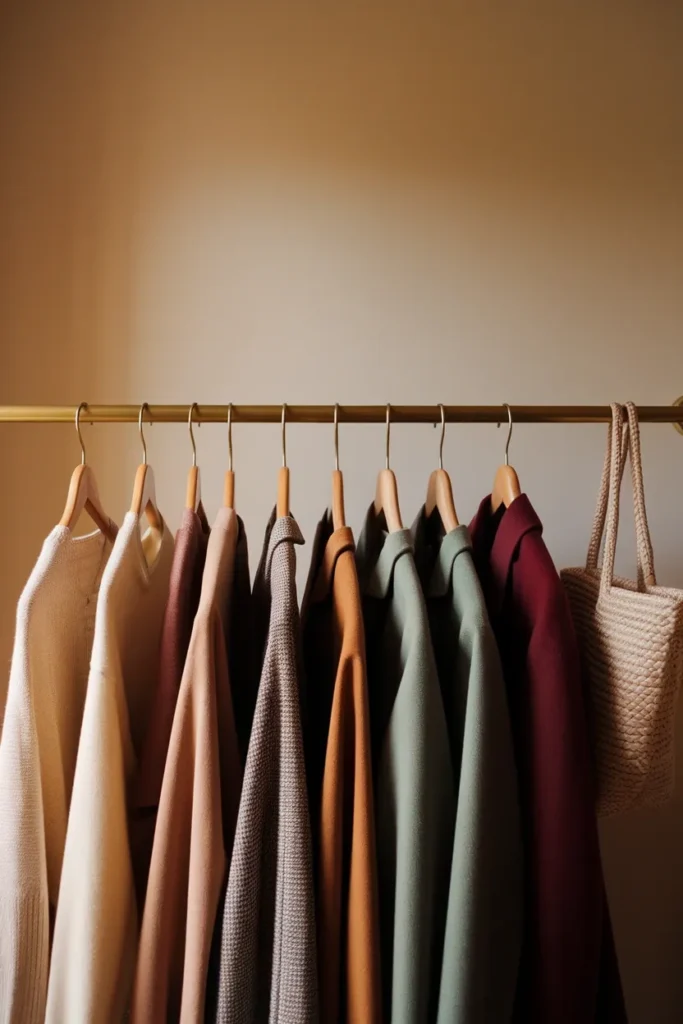
This is the part the charts skip, and it is the part that decides whether any of this survives contact with real life. You are not starting from an empty closet. You are starting from eighty-something pieces bought over a decade, and most of them predate the word chroma.
Do not purge. Sort into three piles instead.
Keep. Anything in your palette, obviously, plus anything in your palette-adjacent neutrals. Most closets have more of these than expected.
Bridge. Wrong color, right piece. A cool-toned blouse on a Warm Autumn stops being a problem the moment a camel cardigan sits between it and your face. Anything worn below the waist bridges automatically. Anything layerable bridges with one piece on top. This pile is usually the biggest, and it is the reason a season change does not have to cost anything.
Retire slowly. Wrong color, worn near the face, no layering fix. Do not bin these on day one. Wear them out, then replace them one at a time with the palette version. Replacing on failure rather than on discovery is what keeps this from turning into a four-hundred-dollar weekend.
Give it two seasons and the closet self-corrects. If you want a target number before you start, how many clothes you actually need in a minimalist wardrobe is a more useful benchmark than any purge rule.
How to Shop Your Palette Without Wasting Money
Three habits that save more than any single purchase decision.
Photograph the swatch, not the screen. Screens are wildly inconsistent. Keep a photo of a real fabric swatch in your palette on your phone and hold your phone next to the garment in store, in daylight if you can get to a window.
Buy the near-face pieces first. Tops, knits, scarves. Highest color impact per dollar. Expect to pay roughly $15 to $40 at Old Navy, Target, or Uniqlo, and roughly $50 to $150 at Madewell, Quince, or J.Crew for the same category in better fabric.
Buy the accent color once, at the top of your budget. One really good burgundy coat beats three mediocre ones. If a piece is over roughly $300 and you are not certain of your season yet, wait, or find the mid-tier version first: a Quince or Everlane equivalent usually runs $80 to $180 and tells you whether you will actually wear the color before you commit. Prices move constantly, so treat every number here as a range to verify at the register, and the roundup of capsule wardrobe brands worth the money in 2026 is the faster way to compare tiers.
One warning worth stating plainly. Color analysis is a tool for spending less, and the industry around it is very good at turning it into a reason to spend more. If a chart, an app, or a consultant leaves you feeling like your entire closet is now wrong, that is a sales outcome, not a styling one.
Frequently Asked Questions
Can your color season change over time? Your underlying season, meaning your undertone, generally stays put. What changes is contrast. Hair going gray or silver lowers the contrast between hair and skin, which often means a Deep season starts looking better in slightly softer colors even though the hue direction has not moved. Re-check the value slider every few years, not the hue.
What is the difference between the 4, 12, and 16 season systems? The classic four (Spring, Summer, Autumn, Winter) sort by hue only. The 12-season system adds value and chroma, which is why it is the standard on most color analysis charts today. The 16-season system splits further into finer sub-seasons. For dressing purposes, 12 is the point of diminishing returns. Going to 16 mostly helps professionals, and going back to 4 loses too much.
Is seasonal color analysis actually scientific? Partly. The vocabulary (hue, value, chroma) comes from measurable color science, and the effect of reflected light on skin appearance is real. The season groupings themselves are a styling convention, not a validated scientific classification. It is a useful framework, and it is not a diagnosis.
Can I be between two seasons? Yes, and it is common. Neighboring seasons share colors by design. If you keep landing between two, shop the overlap first, since those colors are right either way, and let the edges of the palette wait.
Do phone filters and AI color analysis apps work? Use them for a starting hypothesis, not an answer. Phone cameras auto-correct white balance, which is precisely the variable the test depends on. An app that says Soft Summer is worth checking against a real drape test in daylight before you shop on it.
Is a professional color analysis worth the money? Depends on what you would otherwise spend. In-person draping in the US typically runs somewhere in the low hundreds. If you are about to invest in a coat, a suit, or a full wardrobe reset, it can pay for itself in returns avoided. If you mostly buy $30 tops, the home method above gets you close enough.
Will my season palette work year-round? Yes, and that is the quiet advantage. Because a season palette is internally coordinated, pieces bought in July still work with pieces bought in December. That is the same reason a capsule wardrobe works: fewer colors, more combinations.
Save the Chart, Then Use It Once
Here is the whole thing compressed. Find your three words. Read them off the chart. Buy your white, your denim, your neutral, your metal, and your shoe in the versions that match. Then leave it alone and go get dressed.
You do not need to be certain to benefit. Getting within one season of correct already removes most of the colors that were quietly working against you, and that is enough to make a closet feel calmer within a month.
Save this chart to your color palette board, then open your closet and pick just one thing: the top you wear most often that is not in your palette. Find its replacement in your colors. Start there, and let the rest follow.
Keep reading
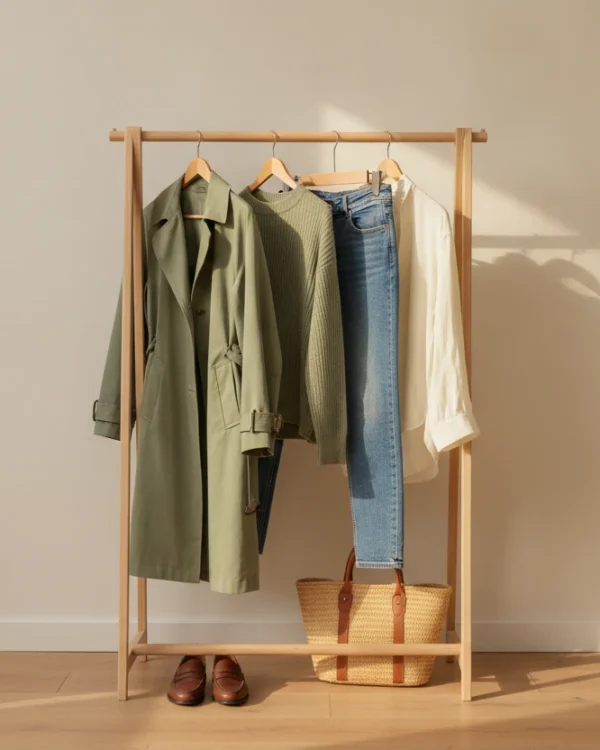
13 Ways to Wear Sage Green for Plus-Size Women
Sage green is the color women buy on impulse and then leave on the hanger. It looks calm and expensive in the...

Sage Green Outfits for Women Over 50: 10 Ways to Wear It Well
Sage green is the one color women keep asking me about and then leave hanging in the closet. It looks calm and...

10 Sage Green Outfit Ideas for Fall (and Exactly What to Pair Them With)
Sage green outfits look easy on a pin and confusing in a closet. The color sits right between a neutral and a...