
Color Analysis for Beginners: How to Find Your Season and Actually Use It
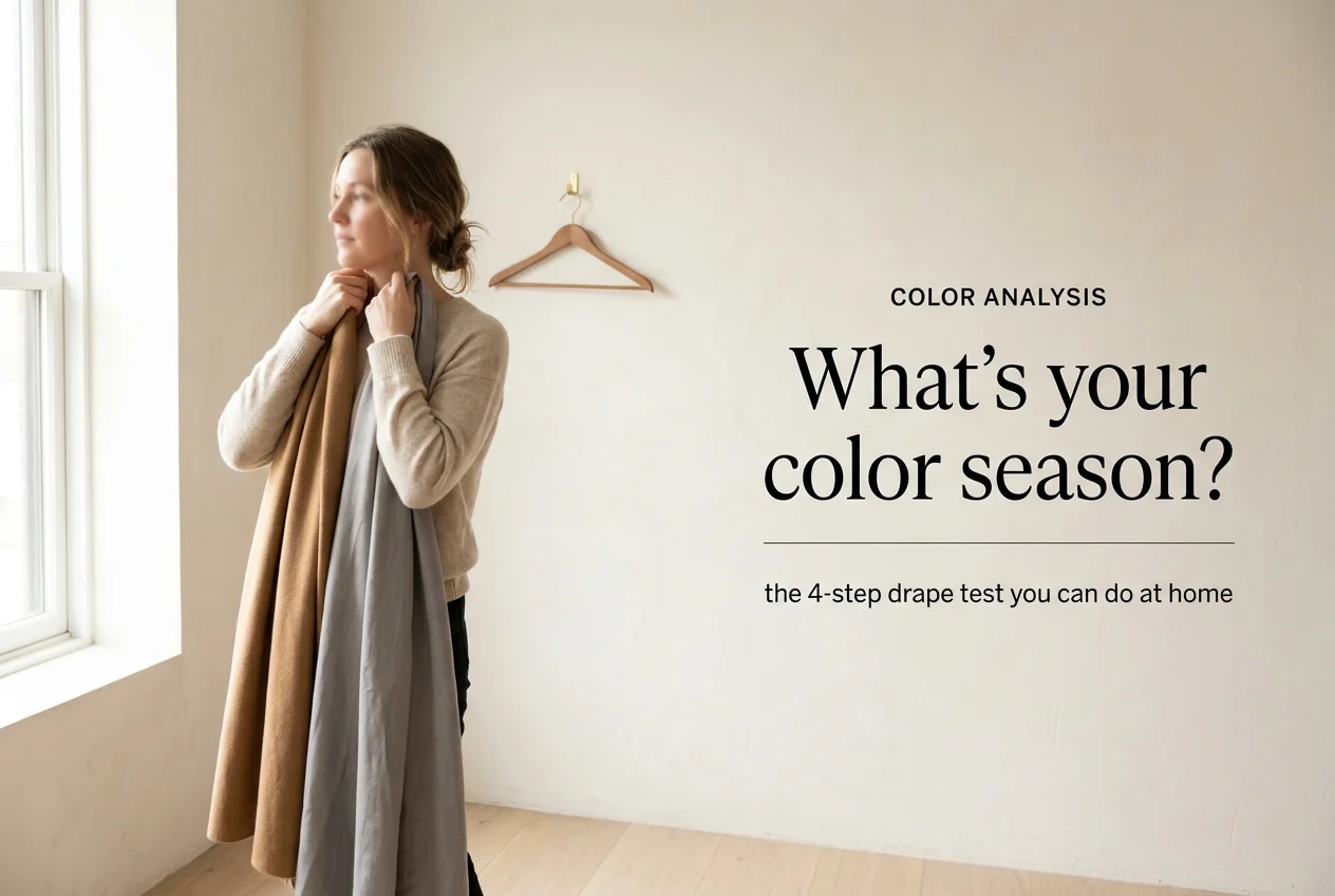
Color analysis is the practice of matching what you wear to the coloring you were born with, and there’s a reason it keeps resurfacing every few years. Most of us own a shirt that makes people ask if we’re sleeping okay. We also own one that pulls a compliment every single time it leaves the house. Same closet, same face, same lighting. The only thing that changed is the color.
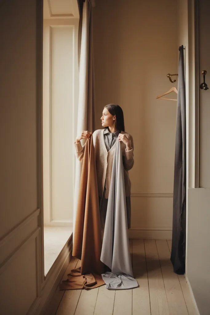
Here’s what this guide does differently. Most color analysis articles hand you a swatch card and walk away. This one takes you through the diagnosis, then through the part nobody covers: what to do Monday morning when you have a 30-color palette in your phone and a closet full of clothes you already paid for. You’ll test at home, in free daylight, and you won’t need to replace a thing to start.
Grab a mirror, a white towel, and about twenty minutes near a window.
What Color Analysis Actually Does for Your Closet
Color analysis sorts colors by how they behave against your natural coloring, meaning your skin, your eyes, and your hair before you dyed it. The output is a palette. The real output is fewer wrong purchases.
Think about the last time you bought something in a color you loved on the hanger and wore twice. That’s the problem this solves. When your colors share a family, everything in the closet quietly starts matching everything else, which is the whole engine behind building a capsule wardrobe from the ground up. Twelve pieces in one color family produce more outfits than thirty pieces bought one impulse at a time.
The practice traces back to Carole Jackson’s 1980 book Color Me Beautiful, which put four seasons into the mainstream, and to the Sci\ART method that later split those four into twelve. Both systems chase the same question, which is whether a color makes her look rested or makes her look like she needs a nap.
What color analysis does not do is hand you a rulebook. It’s a filter, not a fence. If you’re a Deep Winter who loves a rust sweater, wear the rust sweater and keep it below the shoulder line. Nobody is checking.
Three practical wins you’ll notice within a month:
- Returns drop. You stop buying the sixth version of a color that has never worked.
- Getting dressed speeds up. When the hangers agree with each other, outfit math takes seconds.
- Cost per wear falls. A $98 sweater in your palette gets worn 40 times. The same sweater in a color that fights your skin gets worn four.
The Three Things Every Color System Is Measuring
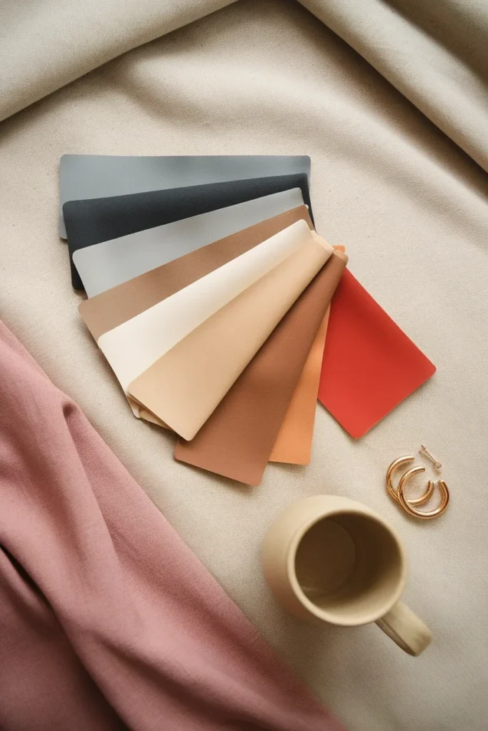
Every color system, whether it splits the world into four seasons or sixteen, is measuring the same three properties. Learn these and the season names stop feeling arbitrary.
Hue: warm or cool
Hue is temperature. Does the color lean golden and yellow-based, or does it lean blue and pink-based? A warm ivory sits next to a cool optic white and suddenly one of them looks slightly dirty. Neither is wrong. They’re just from different families.
Value: light or deep
Value is how much light the color holds. Butter yellow and mustard are the same hue at two different values. Your own value comes from the overall depth of your hair, skin, and eyes together, which is why the same person often looks better in charcoal in winter than in the summer when her hair has lifted two shades.
Chroma: clear or muted
Chroma is intensity. A clear color looks like it was poured straight from the bottle. A muted color looks like someone stirred in a spoonful of gray. Soft Summers live in the muted lane. Bright Winters live in the clear one. Wearing the wrong chroma is the mistake that’s hardest to name and easiest to feel, because the color technically “matches” and still looks off.
Here’s the order that matters when you’re testing: hue first, then value, then chroma. Get temperature right and you’ve eliminated half the palettes on earth. Get it wrong and every step after it inherits the error.
This is also why a smaller closet gets easier to run once you know your three dimensions, and it’s worth reading how many clothes you actually need in a minimalist wardrobe alongside this, because the number drops once the colors cooperate.
Start With Your Undertone: Three Tests, Five Minutes
Undertone is the color underneath your skin’s surface tone. Surface tone changes with sun, sleep, and season. Undertone doesn’t. The two pigments doing most of the work here are eumelanin and pheomelanin, and if you want the actual biology behind the pigments that actually create your skin’s undertone, the NIH’s StatPearls entry lays it out clearly.
Run all three of these tests. Two out of three agreeing is your answer.
Test 1: the metal test
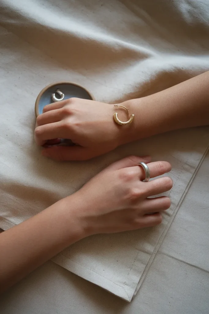
Hold a gold ring or hoop against one side of your jaw and a silver one against the other. Look at your skin, not the metal. Gold usually makes warm skin look lit from inside and makes cool skin look slightly sallow. Silver does the reverse. If both look fine, you may be neutral, which is more common than the internet admits.
Test 2: white against cream
Drape a piece of optic white fabric under your chin, then swap it for a warm cream one. One of them will make the shadows under your eyes recede. The other will bring them forward. A plain white pillowcase and a linen napkin work perfectly for this.
Test 3: magenta against orange
Try a cool magenta or fuchsia, then a warm coral or tomato. Warm skin tends to hold its own against orange-based reds and look flushed beside magenta. Cool skin does the opposite.
The vein test deserves a warning
You’ve seen the advice: look at your wrist, blue veins mean cool, green means warm. It’s the least reliable test of the three, because vein color is affected by skin thickness and how the light hits your arm, and plenty of people see teal and stall out. Use it as a tiebreaker, never as the answer.
One inclusivity note worth saying plainly, because the older books handled it badly: every undertone appears at every skin depth. Deep skin can be cool, olive skin can be warm, and the idea that everyone with deep skin is an Autumn or a Winter is simply wrong. Test your own face rather than trusting a chart of somebody else’s.
Get the Light Right or Don’t Bother
This is the step that invalidates most at-home results, and almost nobody leads with it.
Your bathroom vanity bulbs are lying to you. So is your kitchen ceiling fixture, your ring light, and every filter on your phone. NIST researchers have measured how much light sources shift color perception, and their findings on skin specifically are worth a look: warm and cool light sources render skin tones so differently that a lamp rated highly on the old color rendering index can look worse on a face than one rated far lower.
I ran the same gold and silver test twice in one afternoon, once under my bathroom vanity bulbs and once beside a north-facing window, and got two different answers. That’s the whole argument for daylight in one sentence.
Set up like this:
- Stand at a north-facing window between roughly 10am and 2pm. North light is indirect and stays consistent, which is why artists have used it for centuries.
- Turn off every artificial light in the room. Mixing daylight with a warm bulb gives you the worst of both.
- Remove your makeup. Foundation is a color correction you already applied.
- Cover your hair with a white towel. Dyed hair skews the read more than anything else on this list.
- Wear a white or neutral gray top, or drape a white towel over your shoulders. A navy sweater will bounce blue onto your jaw.
No north window? An overcast day is even better, and stepping just inside an open garage door on a bright day gives you soft, even, daylight-balanced light for free.
Do this once, properly, and you won’t have to keep re-testing every time a video tells you your season is wrong.
The Four Color Seasons in Plain English
Four seasons, two questions. Are you warm or cool, and are you light or deep. That’s genuinely all the original system is doing.
Spring: warm and light
Golden, clear, and full of light. Think butter yellow, coral, warm turquoise, camel, and a fresh grassy green. Spring skin usually has a peachy or golden cast, and the hair often carries visible gold. Optic white and true black tend to overwhelm a Spring, so ivory and soft brown do the heavy lifting instead. Best neutral base for a capsule: camel and ivory.
Summer: cool and light
Cool, soft, and slightly dusty, like a landscape seen through morning haze. Powder blue, soft rose, sage, lavender, and a gentle slate. Summer skin reads pink or neutral-cool, and the coloring overall is low contrast, which means head-to-toe black creates a gap the face has to fight across. Best neutral base: soft navy and dove gray.
Autumn: warm and deep
Warm, rich, and earthy. Rust, olive, terracotta, mustard, forest, and a deep chocolate. Autumn coloring carries real depth with golden warmth underneath, and it’s the one season that genuinely wears brown better than black. Best neutral base: espresso and olive.
Winter: cool and deep
Cool, saturated, and high contrast. True black, optic white, cobalt, emerald, ruby, and icy pastels used as accents. Winter coloring shows a real jump between hair and skin, which is why crisp contrast looks deliberate on a Winter and severe on a Summer. Best neutral base: true black and optic white.
Two things to watch as you read those. First, the season names describe color families, not the weather you look good in, so a Winter can absolutely wear linen in July. Second, almost nobody is a textbook example. If you’re reading two of these and nodding at both, you’re normal, and the twelve-season system exists precisely for you.
Why 12 Seasons Exist, and When You Actually Need Them
The twelve-season system takes each original season and splits it three ways, which lets each family lean toward one of its neighbors instead of sitting in a box.
Every season gets a true version plus two variations:
- Winter splits into True Winter, Bright Winter, and Deep Winter
- Summer splits into True Summer, Light Summer, and Soft Summer
- Spring splits into True Spring, Light Spring, and Bright Spring
- Autumn splits into True Autumn, Soft Autumn, and Deep Autumn
The logic is called flow. A Deep Autumn borrows depth from Winter. A Light Summer borrows lightness from Spring. Soft Summer and Soft Autumn sit right beside each other and swap muted, low-chroma colors across the fence, which is exactly why so many people bounce between those two for months.
You need the twelve-season layer if any of this sounds familiar. You test as clearly cool but black still feels heavy on you. You love your palette on paper and half the swatches look wrong in person. Two different quizzes gave you two different answers. In each case the four-season answer is probably right in temperature and wrong in depth or clarity, and the sub-season fixes it.
You do not need it if the four-season answer already works. Plenty of people run a beautiful closet on “cool and light” and never learn another term. There’s no prize for precision here.
Sixteen-season systems exist too, adding a fourth variation per family. They’re genuinely useful for professional stylists and mostly overkill for a home closet.
Depth matters more as coloring shifts over time, which is one reason a capsule wardrobe built for women over 40 leans on adjusting value rather than abandoning colors that used to work. Hair lightens, contrast softens, and the sub-season usually moves before the season does.
The At-Home Drape Ladder: Four Rungs to a Working Answer
Here’s the framework, and it’s the one part of this article worth screenshotting. Most people test badly because they compare twenty colors at once and their eyes fatigue by swatch six. Climb the ladder instead, one rung at a time, and never move up until the rung below it is settled.
Rung 1: temperature. Two drapes only. A warm coral and a cool fuchsia. Ask one thing: which one makes the shadows under your eyes lighter. Not which is prettier. Not which you own more of. Settle this before you go on.
Rung 2: depth. Stay in the temperature you just won. Take a pale version and a deep version of the same color, for example a soft dusty blue and a deep navy. Watch your jawline. The wrong depth either washes your face out or creates a hard line where your chin ends.
Rung 3: clarity. Two drapes again, same temperature, same depth, one clear and one muted. Clear looks like fresh paint. Muted looks like it has a whisper of gray in it. On the wrong one, your features go slightly flat and your eyes stop being the first thing you see.
Rung 4: confirm with a stranger color. Take a color you’ve always avoided that your result says should work, and try it. If it looks better than you expected, your ladder is sound. If it’s clearly awful, drop back to Rung 2 and retest depth, because depth is where most home tests go wrong.
Two rules that make the ladder work. Only compare two things at once, because the human eye is excellent at A versus B and terrible at ranking twelve. Rest your eyes on a plain white wall for ten seconds between every pair.
The first time I draped myself I landed on Soft Autumn, and three weeks later, retesting properly in daylight, I came out Soft Summer. The distance between those two answers was one shade of gray, which tells you everything about how much lighting matters.
Give it two sessions on different days before you commit. If you get the same answer twice, it’s your answer.
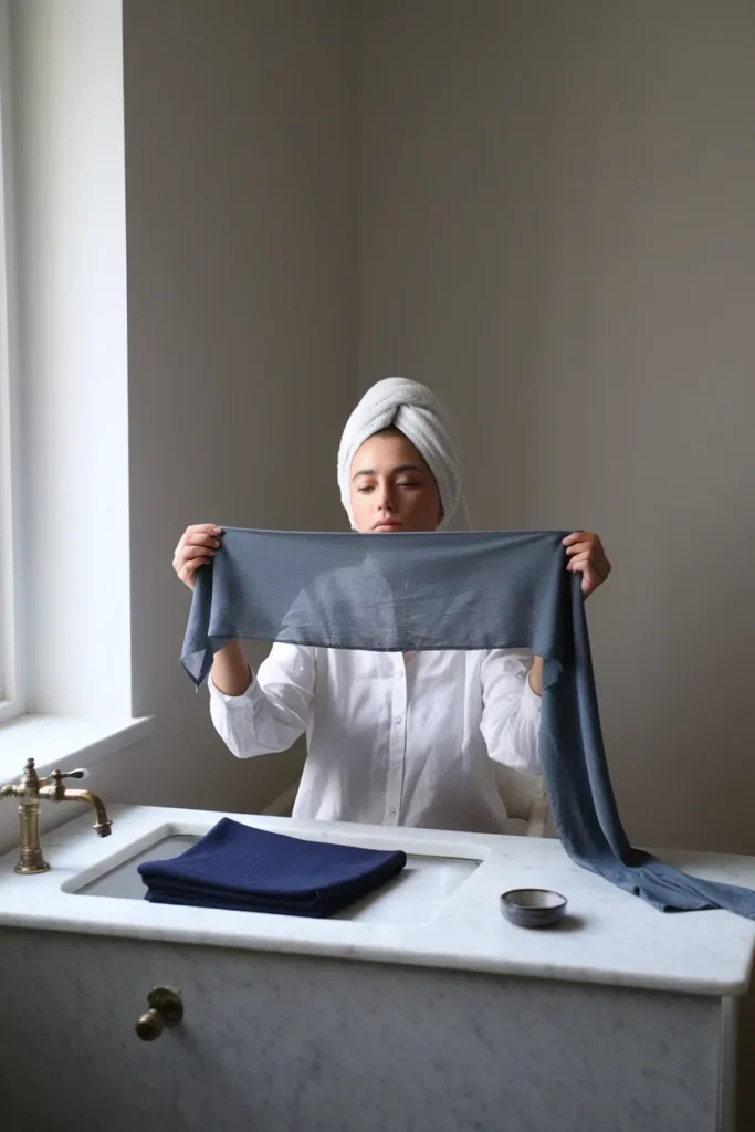
Free Quiz, AI App, or a $300 Session: What’s Actually Worth It
Four options exist, and the honest answer is that the cheapest one is good enough for most closets.
Free online quizzes ($0). Fine as a starting hypothesis, unreliable as a verdict. They ask you to self-report hair and eye color, which is the same self-assessment you’re trying to check. Use one to get a candidate season, then confirm it with the drape ladder.
AI photo apps (roughly $20 to $60). Better than a quiz because they read actual pixels, and still limited by the same thing that limits you: your photo’s lighting. A selfie taken under a warm bulb will hand you a warm season with total confidence. If you use one, feed it a bare-faced photo in indirect daylight, and run it twice with two different photos to see whether it agrees with itself.
Virtual consultations with a real analyst (roughly $150 to $400). A trained eye watching you over video, usually with homework beforehand. Quality depends heavily on your camera and your window.
In-person professional analysis (roughly $200 to $800, commonly $300 to $500). The full drape set, controlled lighting, a physical swatch book you carry shopping. It’s the most accurate option and the only one that removes the lighting problem entirely. Prices move constantly and vary a lot by city, so confirm current rates before booking.
TikTok and Instagram filters: entertainment. They alter the very thing you’re measuring.
My honest take for a capsule builder: run the drape ladder twice for free. If you still can’t separate two adjacent seasons after two proper sessions, that’s the moment a paid analysis earns its money, because the sub-season boundary is genuinely hard to call on yourself. Spending $300 to confirm what a white towel and a north window already told you is a waste.
If you do land on a season and want to shop it well, the best capsule wardrobe brands from affordable to investment is a more useful next click than another quiz, because knowing your colors only pays once you know which retailers carry them in fabrics worth owning.
Grade Your Closet Before You Buy One New Thing
Here’s the part the rest of the internet skips. Learning your season triggers an urge to replace everything, and that urge is expensive and unnecessary. Grade first.
Pull every top, sweater, and jacket you own. Everything that lands near your face. Bottoms and shoes barely matter for this, which we’ll get to. Then sort into three piles using your window light.
| Grade | What it means | What to do |
|---|---|---|
| Keep | The color sits in your palette and the piece fits. Your face looks rested in it. | Hang it front and center. This pile is your real capsule. |
| Rescue | Right temperature, wrong depth or clarity. Or a color you love that fights your face. | Move it away from your face. Layer a palette-correct scarf, cardigan, or collar over it. Bottoms and outer layers get a full pass. |
| Release | Wrong temperature, worn rarely, no rescue path. | Sell, donate, or hand it to a friend whose season it clearly is. |
My own grade came out 14 keeps, 9 rescues, and 6 releases out of 29 pieces. The surprise was how big the middle pile was, because almost nothing needed to leave the house, it just needed to move six inches lower on my body.
Three rescue moves that do most of the work:
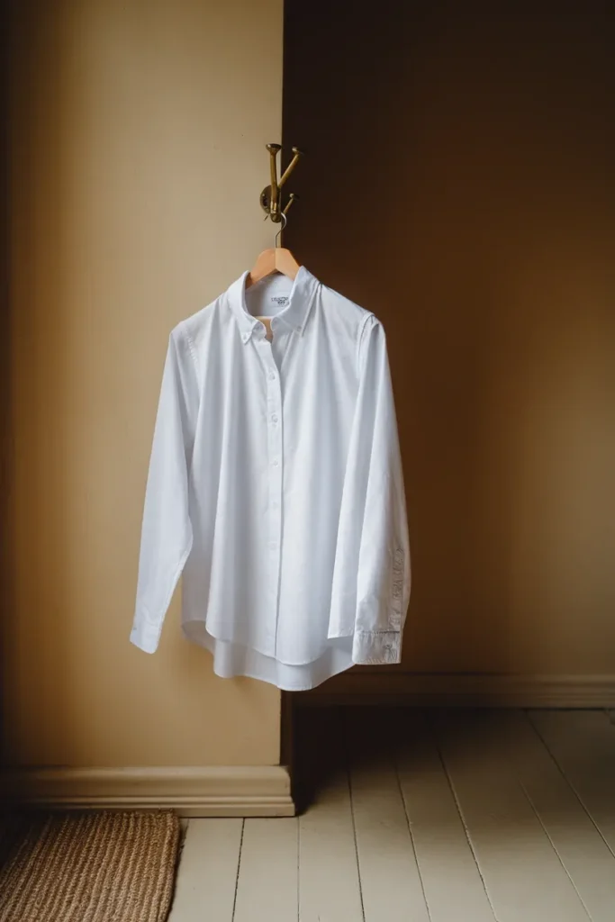
- Collar trick. A palette-correct button-down under a wrong-color crewneck puts your color back at your throat.
- Scarf trick. A silk square in your best neutral covers the entire offending neckline.
- Demotion. A wrong-color top becomes an under-layer, a weekend shirt, or a jacket you never button. It stays useful, it just stops being the first thing people see.
Only after the grade is done should you look at gaps. Nine times out of ten the gap is one or two pieces near the face, not a wardrobe. If your keep pile is thin at the top, the eight capsule wardrobe tops that anchor every outfit is the list to shop against, because tops are where your palette does almost all of its work.
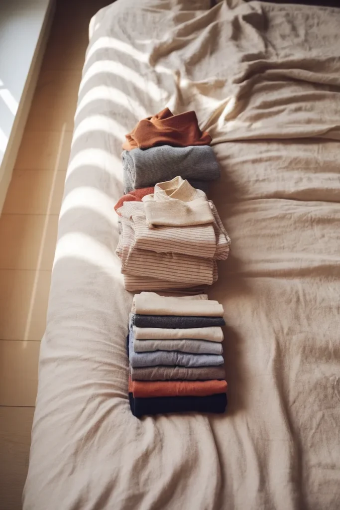
Turn Your Season Into a Capsule Wardrobe
A palette is a list of colors. A capsule is a list of decisions. Here’s how one becomes the other.
The rule that makes it simple: color matters most within about eighteen inches of your face, and barely at all below your waist. Use that to assign your palette by garment position rather than by preference.
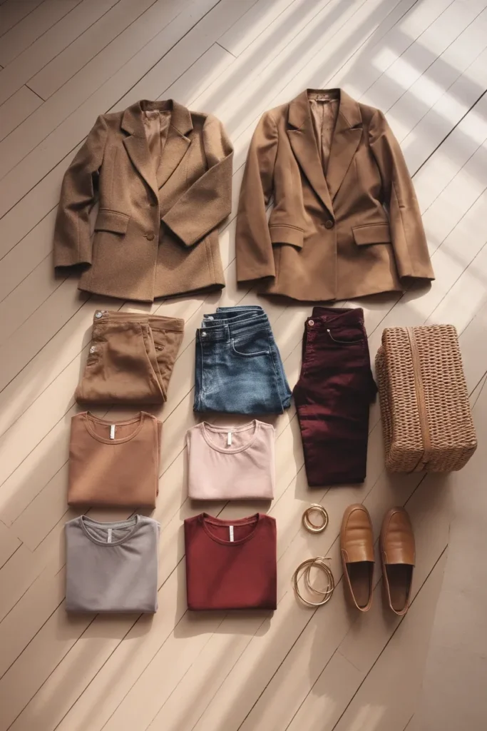
Anchor layer (coat, trousers, jeans, blazer, skirt). Your season’s two best neutrals, and nothing else. These pieces cost the most, get worn the most, and need to work with every top you own. This is where a Summer picks soft navy over black, and where an Autumn picks espresso over charcoal.
Face layer (tops, knits, button-downs, scarves, collars). Your season-true colors live here and only here. This layer is small, it’s cheap to replace, and it’s responsible for roughly all of the “you look great today” you’ll ever collect. Six to eight pieces is plenty.
Accent layer (bag, shoes, jewelry, one statement piece). One accent color from your palette, used repeatedly. Metals follow your undertone: gold for warm, silver for cool, either for neutral. Repetition is what makes a small closet look intentional.
Free zone (below the waist, plus outer shells). Denim, olive, khaki, and gray get a pass regardless of season. Don’t overthink pants.
A twelve-piece starter, assigned:
- Neutral coat, best neutral
- Blazer, second-best neutral
- Trousers, best neutral
- Jeans, free zone
- Midi skirt, second-best neutral
- through 10. Five tops in season-true colors, at least two of them in your single strongest shade
- Knit in your best neutral
- Scarf or bag in your one accent
That’s roughly 30 outfits from twelve pieces, because the anchors agree with each other by design. If you want the printable version to work against while you shop, the free capsule wardrobe checklist printable pairs well with this and saves you rebuilding the list from scratch.
One last thing on price tiers. Face-layer pieces are where spending pays, because a $138 sweater in your exact shade outperforms three $29 sweaters in shades that nearly work. Anchor pieces are worth investing in for fabric and cut. Free-zone pieces are where mass-market prices make complete sense.
Frequently Asked Questions
What is color analysis, in simple terms?
It’s a method for working out which colors make your face look rested and which ones make it look tired, based on the undertone, depth, and clarity of your natural coloring. The result is a palette of colors that work with you rather than against you. Most people use it to stop buying clothes they never wear.
How do I find my color season at home for free?
Stand at a north-facing window in the middle of the day with no makeup, hair covered by a white towel, and every artificial light switched off. Then run the drape ladder in this article: temperature first, then depth, then clarity, comparing only two colors at a time. Do it twice on separate days. Matching answers mean you’ve got it.
Are online color analysis quizzes and AI apps accurate?
They’re a reasonable starting point and a poor final answer. Quizzes rely on your own self-assessment, which is the thing you’re trying to verify. AI apps read your photo honestly but inherit whatever lighting that photo was taken in. Use either to generate a hypothesis, then confirm it with fabric in daylight.
How much does a professional color analysis cost?
As of August 2026, in-person sessions in the US commonly run about $300 to $500, with the wider range sitting between $200 and $800 depending on your city and the analyst’s experience. Virtual consultations typically land around $150 to $400, and AI apps sit near $20 to $60. Rates change often, so check before you book.
Can my color season change?
Your underlying season stays put, because undertone doesn’t shift. Your best version of it can move. Going gray, coloring your hair, or losing summer contrast all change your overall depth, which often shifts you to a neighboring sub-season. Retest after any significant hair change rather than assuming the old palette still applies.
Does color analysis work for every skin tone?
Yes, though the older four-season books handled deep and olive skin poorly and that legacy still shows up in bad charts. Every undertone occurs at every skin depth. Deep skin can be cool, fair skin can be warm, and olive skin sits in its own neutral-leaning category that plenty of quizzes mishandle. Trust your own drape results over any chart of someone else’s face.
Do I have to replace my whole closet once I know my season?
Not even slightly. Grade what you own into keep, rescue, and release first. Most of what looks wrong can simply be moved away from your face with a scarf, a collar, or a layer, and most people find their genuine gaps come to one or two tops. Replacing a wardrobe over a palette is the most expensive mistake in this whole practice.
The Real Point of All This
Color analysis isn’t about rules. It’s about giving yourself a shortcut so you stop relitigating the same decision every morning and every time you’re standing in a fitting room holding two nearly identical sweaters.
Find your temperature. Confirm your depth. Grade what you already own. Buy your next three pieces in colors you’ve actually tested against your own face in real daylight. That’s the whole practice, and it costs nothing but a white towel and twenty minutes near a window.
Start with the grade this weekend. Pull your tops, stand at the brightest window in your home, and make three piles. You’ll learn more about your palette in one hour of honest sorting than in a month of quizzes, and you’ll almost certainly find your closet was closer to right than you thought.
Keep reading
13 Ways to Wear Sage Green for Plus-Size Women
Sage green is the color women buy on impulse and then leave on the hanger. It looks calm and expensive in the...

Sage Green Outfits for Women Over 50: 10 Ways to Wear It Well
Sage green is the one color women keep asking me about and then leave hanging in the closet. It looks calm and...

10 Sage Green Outfit Ideas for Fall (and Exactly What to Pair Them With)
Sage green outfits look easy on a pin and confusing in a closet. The color sits right between a neutral and a...