
Winter Color Analysis: The Colors That Actually Work on You
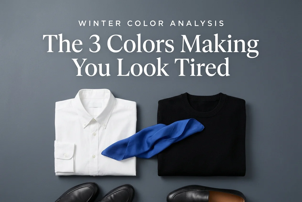
Winter color analysis usually gets explained in swatches. You have seen them: cobalt, magenta, icy blue, true black, arranged in a tidy grid that looks gorgeous saved to a board and tells you almost nothing about what to buy on a Tuesday morning. Here is the part most guides skip. Being a Winter has less to do with the loud colors and more to do with two quiet decisions, which white you own and which black you own. Get those two wrong and every outfit in your closet reads slightly off, no matter how many cobalt sweaters you stack on top.
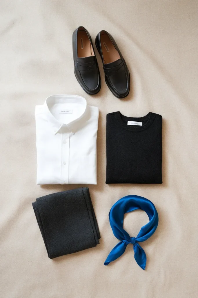
Winter is one of the four color seasons, and it is the coolest and highest contrast of the group. That sounds abstract until you stand in a fitting room holding two white shirts and cannot articulate why one makes you look rested and the other makes you look like you slept badly. This guide is about closing that gap.
We are going to move fast through diagnosis, because you probably already suspect you are a Winter, and then spend the real time on execution. Which four neutrals do the heavy lifting. Which accents deserve hanger space. What a 14 piece Winter capsule costs at four different price tiers. And how the 2026 color conversation, including a Pantone Color of the Year that is genuinely tricky for Winters, actually maps onto your closet.
What Actually Makes Someone a Winter
Three measurements decide every color season, and Winter sits at a specific corner of all three.
Undertone: cool. Your skin leans blue, pink, or neutral-cool rather than golden or peachy. Silver sits quietly against your wrist while gold seems to hover a half inch above it.
Value: usually deep, sometimes extreme. Winters often carry dark hair against light or deep skin, which creates natural separation between features.
Chroma: clear. This is the one people miss. Winter colors are saturated and unmuted. A dusty rose and a true fuchsia are the same hue family, and only one of them belongs to you.
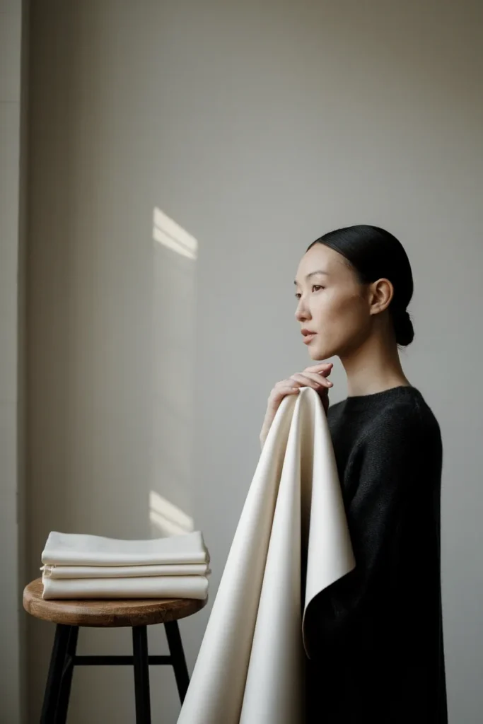
The shorthand people use is “you look good in black,” which is roughly true and not very useful, since plenty of Deep Autumns wear black perfectly well. The sharper test is contrast. Hold a stark white sheet of printer paper next to a cream envelope, directly under a north-facing window, no overhead bulbs. If the paper looks clean and the cream looks slightly yellow and heavy against your face, you are almost certainly reading Winter. If the cream softens you and the paper feels harsh, you are reading somewhere else, and it is worth understanding how color analysis works across all twelve seasons before you buy anything on the strength of a single test.
One honest caveat. Lighting ruins more self-diagnoses than any other factor. Warm bulbs push everyone toward Autumn, and phone cameras auto-correct color aggressively. Daylight, bare face, hair pulled back, no exceptions.
The Three Winter Subtypes, Sorted in Under a Minute
Winter splits into three. You do not need a certificate to place yourself, you need one distinguishing question per type.
Deep Winter (also called Dark Winter)
Depth leads. Your darkest feature is very dark, and the palette follows it down: pine, aubergine, espresso-adjacent charcoal, burgundy, deep teal. Icy pastels feel thin on you. Distinguishing question: does black feel like your easiest color rather than your boldest one? If yes, Deep.
Cool Winter (also called True Winter)
Coolness leads. No warmth anywhere in the palette, which means true blue reds, cobalt, emerald, fuchsia, and a stark white that is genuinely blue-white. Distinguishing question: does a tomato red look faintly orange on you while a cherry red looks correct? If yes, Cool.
Bright Winter (also called Clear Winter)
Clarity leads. Saturation matters more than temperature, and your eyes usually read bright and glassy. Hot pink, electric turquoise, true red, and stark white against jet black. Distinguishing question: do muted colors seem to erase you entirely, even cool muted ones? If yes, Bright.
Most people land cleanly. If you are stuck between two, you are probably sitting on a boundary, which is normal and largely harmless, because the neutral base is nearly identical across all three. The accents are where the subtypes diverge, and accents are the cheaper part of a closet to get wrong. When you want a proper method rather than a gut call, you can run a color analysis test at home with no kit in about twenty minutes.
Your Winter Neutral Base: The Four That Carry Everything
This is the section worth screenshotting. Four neutrals, and they do about eighty percent of the work in a Winter closet.
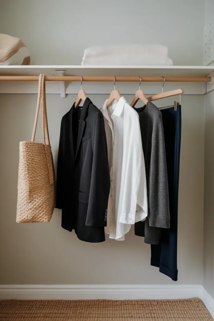
True black. Not faded, not washed, not that soft gray-black cotton takes on after ten cycles. Real black. Winter is the one season that can wear it directly against the face, which is a genuine advantage since black is the most widely stocked and cheapest color in American retail.
Stark white. Optic, bright, blue-leaning. This is the single highest impact purchase you can make, and it is also the piece most Winters already own the wrong version of.
Charcoal or true gray. Gray with no beige in it. A cool mid gray is the most underrated Winter neutral because it softens an all-black outfit without warming it.
Navy. Deep, saturated, slightly cool. Navy is the polite alternative to black for anyone who finds head-to-toe black too severe for daytime.
Notice what is missing. No camel, no taupe, no oatmeal, no ivory. Those are the backbone of most minimalist closets sold online right now, which is exactly why so many Winters build a beautifully cohesive neutral wardrobe and then wonder why they look washed out in all of it. Your neutral base is not warm. Build the base before you add color, and build it cool.
The Winter Accents Worth Real Hanger Space
Accents are where Winters have the most fun and waste the most money, usually by buying six versions of the same color story.
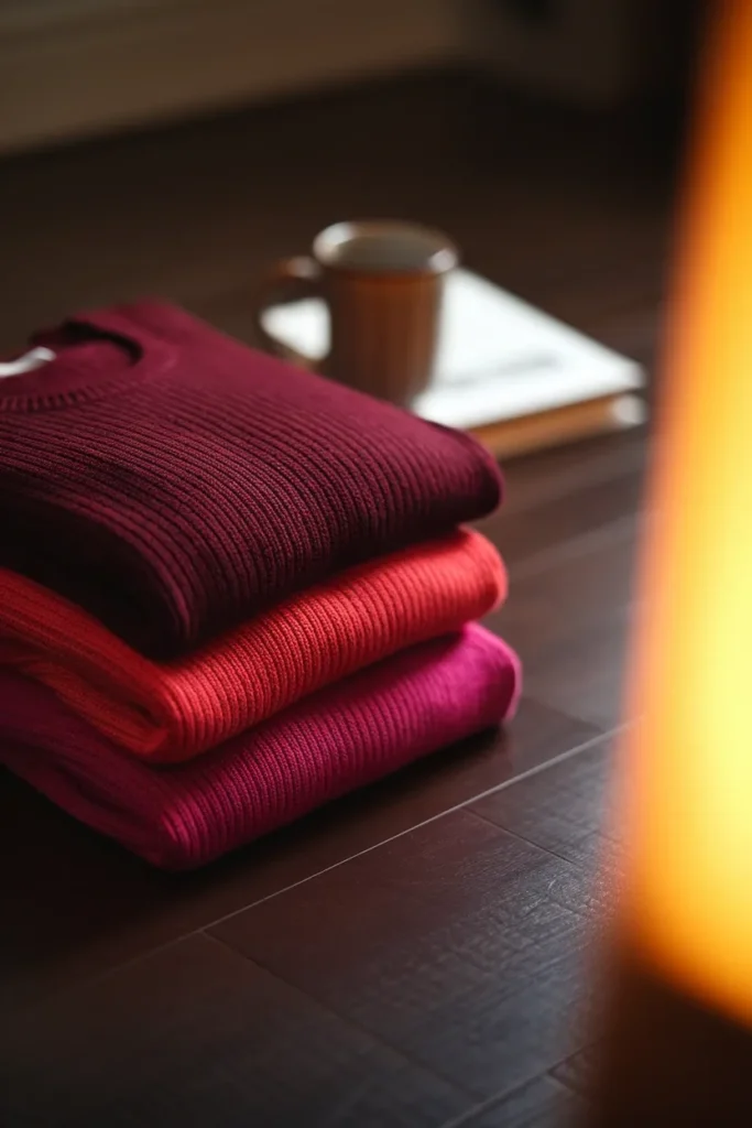
Pick two or three and commit. The full Winter accent range runs wide: cobalt, sapphire, emerald, true red, cherry, fuchsia, magenta, violet, hot pink, icy pink, icy blue, icy lavender, lemon, and pine.
Here is a filter that helps. Your accents should pass the three outfit rule: if a color cannot pair with at least three separate pieces already in your neutral base, it is a costume, not a capsule piece. Cobalt passes easily since it works over black, under charcoal, and beside stark white. A neon lime probably does not.
Two accents deserve specific mention because they behave differently than people expect.
Emerald is the most forgiving Winter accent for anyone nervous about color. It reads almost as a neutral in knitwear and photographs beautifully in low winter light.
Icy pastels confuse people. Winter’s pastels are not soft, they are pale versions of saturated colors, closer to a frosted glass than a nursery. Icy blue is a Winter color. Powder blue is a Summer color. They look nearly identical folded on a shelf and completely different against your face.

The Three Traps That Make a Winter Look Tired
If you have ever stood in front of a full closet thinking you look exhausted in everything you own, one of these three is usually responsible.
Trap one: the wrong white. Cream, ivory, eggshell, and bone all carry yellow. Against a cool complexion they transfer that yellow upward, and the effect lands squarely on the under-eye area. Swapping one cream shirt for a stark white one is the cheapest visible upgrade available to a Winter, and it costs about thirty dollars at the mass tier.
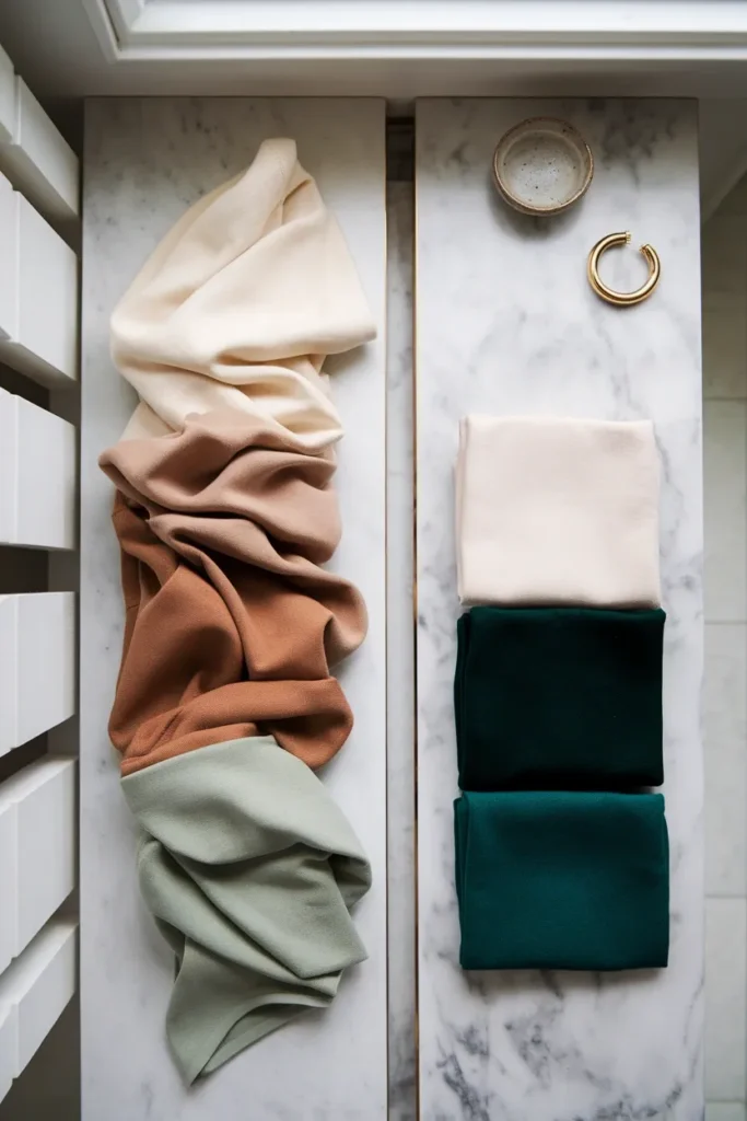
Trap two: the wrong brown. Camel, tan, and warm caramel are the hardest colors in fashion for a Winter, and they are everywhere, because they anchor the quiet luxury look that dominates minimalist style content. If you love brown, go espresso or a near-black cocoa, and keep it below the waist or in a bag rather than next to your face.
Trap three: the dusty mid-tone. Sage, dusty rose, mushroom, muted olive, and greige. These are muted, and muted is the one quality Winter genuinely cannot process. The color does not read as ugly, it just quietly flattens you. This is the trap that hides longest, because nothing looks obviously wrong in the mirror, it simply never looks quite right either.
A quick reality check on all three. If you are consistently drawn to warm neutrals and they consistently look fine, it is worth confirming your season honestly rather than forcing a Winter palette. Comparing yourself against the full color analysis chart with all twelve seasons side by side takes five minutes and saves a lot of returns.
The 6-4-2 Winter Closet Split
Most palette guides tell you which colors. Almost none tell you how much. Here is the proportion rule I would build a Winter closet on, expressed per twelve pieces so it scales to any closet size.
| Tier | Count per 12 pieces | What it does | Winter examples |
|---|---|---|---|
| 6 Base | 6 | Pairs with everything, repeats without being noticed | True black, stark white, charcoal, navy |
| 4 Accent | 4 | Carries the outfit, one per look | Cobalt, emerald, true red, fuchsia |
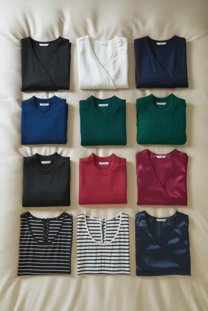
| 2 Statement | 2 | High contrast or print, worn deliberately | Black and white stripe, jewel-tone coat, icy blue silk |
Why six, four, and two. Six base pieces generate enough combinations that you never repeat visibly within a work week. Four accents give you one strong color per outfit without competing. Two statements keep the closet from feeling like a uniform.
The failure mode almost every Winter hits is inverting this: eight accents, three statements, and one lonely correct white. That closet is full of beautiful clothes that refuse to talk to each other, which is precisely the four hundred dollars and nothing goes together problem.
Run the split against what you own right now. Count your true blacks, your stark whites, your charcoals, your navies. If the base number is under six, buy nothing colorful until it is.
The 14 Piece Winter Capsule, Priced at Four Tiers
Here is the palette translated into an actual shopping list. Prices are ranges rather than fixed numbers because American retail moves constantly, and anything I pin down today will drift by the time you read it. Check current pricing before you commit.
| Piece | Color | Mass ($10 to $50) | Mid ($50 to $150) | Contemporary ($150 to $400) |
|---|---|---|---|---|
| Stark white button-down | Optic white | Uniqlo, Old Navy | Everlane, Quince | Frank & Eileen |
| Stark white tee | Optic white | Target A New Day | Madewell | COS |
| True black crewneck knit | True black | Uniqlo | Quince, J.Crew | COS, Vince on sale |
| Charcoal fine-gauge knit | Cool charcoal | H&M | Banana Republic | COS |
| Navy knit | Deep navy | Amazon Essentials | J.Crew | Massimo Dutti |
| Black tailored trouser | True black | Old Navy | Banana Republic | COS, AYR |
| Charcoal wide-leg trouser | Cool gray | H&M | Everlane | COS |
| Dark rinse jean | Blue-black | Old Navy, Gap | Madewell, Abercrombie | AYR, Reformation |
| Black blazer | True black | H&M | J.Crew, Banana Republic | Sezane, COS |
| Wool coat | Black or navy | Uniqlo | Quince | Sezane, Toteme |
| Cobalt or emerald knit | Accent | Uniqlo | Quince, J.Crew | Sezane |
| True red or fuchsia top | Accent | H&M | J.Crew | Reformation |
| Black leather loafer | True black | Target | Madewell | Sezane |
| Black or silver crossbody | True black | Target | Quince, Madewell | Sezane, Toteme |
Dupe routing, both directions. If a piece here runs past three hundred dollars, the mid tier equivalent is usually within reach of the same look, and a wool coat from Quince at roughly one twenty to one eighty will read very close to a contemporary version at three to five times that from six feet away. Going the other way, a sub fifty dollar black knit will almost always be a lighter gauge with more synthetic content, which means it pills sooner and holds its color for fewer washes. That is a fair trade for a trend accent and a poor one for a base piece you will wear ninety times a year.
Outerwear is the exception worth spending on, since a Winter coat sits against your face in every photograph taken between November and March, and cheap black outerwear fades to gray-brown faster than any other category. Our roundup of the wool coats that earn their hanger space covers the specifics.
A note on proportions and fit. Cool colors and high contrast work on every body, and none of this changes with size. What does change is where you place the contrast. If you are petite, keeping the sharpest black to white break at your natural waist rather than mid-thigh keeps the eye moving upward. If you are tall, you can carry a full column of one color and let the accent live at the shoulder. Curvy and hourglass proportions tend to work well with a defined waist and a single accent at the top half. None of these are rules about hiding anything, they are about where the contrast lands.
Metals, Prints, and Fabric Weight
Three finishing details separate a Winter who has read a palette guide from one who has actually applied it.
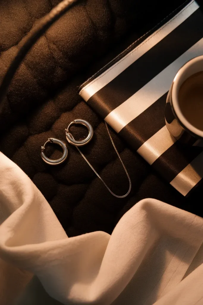
Metals: silver, white gold, platinum, and gunmetal. Cool metals sit flat against cool skin. Yellow gold does not fail dramatically, it just adds a warm cast you spent the whole article removing. If you love gold, wear it away from your face, at the wrist or waist, or choose a white gold with a cooler finish. Mixed metal pieces work well for Winters sitting near a boundary.
Prints: high contrast, clean edges. Black and white stripes, houndstooth, sharp geometrics, crisp florals on a dark ground. What does not work is a low contrast, blurry-edged print in muted tones, since it introduces exactly the muddiness Winter cannot absorb. Scale matters less than contrast.
Fabric: structure and a smooth surface. Winter colors sit best on fabrics that reflect a little light. Fine merino, silk, cotton poplin, crisp wool, satin, and smooth leather all hold saturation. Loose slubby linen, heathered marled knits, and washed-out brushed cotton all diffuse it, which is why the same emerald can look rich in silk and dull in a heathered sweatshirt. If a fabric looks slightly hazy on the hanger, it will look hazy on you.
Accessories carry more weight in a Winter closet than most, because a mostly neutral base needs a point of interest, and the small accessories that change every outfit are the cheapest way to add one.
Grading the 2026 Colors Against a Winter Palette
Most palette guides are written once and left alone, which means they never tell you what to do with the colors actually in stores this year. So here is the current color conversation, graded honestly.
Pantone’s 2026 Color of the Year is a white, and Winters should be careful with it. Pantone named PANTONE 11-4201 Cloud Dancer its Color of the Year, describing it in its own release as “a billowy white imbued with a feeling of serenity” and “an airy white hue,” explicitly framing it as soft rather than stark. That softness is the whole point of the color, and it is also the problem. A billowy white is a step toward ivory, and ivory is trap one. Expect a flood of soft whites in stores through 2026. Hold your stark white standard anyway, or wear the soft version below the waist.
Pinterest’s 2026 palette is unusually kind to Winters. Pinterest published its 2026 palette as Cool Blue, Jade, Plum Noir, Wasabi, and Persimmon. Graded for a Winter closet:
- Cool Blue: excellent. Sits close to cobalt and works for all three subtypes.
- Plum Noir: excellent for Deep Winter, very good for Cool Winter. Deep, cool, saturated.
- Jade: good, especially in its cooler and clearer interpretations. Bright Winter should push toward emerald.
- Wasabi: skip. Yellow-green and muted, which is the opposite of everything above.
- Persimmon: skip, or wear far from the face. It is a warm orange red.
Three of five is a strong year for a Winter, and it means the accent pieces you want will be widely stocked and often discounted rather than special ordered. That is a practical advantage worth using while it lasts.
Occasion dressing is where the palette pays off most obviously, since Winter owns the two colors that read as formal in American culture, black and stark white. If your closet skews neutral and you need it to work after dark, what to wear on New Year’s Eve when your closet is mostly neutrals walks through it.
Frequently Asked Questions
Can Winters wear brown, camel, cream, or beige? With conditions, and the conditions differ. Espresso and near-black cocoa work, particularly below the waist or as a bag or boot, while camel, tan, and warm caramel are the difficult end and will cast warm against a cool complexion. Cream and beige are the same problem in a lighter key: cream carries yellow, and a cool complexion transfers that yellow straight to the under-eye area. The workaround for all of them is placement. Keep the warm neutral below the waist, or wear it as outerwear over a stark white shirt so the white is what sits at your collar.
What is the difference between Deep Winter and Cool Winter? Deep Winter leads with darkness and can borrow a little warmth at the edges, so pine, aubergine, and burgundy sit comfortably. Cool Winter leads with temperature and stays strictly cool, so cherry red, cobalt, emerald, and true fuchsia dominate. The quick tell is red: if tomato red looks faintly orange on you and cherry red looks correct, you are Cool.
Should Winters wear silver or gold? Silver, white gold, platinum, and gunmetal are the natural fit. Yellow gold does not look wrong so much as slightly warm, which dilutes the cool clarity the rest of the palette is building. Wear gold at the wrist or waist rather than at the ear or neck if you love it.
Is a professional color analysis session worth the money? It depends on how much you shop. A session commonly runs from a couple hundred dollars up into the high hundreds in most American cities, and it mainly buys you certainty and a portable swatch fan. If you regularly return clothes because the color felt off, that certainty pays for itself quickly. If you shop rarely and carefully, a good at-home drape test in daylight gets you most of the way there for nothing.
Does my palette change if I am petite, curvy, or between sizes? The palette does not change at all, because color relates to your coloring and not your proportions. What changes is placement. Where you put the high contrast break, how much of one color you run in a vertical column, and whether an accent lives at the shoulder or the hem are all proportion decisions layered on top of a fixed palette.
Do Winter colors work year-round or only in cold months? Year-round. The season name describes your coloring, not the calendar. Summer simply shifts the fabric rather than the color, so cobalt cotton and stark white poplin in July do the same job that cobalt merino and stark white oxford do in January. Winter palettes actually read especially fresh in hot weather, since stark white and saturated blues feel cooler than warm neutrals do.
How long should a good black knit last? A merino or high-quality cotton knit worn weekly should hold its color and shape for three to five years with cold washing and flat drying. Cheaper blends with heavy synthetic content usually start graying at the shoulders and pilling under the arms inside a single season, which is why the black base pieces are the ones worth trading up.
Start With the White
If you take one thing from all of this, take the white shirt.
Winter color analysis can spiral into subtype debates and swatch fans and a lot of second-guessing, and none of that is where the actual improvement lives. The improvement lives in four cool neutrals, two or three accents you genuinely wear, and the discipline to stop buying the warm ivory knit that keeps calling to you from the sale rack.
Run the 6-4-2 split against your closet this weekend. Count what you own. Buy the one stark white piece you are missing, wear it next to your face, and see whether you look more rested in photographs. That single swap tells you more than any quiz will.
Then come back and build the rest slowly, one correct color at a time.
Keep reading
13 Ways to Wear Sage Green for Plus-Size Women
Sage green is the color women buy on impulse and then leave on the hanger. It looks calm and expensive in the...

Sage Green Outfits for Women Over 50: 10 Ways to Wear It Well
Sage green is the one color women keep asking me about and then leave hanging in the closet. It looks calm and...

10 Sage Green Outfit Ideas for Fall (and Exactly What to Pair Them With)
Sage green outfits look easy on a pin and confusing in a closet. The color sits right between a neutral and a...