
Summer Color Analysis: How to Find Your Shade of Cool and Actually Wear It
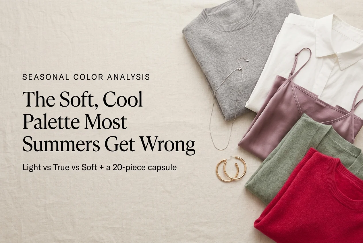
If you keep buying gorgeous clothes that look flat the second you put them on, Summer Color Analysis might be the piece you’re missing. The Summer palette is cool, soft, and medium in depth, and it belongs to more American women than any other season. It is also the one most often misdiagnosed, because Summer sits quietly between two loud neighbors. Here’s how to tell if it’s yours, how to pin down your exact sub-season, and how to turn a swatch card into a closet that finally agrees with itself.
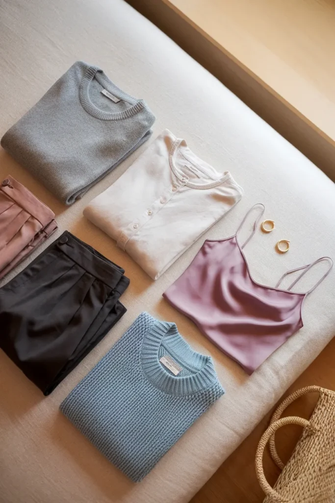
Let’s define what “flatter” actually means here, because the word gets thrown around without content. A color that suits you does two measurable things. It reduces the harsh line where fabric meets your jaw, so the eye lands on your face instead of the edge of your shirt. And it stops bouncing warm or overly saturated light up onto skin, which is what deepens under-eye shadow and pulls out redness around the nose and chin. That’s the whole mechanism. Nothing mystical.
What the Summer Color Season Actually Means, and What It Doesn’t
Summer describes your coloring, not your birthday and not the weather. In seasonal analysis, a Summer has cool undertones, softly muted color rather than clear bright color, and a light to medium depth overall.
Picture a coastline in the morning before the haze burns off. Everything is present, nothing is shouting. That is the Summer palette in one image.
What Summer is not: it isn’t a preference. Loving lavender does not make you a Summer, and looking wonderful in tomato red probably means you aren’t one. It also isn’t about being pale. Plenty of Summers have deep olive or rich brown skin with cool undertones, and the palette works exactly the same way on them.
If the whole framework is new to you, it’s worth understanding how color analysis actually works for beginners before you go sub-season hunting. Getting the parent season right saves you from a very common trap, which is landing on a hyper-specific label like Soft Summer while your actual undertone is warm.
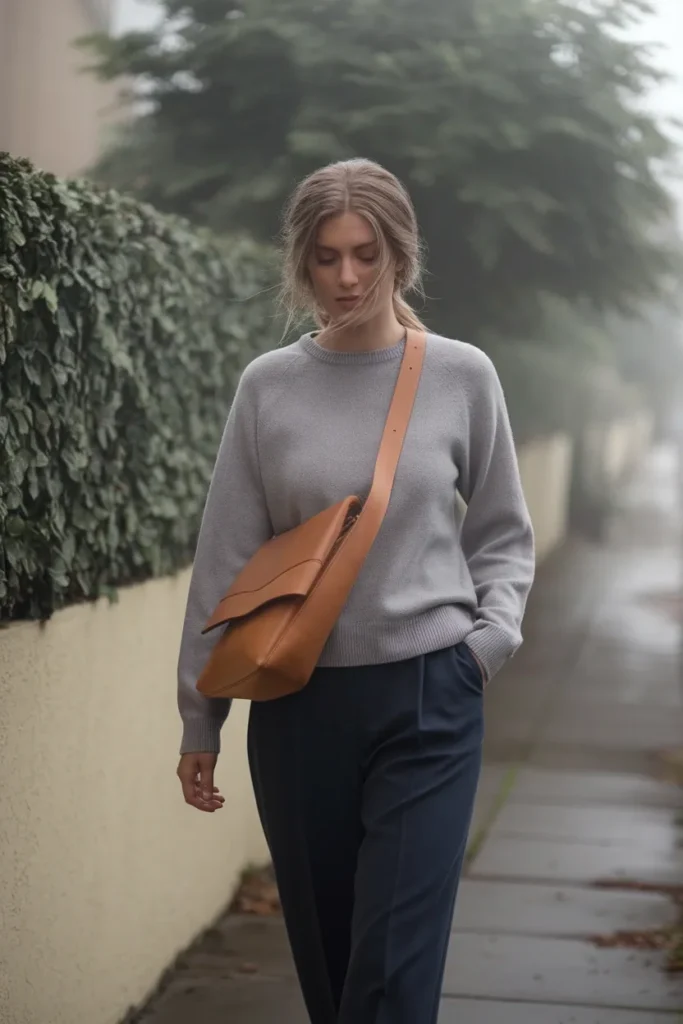
Every color, in every system, gets sorted by three properties. Color scientists have been measured on scales of hue, value, and chroma since Albert Munsell formalized the model in 1913, and seasonal analysis borrows those exact three dials.
Here is what each one means when you’re standing in front of a mirror.
Hue is temperature. Cool leans blue and pink, warm leans yellow and gold. Summer is cool.
Value is how light or deep a color is. Summer sits light to medium, and it rarely goes very deep.
Chroma is intensity, meaning how pure and saturated a color is versus how gray it is. Summer is muted. Add a whisper of gray to any bright color and you’re heading toward Summer.
Read those three together and you get the whole season. Cool, medium, and softened. Miss one dial and you land in the wrong place. A cool, medium, and bright person is a Winter, not a Summer, and that single dial explains most of the mislabeling that happens with online quizzes.
Once you know the three dials, you can run a color analysis test at home without a drape kit using fabric you already own. It takes about twenty minutes and it beats any quiz that asks you to pick your favorite dessert.
Five Signals You’re a Summer, and Three That Fool People
Front-loading the strongest signal, because it does more diagnostic work than the other four combined.
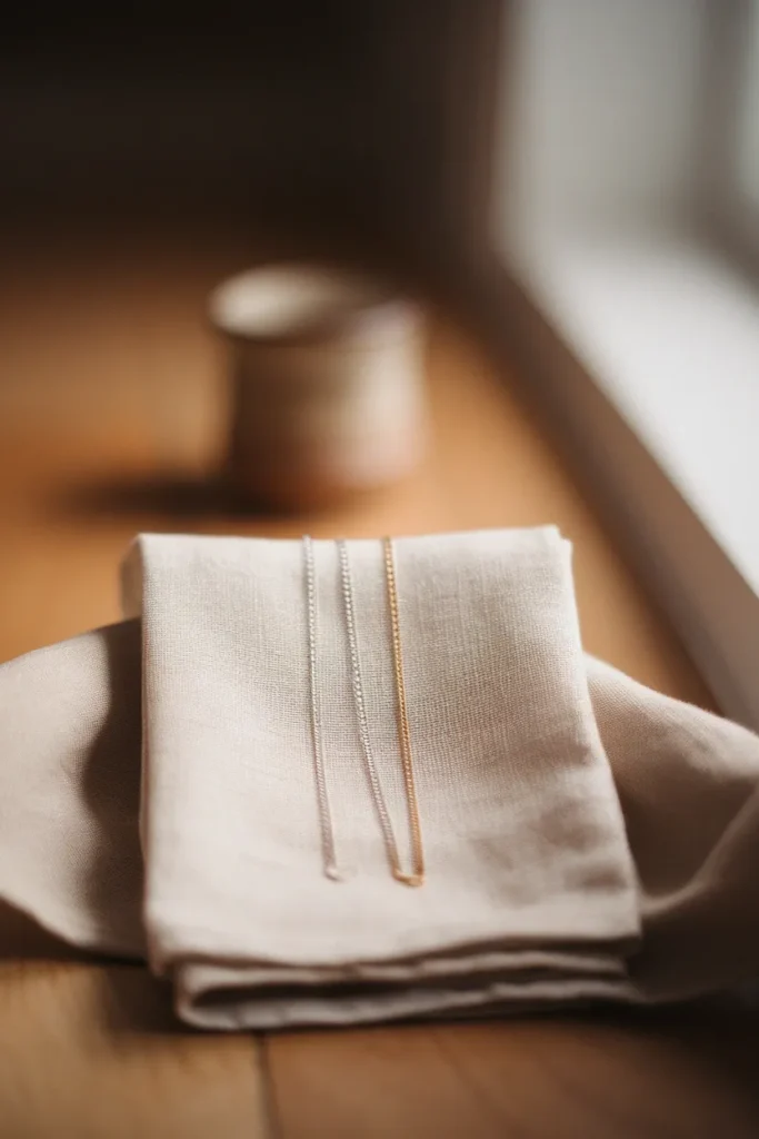
1. Silver reads cleaner on you than gold. Hold a silver chain against one side of your neck and a gold one against the other, in daylight. If silver looks intentional and gold looks slightly muddy or orange where it meets your skin, that’s a cool undertone talking.
2. Stark white makes you look tired, soft white doesn’t. Optic white is a value bully. It sits so much lighter than your skin that it drags shadow into your face. Swap to a soft oyster white and watch your under-eye area quiet down.
3. Your overall contrast is low to medium. Take a photo of yourself, convert it to grayscale, and squint. If your hair, skin, and eyes read as neighbors on the gray scale rather than opposites, you’re low contrast. Summers usually are.
4. Bright, saturated color wears you. Put on cobalt or fuchsia and step back six feet. If you notice the sweater before you notice your face, the chroma is too high.
5. Your eyes have a soft, blended edge. Summer eyes often show a slightly hazy border between the iris and the white, and frequently a gray, sage, or muted blue tone. Clear, sharply defined irises point toward Winter or Spring.
Now the three signals that fool people.
Blonde hair. Ash blonde is a Summer signal. Golden blonde is not. The hair color you were born with matters more than the one you’re currently maintaining.
A deep tan. A tan changes the depth of your skin, not its undertone. If your palette suddenly stops working in August, your value shifted temporarily and your season did not.
“I look good in navy.” Almost everyone looks good in navy. It’s the most forgiving color in the closet and it proves nothing about your season.
Light, True, or Soft: Finding Your Summer Sub-Season
All three sub-seasons are cool. What separates them is which of the other two dials leans hardest.
Light Summer
Light Summer borrows from Spring, so it stays cool but lifts brighter and lighter. Think of a garden at dawn. Your palette runs powder blue, soft periwinkle, pale rose, mint, light lemon-tinged yellow, and a clean soft white. Depth is your enemy. A heavy charcoal coat will swallow a Light Summer whole, and a light gray one will look expensive on her.
True Summer
True Summer, also called Cool Summer, is the purest version. Coolness is the dominant dial and the palette stays medium in depth and gently muted. Your colors are dusty rose, raspberry, soft fuchsia, cadet blue, medium slate, sage, and a real navy. If you’ve read that True Summer and Cool Summer are two different things, they aren’t. Two naming systems, one palette.
Soft Summer
Soft Summer borrows from Autumn, so muting is the dominant dial and the coolness relaxes slightly. Everything looks like it has a thin gray veil over it. Your palette is mauve, dusty teal, sage, cocoa with a gray base, mushroom, and soft burgundy. Soft Summer is the most common misdiagnosis in the whole system, mostly because the muting reads as “boring” in swatch form and then looks quietly expensive on an actual person.
Pinterest is worth watching here. Search volume for “soft summer” runs noticeably ahead of the other two sub-seasons, which suggests a lot of women recognize the muted description first and work backward from there.
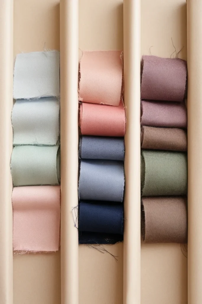
Your Summer Neutral Base, the 60 Percent
Most palette advice fails because it leads with accent colors. Build the base first and the accents take care of themselves.
Your neutrals should make up roughly sixty percent of your closet, and for a Summer they are:
- Soft white or oyster instead of optic white
- Dove gray and medium slate, the single most useful Summer neutral there is
- Cool taupe or greige, meaning a taupe with a gray base rather than a yellow one
- Navy, which functions as a Summer’s black
- Charcoal, for True and Soft Summers who want depth without hardness
- Cocoa with a gray base, a Soft Summer specialty that most brands label as “mushroom”
What’s missing from that list is camel. Camel is the default neutral in half of American retail, and it is warm all the way through. If camel has never quite worked on you despite everyone insisting it’s a classic, this is why.
Gray is the color to lean on hardest. It’s the one neutral where the mass-market tier gets it right consistently, which means a Summer can build a base at Uniqlo and Old Navy prices and spend the real money on the pieces that touch her face.
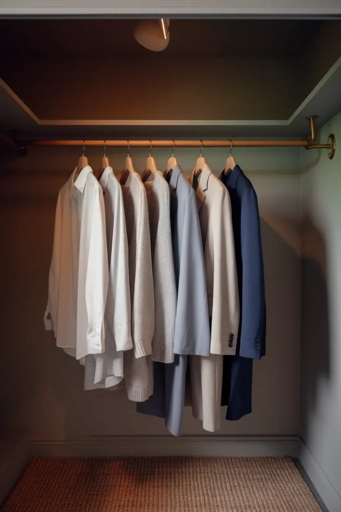
Can Summers Wear Black? The Honest Answer
Yes, with one rule.
Black is not in the Summer palette, and pretending otherwise helps nobody. Black is maximum depth and maximum coolness at once, and a Summer’s coloring is medium and soft. Put the two together directly under the chin and black wins. Your face goes gray, your under-eye shadow deepens, and the outfit starts wearing you.
The rule is distance. Black works below the waist and it works as an accessory. Black trousers, black loafers, a black belt, a black crossbody, all fine. Black turtlenecks and black crewnecks, not fine.
If you love black near your face and refuse to give it up, there’s a middle path. Wear it with a soft white or dove gray layer breaking the line at your collarbone, so black never touches your jaw directly. A scarf does the same job. You get the outfit you want and your face keeps its color.
For a genuine black substitute, navy is the answer nine times out of ten, and charcoal is the answer for the other one.
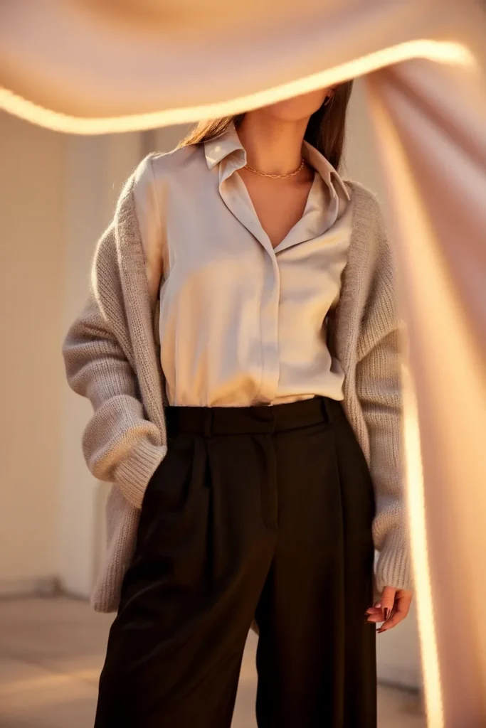
Alt text: Black trousers styled with a soft white shirt so light color sits near the face
The Summer Swap Table
Here’s the part the theory guides skip. You already own a closet, and most of it is probably the wrong temperature. You do not need to replace it. You need a translation key.
Screenshot this one.
| What you probably own | Why it fights a Summer palette | Swap to | Typical US range |
|---|---|---|---|
| Black crewneck or tee | Depth overwhelms medium coloring at the jawline | Charcoal, soft navy, slate | $15 to $60 |
| Optic white shirt | Value jump is too steep, pulls out facial redness | Soft white, oyster, dove | $30 to $120 |
| Camel coat or sweater | Yellow undertone runs directly against cool skin | Cool taupe, greige, gray | $80 to $300 |
| Olive utility jacket | Yellow-green reads sallow against pink skin | Sage, soft sea green | $60 to $180 |
| Mustard knit | Highest warmth and chroma in the closet | Butter yellow, worn below the waist | $30 to $120 |
| Fuchsia or hot pink top | Chroma sits far above a soft palette | Dusty rose, mauve, raspberry | $25 to $150 |
| Tomato red dress | Warm and saturated at the same time | Raspberry, soft burgundy | $60 to $250 |
| Bright cobalt sweater | Clear brightness fights the muting | Periwinkle, cadet blue | $30 to $140 |
Now the decision rule, which matters more than the table.
Anything on the left that sits above your waist gets demoted, rehomed, or rescued with a scarf. Anything that sits below your waist can stay indefinitely. Your color season governs the twelve inches around your face and almost nothing else. Most women give away far more than they need to, then rebuild from zero and wonder why the project cost four hundred dollars.
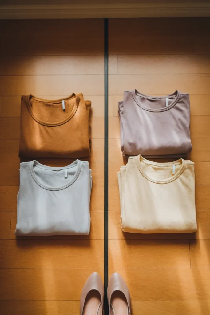
Your Accent Colors, the 30 and the 10
With sixty percent neutrals holding the base, the remaining forty splits into two jobs.
The 30 percent is your soft color. These are the pieces that read as color from across a room but never demand attention. For a Summer that means dusty rose, sage, periwinkle, mauve, dusty teal, and soft denim blue. Sweaters, blouses, and dresses live here.
The 10 percent is your one clear voice. Every closet needs a color that makes a person look twice. For Summer the strongest candidates are raspberry, soft burgundy, and a genuine cool fuchsia. Use it on one piece per outfit, ideally near your face, because the muting in the rest of your palette gives it room to land.
The ratio is what keeps things cohesive. Reverse it and you get a closet where every piece competes and nothing pairs, which is the actual mechanism behind having a full closet and nothing to wear. There’s a fuller method for adding color to a capsule wardrobe without losing cohesion if you want to run the ratio across a whole rebuild rather than one season’s worth of buying.
The Season Twins People Mix Up Most
Three comparisons account for nearly all Summer misdiagnosis. Here’s the tell for each.
| Confusion | The tell | If it’s you |
|---|---|---|
| Soft Summer vs Soft Autumn | Hold sage against cocoa-brown. Sage lifts a Summer, cocoa-brown lifts an Autumn. Both look muted, only one looks cool. | Check whether silver still beats gold. Soft Summer keeps silver. Soft Autumn switches. |
| Light Summer vs Light Spring | Both are light and delicate. Put peach next to pale rose. Peach glows on a Spring and yellows a Summer. | If ivory suits you better than soft white, you’re Spring. |
| True Summer vs True Winter | Both are cool. The dial that separates them is chroma. | Wear pure fuchsia. A Winter it flatters, a Summer it flattens. |
If you want all twelve laid out at once rather than three at a time, the color analysis chart with all 12 seasons side by side shows exactly where Summer’s borders sit against its neighbors.
Test Your Colors in the Right Light
This is where most at-home attempts go wrong, and it’s not a skill problem.
Your bathroom bulbs are lying to you. Light sources differ dramatically in how faithfully they render color, and researchers at NIST have spent years quantifying how much a light source shifts the color you actually see. A warm-toned LED can make a cool mauve read as beige and can make a warm camel look almost neutral. Under that bulb, every conclusion you draw is wrong.
Try what I’d call the three-photo test.
Put on the same top. Photograph yourself in the same pose three times: once beside a north-facing window at midday, once outdoors in open shade, and once under your usual bathroom light. Compare the three side by side on your phone.
The two daylight shots will agree with each other. The bathroom shot will disagree with both, and the size of that gap tells you exactly how much your home lighting has been distorting every getting-dressed decision you’ve made for years.
Trust the daylight pair. Always.
A 20-Piece Summer Palette Capsule That Actually Mixes
Swatches are a diagnosis. A capsule is a treatment. Here’s the whole thing, built on the 60-30-10 split.
Neutrals, 12 pieces (the 60 percent)
- Soft white silk or cotton shirt
- Soft white tee
- Dove gray crewneck sweater
- Slate gray cardigan
- Greige blazer
- Navy blazer or knit jacket
- Charcoal wide-leg trousers
- Cool taupe straight-leg trousers
- Mid-wash blue jeans, cool cast, no orange tint
- Navy midi skirt or midi dress
- Soft white sneakers
- Gray or navy tote
Soft color, 6 pieces (the 30 percent)
- Dusty rose knit
- Sage button-down
- Periwinkle sweater
- Mauve camisole
- Dusty teal midi dress
- Soft denim-blue overshirt
Clear accent, 2 pieces (the 10 percent)
- Raspberry sweater
- Soft burgundy scarf or crossbody
The outfit math works out to well over forty combinations, because every neutral bottom pairs with every top and both accent pieces layer over anything in the first eighteen. The reason it holds together is temperature, not luck. Nothing in the list is warm, so nothing clashes.
Build the tops first if you’re starting from scratch. They sit closest to your face and they carry the most color responsibility, which is the logic behind the eight capsule wardrobe tops that anchor every outfit.
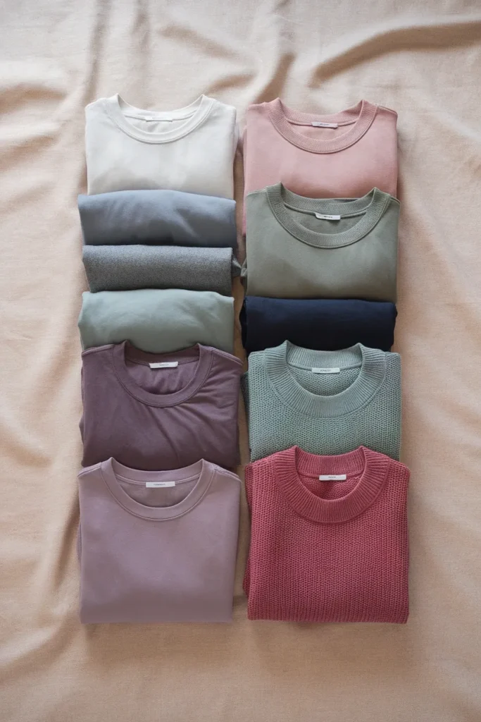
Where to Shop a Summer Palette in the US, by Price Tier
Cool, muted color is not evenly distributed across American retail. Some brands run warm as a house signature and will never serve you well. Here’s where a Summer palette is genuinely easy to find. Prices shift constantly, so treat these as bands rather than quotes.
Mass, roughly $10 to $50. Uniqlo is the strongest pick in this tier for a Summer, especially the gray and navy knits, which typically run about $30 to $50. Old Navy and Gap handle soft white and navy basics well. Target’s A New Day line carries dove gray and mauve most seasons. Skip the camel and rust that dominate their fall floor sets.
Mid, roughly $50 to $150. Quince is the value pick for cool-toned cashmere and silk, generally $50 to $90 for a sweater. Everlane runs cooler than most American brands as a house aesthetic, and its grays and navies are reliable. J.Crew and Banana Republic both carry sage and slate consistently. Madewell jeans typically run about $98 to $138 and their mid-wash denim skews cool, which suits a Summer better than a stiff indigo.
Contemporary, roughly $150 to $400. COS is the single best match in this tier. Muted, cool, gray-forward, and structurally quiet. Sezane carries the dusty rose and soft burgundy end beautifully. Reformation is worth watching for mauve and dusty teal in dress form.
Investment, $400 and up. Toteme’s whole palette is essentially built for cool neutrals, and Massimo Dutti sits just below it as a positioning reference. If you’re eyeing a $500 gray cashmere coat, the honest advice is to try the $180 version from COS first and see whether the color, rather than the fabric, was what you actually wanted.
One caution on the sub-$50 tier. Cheaper cool grays often go slightly purple or slightly green after ten washes, because the dye is doing more work in a cool tone than a warm one. For pieces that sit near your face, the mid tier earns its money.
Worth flagging the naming collision here too. If you’re shopping for hot-weather clothes rather than for your color season, a 24-piece summer capsule wardrobe for hot weather is a different project entirely, and the two words only look alike.
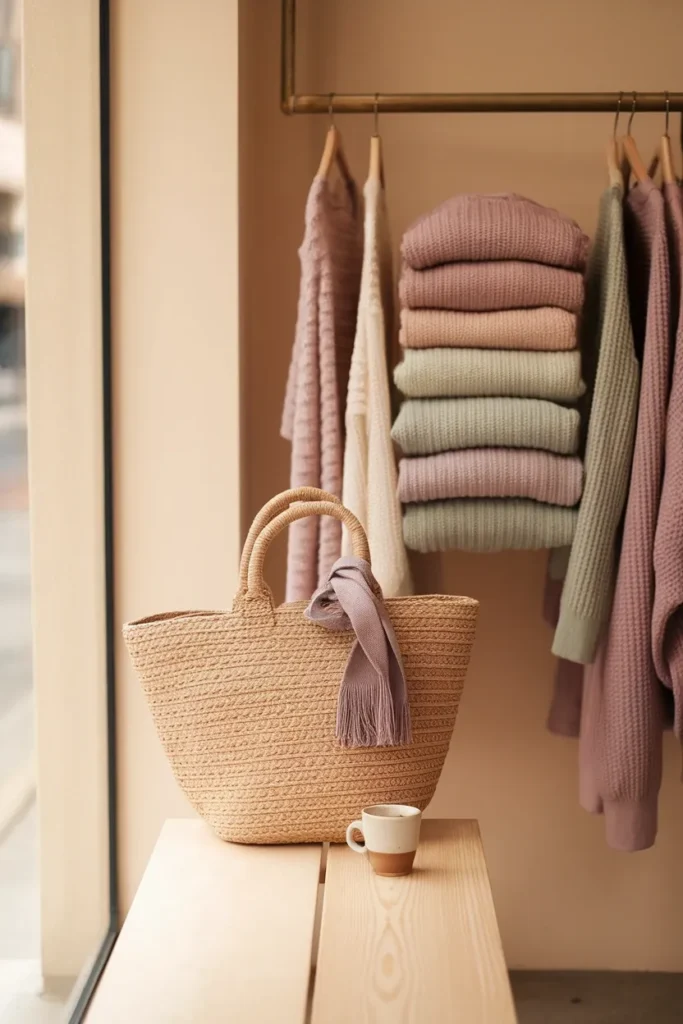
Hair, Makeup, and Metals That Match a Cool Palette
Clothing gets all the attention, and the three things closest to your face often matter more.
Metals. Silver, white gold, and platinum are your defaults. Rose gold works surprisingly well on True and Soft Summers because it carries a pink cast rather than a yellow one. Yellow gold is not forbidden, though it does best in a matte or brushed finish rather than a high polish, where the warmth concentrates.
Hair. Ash tones over golden ones. Ash blonde, cool light brown, and soft mushroom brown all sit naturally in the palette. Warm caramel balayage is the single most common thing that fights a Summer’s coloring, and it’s also the most requested color in American salons, which is not a coincidence. If you’re deciding, take the cooler option one shade at a time.
Makeup. Blush in soft rose or cool plum. Lips in mauve, rosewood, and dusty berry. Skip anything described as coral, brick, or terracotta. For eyes, taupe and soft gray do more than black, which lands too hard against low-contrast features.
Sunglasses. Tortoise frames in a cool brown, gray, or a soft blush acetate. The warm honey tortoise that dominates most sunglass walls is a warm-season frame.
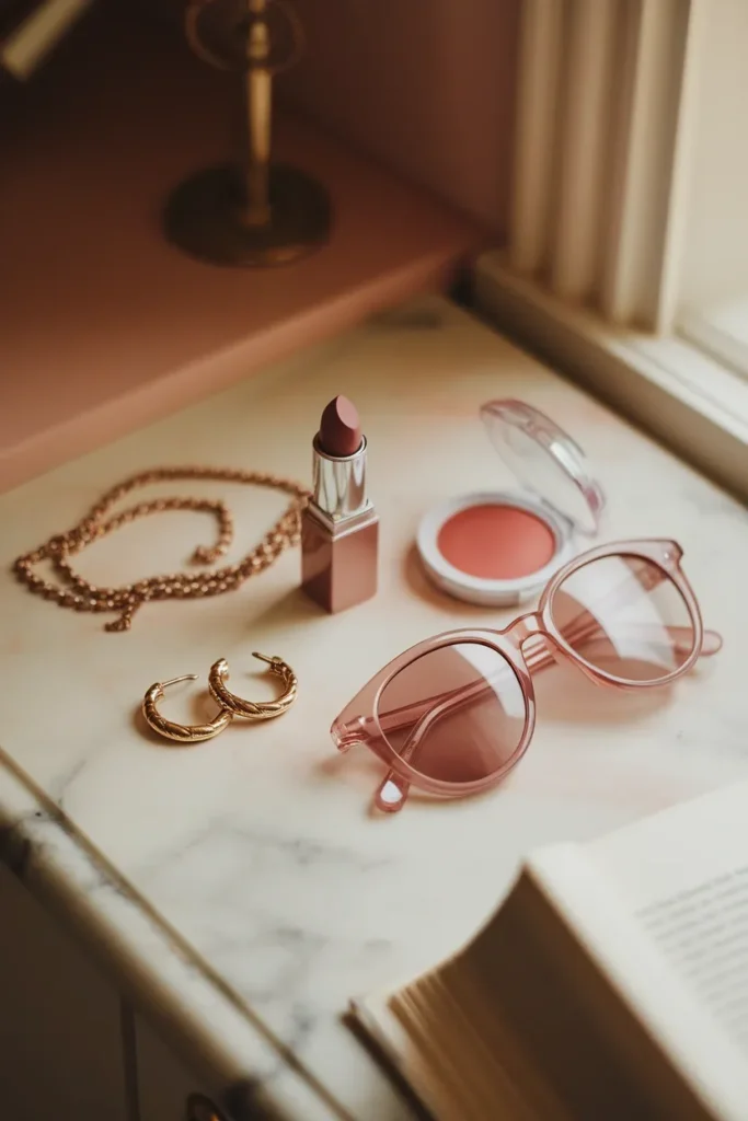
Summer Color Analysis Frequently Asked Questions
Can Summers wear black?
Below the waist and as accessories, yes. Directly against your face, it’s the one color most likely to make you look tired, because its depth overwhelms medium, low-contrast coloring. If you want black near your face, break the line with a soft white or dove gray layer at the collarbone. Navy is the better everyday substitute.
Is True Summer the same as Cool Summer?
Yes. Two naming conventions, one palette. Some systems say True Summer, others say Cool Summer, and a few say Summer Summer. They all describe the cool-dominant version that sits at the center of the season.
What’s the difference between Soft Summer and Soft Autumn?
Both are muted, which is why they get confused. The difference is temperature. Soft Summer stays cool and looks best in sage, mauve, and gray-based cocoa. Soft Autumn runs warm and comes alive in olive, camel, and warm brown. The fastest check is the metal test. Soft Summer keeps silver, Soft Autumn switches to gold.
Does your color season change over time?
Your undertone doesn’t change, and undertone is what determines your season. What does change is depth. Hair going gray, a summer tan, or a color-treatment shift can all move your value, which sometimes means moving between sub-seasons within Summer. Going from Light Summer to True Summer as your hair silvers is common. Going from Summer to Autumn is not.
Does a Summer palette work for petite or curvy proportions?
Color and proportion are independent systems, so the palette applies identically. What changes is placement. If you’re petite, keeping your top and bottom within a close value range, say dove gray with slate, creates one unbroken vertical line, which suits a shorter frame well. If you’re curvy, the soft accent colors give you a way to draw the eye where you want it without adding visual bulk, since muted color reads flatter than saturated color.
Do I need to pay for a professional color analysis?
Not to get started. A careful at-home test in daylight will place you in the right parent season the large majority of the time. Paying for a session, which typically runs $150 to $400 in most US cities, makes sense in two situations: you’ve tested repeatedly and keep landing between two sub-seasons, or you’re about to spend serious money rebuilding a wardrobe and want certainty first.
Does a Summer palette work in winter, or only warm months?
It works year-round, and that’s one of Summer’s real advantages. The season name refers to your coloring, not the calendar. Cool grays, navy, charcoal, and soft burgundy are natural cold-weather colors, and the light end of the palette carries you through spring and summer. You never have to swap systems in October.
Start With One Shelf
You don’t need to know your sub-season to start using any of this. Get the parent season right, build the neutral base, and keep the wrong-temperature pieces below your waist where they can’t do any harm.
If you want a first move that takes ten minutes: pull every top you own that sits above your waist, take them to a window in daylight, and sort them into two piles by temperature. That’s it. The pile that looks cool and softened is your working palette, and the size of the other pile will tell you exactly how much of your budget has been going to colors that were never going to work.
Try it this weekend and see what’s actually in there. You might already own more of your palette than you think.
Keep reading
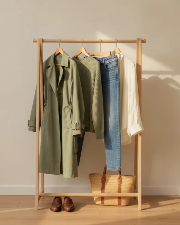
13 Ways to Wear Sage Green for Plus-Size Women
Sage green is the color women buy on impulse and then leave on the hanger. It looks calm and expensive in the...

Sage Green Outfits for Women Over 50: 10 Ways to Wear It Well
Sage green is the one color women keep asking me about and then leave hanging in the closet. It looks calm and...

10 Sage Green Outfit Ideas for Fall (and Exactly What to Pair Them With)
Sage green outfits look easy on a pin and confusing in a closet. The color sits right between a neutral and a...