12 Outfit Color Combinations for Plus-Size Women That Always Look Expensive
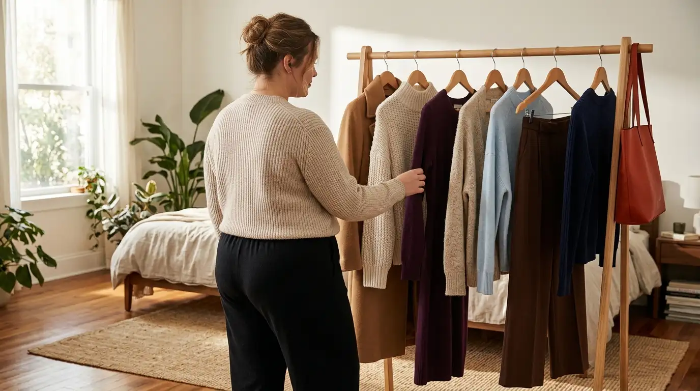
Most plus-size closets are stuck in one color. Black leggings, black tunic, black cardigan, maybe a navy one for variety. It works, sort of, until you catch your reflection in a store window and think you look tired. The fix usually isn’t a new budget. It’s choosing outfit color combinations for plus-size women on purpose, and knowing exactly where each color goes.
Two colors that sit well together read as a plan. A plan reads as money, even when the sweater came off the mass-tier rack.
Below are 12 pairings that work in a real capsule wardrobe. Each one tells you which color goes on the bottom, which goes on top, what the accent is, and which pieces to reach for. A few borrow shades from this year’s Pinterest color forecast, so they feel current without becoming a trend you regret by spring. Most of them start with clothes you already own.

Begin with the placement map right below. It’s the rule every combination on this list follows, and it’s worth a screenshot.
The 60-30-10 Placement Map
Every combination below uses one split. About 60 percent of the outfit is your base color, usually the bottom half or a long layer. About 30 percent is the support color, often your top or blazer. The last 10 percent is the accent.
Where the lighter or brighter shade sits matters more than which shade you pick. Put it near your face, and the whole outfit draws the eye upward.
SAVE THIS
The 60-30-10 Placement Map
| Role | Share | Where it usually goes |
|---|---|---|
| 🟫 Base color | About 60% | Trousers, skirt, dress, or a long coat |
| 🤍 Support color | About 30% | Top, knit, blazer, or shirt-jacket |
| ✨ Accent | About 10% | Bag, scarf, shoes, belt, or earrings |
| 👀 Lightest or brightest shade | Any share | Near your face, where you want eyes to land |
The shares are a guide for your eye, not a measurement. Close is good enough.
1. Camel, Cream, and Chocolate: The Quiet Luxury Trio
Three warm neutrals, one long line of color.
- Base: chocolate brown wide-leg trousers with a high rise, hemmed to skim the top of your shoe.
- Support: a cream crewneck knit, half-tucked so the waistband shows.
- Layer: a camel coat worn open, which draws two clean vertical lines down the front.
Keep every piece matte or brushed. Wool, suede, and ribbed knit in these shades look richer than shiny polyester in the same colors, and that finish is most of what makes an outfit look expensive.
The coat does the heavy lifting here. If yours pulls across the back when it hangs open, our guide to capsule wardrobe jackets that earn their hanger space walks through the cuts that stay clean.

2. Navy and Ivory for a Crisp Old Money Look
Black and white can look harsh, especially in daylight. Navy and ivory keep the same sharp contrast but soften both edges.
Put ivory on top, close to your face. A button-down or a fluid blouse both work. Let navy take the 60 percent below: straight-leg trousers, a midi skirt, or dark wash jeans on a casual day. Gold hoops and a tan belt make the small warm accent.
📸 Quick Tip: The Grayscale Phone Test
Snap a mirror photo and switch it to black and white. If your top and bottom blur into one gray block, add more contrast. If the jump looks stark, add a mid-tone layer like a camel or gray cardigan. It works for every pairing on this list.
It’s the outfit that looks like you spent the weekend on a sailboat. Nobody needs to know it was the grocery store.
3. Plum Noir and Oat: The 2026 Swap for Your Black Dress
Pinterest named Plum Noir one of five shades in the 2026 Pinterest Palette report. It’s a deep purple with a brown, almost burgundy cast, and it sits right where black usually goes. That makes it the easiest trend color here to actually wear.
Black knit dress, black tights, black boots. Safe and easy, but it can look flat in photos and a little tired by midweek.
Plum knit dress, oat long coat, espresso boots. Same shape, same comfort, with more depth and a look that seems chosen on purpose.
Build it as a column: a plum knit midi dress, or plum wide-leg trousers with a matching knit. Add an oat long cardigan or coat as the lighter layer, then espresso boots so the dark tone carries down to the floor.
One warning. Skip bright purple jewelry or a lilac bag here. Let the oat do the lightening.

4. Jade and Soft Black for Polished Workdays
Jade is a muted, gray-leaning green. It’s softer than emerald and calmer than kelly, so it plays well in an office.
Wear it on top. A fine-gauge jade knit over soft black wide-leg trousers keeps the color near your face. Washed black looks less severe than inky jet black next to a muted green. For evenings, flip it: a jade satin midi skirt under a black knit.
Recreate this look
One new color, zero new rules to learn. That’s the payoff.

5. Icy Blue and Chocolate Brown, the Pairing All Over Your Feed
Icy blue next to chocolate brown looks like it shouldn’t work. It does, because one color is cool and pale while the other is warm and deep, so neither fights for attention. Pinterest’s 2026 forecast calls this pale shade Cool Blue.
Put the blue on top, in a crewneck sweater or a crisp shirt. Let chocolate take the bottom half or the long coat.
Pale, icy blue knit with chocolate wide-leg trousers.
Chocolate suede loafers to carry the bottom color down.
Bright royal blue, which loses the soft contrast.
Black shoes, which break the warm line at your feet.
Repeat the brown once near your top half, with a belt or a bag strap, and the two colors tie together.

6. Burgundy and Charcoal Gray for Office Hours
Charcoal is the gray that looks expensive. Pair it with burgundy and you get a work outfit with warmth but no loudness.
Here’s the same pairing two ways:
| Piece | Weekday | Weekend |
|---|---|---|
| Layer | Burgundy blazer | Charcoal cardigan, worn open |
| Top | Gray fine knit | Burgundy crewneck sweater |
| Bottom | Charcoal wide-leg trousers | Charcoal straight-leg jeans |
| Shoes | Black loafers | White sneakers |
Burgundy belongs to the red family. If it wins you over, our guide to red outfits for plus-size women has 25 more ways to wear it.
Watch the gray, though. Light heather next to burgundy can look washed out, so stay in the dark charcoal range.
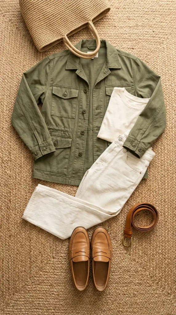
7. Olive, Cream, and Tan Leather for Weekend Errands
Most olive outfits go wrong the same way: olive cargo pants, olive tee, olive jacket, all in one flat cotton. It ends up looking like a uniform.
Break it up. Keep olive to one piece, a utility jacket, and surround it with cream: a cream tee and ecru straight-leg jeans. Then bring in tan leather twice, at your feet and at your waist.
Loafers carry this better than sneakers. If you’re choosing your first tan pair, our rundown of seven capsule wardrobe shoes that cover everything will help you pick.
Easy, warm, done.
8. All Oat, Head to Toe, With Three Textures
Wear one color head to toe and the eye reads a single long line, with no hard break at the waist. The catch is that one flat fabric in one shade can look like loungewear.
Texture fixes that. Build it in three moves:
Start with an oat ribbed knit and oat wide-leg trousers in a close shade.
Add a brushed wool or suede coat one shade darker.
Finish with a camel leather bag so the eye has somewhere to stop.
Ribbed knit, brushed wool, and smooth leather give the eye three surfaces to read, so one color looks rich instead of flat.
Keep the two main pieces within a shade of each other. The accent can go deeper.

9. Black and Chocolate Brown, the Pairing People Say You Can’t Wear
Old style advice says black and brown fight. In practice, they only clash when the brown is a light, orangey tan.
Pick a deep chocolate instead, and change the texture between the two. A black turtleneck over a chocolate suede midi skirt. A chocolate knit with black leather trousers. Gold earrings warm up either version.
Deep chocolate is dark enough to sit beside black like a close relative, and the texture change tells everyone the pairing was on purpose.
You get the depth of an all-black outfit with more warmth, built from two basics most closets already hold.
10. Navy With One Persimmon Accent
Navy and orange sit across from each other on the color wheel. That’s why they look so sharp together, and Seattle Central College’s color wheel basics show how complementary pairs like this one work.
Persimmon, a bright red-orange, is loud. So use a 90 and 10 version of the split: navy everywhere, persimmon in exactly one place.
- ▸A structured tote or crossbody bag
- ▸A silky scarf knotted at the neck
- ▸A cardigan tied over your shoulders
- ▸A lip color, if you’d rather skip accessories
Mass-tier stores like Target and Old Navy typically carry a bright bag or scarf each season, which makes a low-risk way to test the color. The usual trade-off is stiffer faux leather that creases sooner.
Pick one spot only. Two persimmon pieces start to compete.

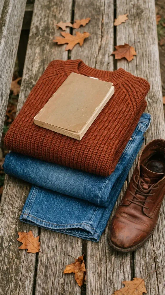
11. Rust and Mid-Wash Denim for Fall 2026
Rust is the friendliest warm color for a denim day.
Throw a rust ribbed knit or a rust corduroy shirt-jacket over a cream tee. Add mid-wash straight-leg jeans and brown ankle boots.
Let a sliver of that cream tee show at the neckline. It puts the lightest shade near your face, right where the placement map says it belongs.
Rust slots straight into a 25-piece fall capsule wardrobe if you’re building one this season.
Choose mid-wash, not dark indigo. The lighter blue keeps rust from looking heavy.
12. Gray, Oat, and a Small Dose of Wasabi
Wasabi, Pinterest’s electric yellow-green for 2026, is the hardest color on this list to wear well. Used as a tiny accent, it’s also the most fun.
Build a calm base first: medium gray wide-leg trousers and a long oat coat. Then add one wasabi piece, such as a thin scarf, a pair of ballet flats, or a knit tied at the shoulders.
⚠️ Watch Out
Yellow-green can make some skin tones look sallow up close. Hold the piece under your chin in daylight first. If it fights your skin, move the color down to your shoes or over to your bag.
Small finishing pieces do this job best, and our guide to small capsule wardrobe accessories that change outfits has more ideas for where an accent can live.
A little goes a long way. Really.

Outfit Color Combinations for Plus-Size Women Frequently Asked Questions
What colors look most expensive on plus-size women?
Deep, slightly muted neutrals usually look the richest: camel, chocolate brown, navy, charcoal, oat, and ivory. Finish matters as much as shade, so matte wool, suede, and ribbed knit look more expensive than shiny fabric in the same color. Pairing two of these on purpose, with the lighter one near your face, does more than any single color can.
Can plus-size women wear bright colors?
Yes. Bright colors work at any size, and the old “stick to black” advice is outdated. The useful question is placement. Put a bright shade where you want attention, often a top or scarf near your face, and anchor it with a neutral. If head-to-toe bright feels like too much, start in the 10 percent accent slot with a bag, shoes, or a scarf.
Do monochrome outfits work for plus-size women?
They do. One color top to bottom reads as a single long line with no hard break at the waist. To keep it from looking flat, mix at least two textures, like ribbed knit with brushed wool, and keep the main pieces within a shade of each other. Navy, oat, chocolate, and charcoal are easy places to start.
Can you wear black and brown together?
Yes, as long as the brown is deep. Chocolate or espresso sits comfortably next to black, while a light orange-tan can look like a mismatch. Change the texture between the two colors, such as a black knit with a chocolate suede skirt, so the pairing looks deliberate. Gold jewelry warms up the whole combination.
Do these color combinations work for petite plus-size women?
Yes. If you’re 5’4″ or under, match your shoes to your bottoms (chocolate trousers with chocolate loafers, navy with navy) so the leg line stays unbroken. Keep coats at hip or knee length instead of ankle length, and let the support color sit on top near your face. Every pairing on this list adapts with those two tweaks.
Do I need to buy new clothes to try these?
Probably not. Most of these pairings start with neutrals already in your closet. Pull out your base pieces first, then look for the one missing support or accent color. If you do buy, start with a single knit or scarf in the new shade before committing to trousers or a coat.
How do I keep navy and chocolate brown from fading?
Check the care label first, since the fabric decides everything. For most cotton knits and denim, washing inside out in cold water and skipping the dryer slows fading. Wool and suede usually need spot cleaning or a professional cleaner. If a label says dry clean only, follow the label over any tip here.
Your Next Outfit Starts Here
Pick one pairing and build it this week with what’s already hanging in your closet. Camel and cream is the easiest start. Plum and oat is the one most likely to get you asked where you shop.
The idea behind all of these outfit color combinations for plus-size women is the same. Decide where the lighter color goes, keep the split close to 60, 30, and 10, and let one texture change do the rest.
Save this to your style board so the placement map is waiting the next time you open a full closet and feel like there’s nothing to wear.
Keep reading

8 Ways to Wear Black for Plus-Size Women
Plus-size women tend to get black handed to them as a hiding place. Dark leggings, a long black tunic, a black cardigan...

8 Black Outfits for Women Over 50 That Look Fresh, Not Tired
Somewhere around 50, the black sweater that always looked sharp starts making you look tired. Same sweater. Same mirror. Different result. Nothing...

8 Black Outfit Ideas (and What to Pair Them With)
Black is the color most closets have too much of and still can’t make work. You grab the black sweater and the...