
12 Outfit Color Combinations That Always Look Expensive
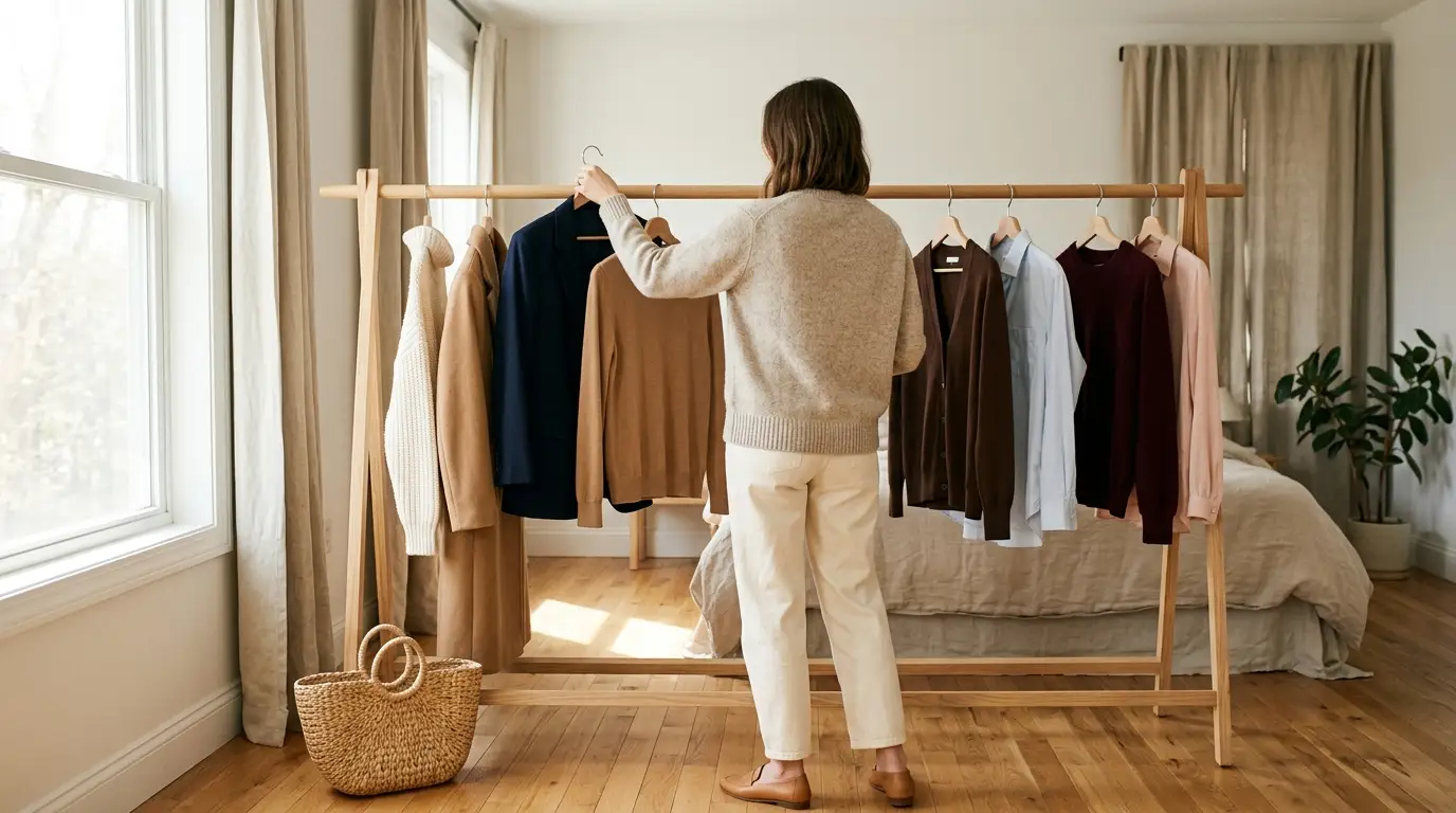
You can own lovely clothes and still feel like your outfits look a little off. Most of the time, the pieces aren’t the problem. The colors sitting next to each other are.
Good outfit color combinations do more work than a price tag. A budget sweater in oatmeal, worn with camel trousers and tan loafers, reads richer than a designer top in a shade that fights everything around it. That makes color the cheapest upgrade in your closet, because you’re mostly rearranging what you already own.
Below are 12 pairings that look expensive in daylight, not just on a filtered pin. Each one comes with a quick formula or a recreate-it checklist, the metal that suits it, and the season it shines in. A few borrow from the shades Pinterest and Pantone flagged for 2026. Most are quiet classics that never left.

Start with the short rule right below. It explains why some pairings look polished and others look accidental, so you can test any combo in your closet, not only these twelve.
The Expensive Color Check: 3 Rules Behind Every Combo Here
Which colors go together has less to do with the colors themselves than with how they behave side by side. Expensive looking outfits nearly always follow three quiet rules.
- One undertone. Warm shades like camel, cream, chocolate, olive, and rust mix easily. Cool shades like navy, charcoal, icy blue, and plum do the same. Crossing over works too, but do it on purpose.
- Two textures. A matte knit next to smooth wool or leather gives the eye something to read. Flat fabrics in matching colors look like a uniform.
- Three colors max. Use the 60-30-10 split: about 60% lead color, 30% second color, 10% accent. Neutrals count.
Then run the squint test. Stand back from a full-length mirror and squint until the details blur. If one piece jumps out like a sticker, the contrast is too sharp for a quiet look. If the outfit melts into one soft shape with a single clear accent, it passes.
✨ The Expensive Color Check
1. Ivory and Camel, the Pairing Quiet Luxury Is Built On
Ivory and camel share the same warm base, so they blend instead of competing. Worn together, they look like one planned outfit, even when the pieces came from three different stores. If you want a single quiet luxury color palette to start with, this is it.
- Top: an ivory crewneck knit or a cream white button-down
- Bottom: cream or camel wide-leg trousers
- Layer: a long camel wool coat or trench coat
- Shoes and bag: tan loafers and a woven tote
- Metal: gold
Choose ivory over bright optical white here. Pure white sits cool against camel and makes the coat look dusty.

2. Navy and Camel for a Workweek That Looks Pulled Together
Black can look harsh under office lights by midafternoon. Navy does the same serious job with a softer edge, and camel warms it right up.
Wear a navy blazer over a camel fine-knit sweater with navy trousers for meetings. On weekends, keep the camel coat and swap in dark denim. Our guide to styling straight-leg jeans for every day shows which shoes keep that hem looking clean.
Recreate this look
Navy is one of the few colors that wears gold and silver equally well, so mix your jewelry freely.

3. Chocolate Brown and Icy Blue, the Fall 2026 Pairing
Fall 2026 trend coverage keeps putting chocolate brown next to pale icy blue, and it lines up with Pinterest naming Cool Blue one of its 2026 colors. Brown carries the weight. Blue keeps it from feeling heavy.
You have two ways in:
- Brown-led: chocolate knit, chocolate trousers, and an icy blue shirt collar peeking out. Blue is your 10%.
- Blue-led: an icy blue sweater with a brown suede skirt or trousers. Blue becomes your 30%.

Start with icy blue in a shirt, scarf, or bag.
Keep the brown deep, close to espresso.
Pale blue right at your face if window light makes you look gray.
Mid-brown with mid-blue, which muddy each other.
Planning the rest of the season around this pair? The 25-piece fall capsule wardrobe list covers the coats, boots, and knits that work with both colors.
4. Charcoal and Soft White, Pantone’s 2026 Pick
Charcoal with bright white can look stark, like a uniform. Swap the bright white for a soft, warm off-white and the whole outfit relaxes.
That shade is having a moment. Pantone chose Cloud Dancer, a soft white, as its 2026 Color of the Year, and it’s the first white the company has ever picked, according to Smithsonian Magazine’s report on Cloud Dancer.
Wear a charcoal wool coat over a soft white knit and charcoal trousers. Finish with black loafers and silver jewelry.
💡 Quick Tip
Hold your white piece next to a sheet of printer paper. If the paper makes it look creamy, it’s a soft white. If the two match, it’s optical white, which reads colder beside charcoal.
Treat charcoal as the gentler black.
5. Black and Chocolate Brown, the Old Rule Worth Breaking
The old rule said never wear black with brown. It looks rich when one color clearly leads and the other shows up in one big, deliberate piece.
Black top, brown belt, black pants, brown boots, black bag. The colors flip back and forth like a checkerboard.
Black knit and black trousers as the base, then one chocolate suede coat and a matching brown bag. Gold jewelry ties them together.
Keep the brown deep and warm. Pale tan next to black can look like a mistake instead of a choice.

6. Burgundy and Blush Pink
Burgundy is fall’s richest red, and blush softens it so it never feels heavy. Fall 2026 trend coverage pairs the two often. It’s an easy match because both shades sit in the same red family.
| Weekday | Weekend |
|---|---|
| Burgundy wide-leg trousers, blush silk blouse | Blush knit, burgundy midi skirt |
| Camel coat on top | Denim jacket on top |
| Burgundy loafers | White sneakers |
| Small gold hoops | Gold hoops and a woven tote |
Keep the blush dusty, not bubblegum. A muted pink with a gray base looks grown-up next to burgundy.

7. Olive, Cream, and Cognac
Think of olive as a neutral with a little personality. It sits well beside almost every warm shade, and it looks expensive when the rest of the outfit stays simple.
Olive leads at about 60%. Cream follows at 30%. Cognac leather takes the last 10%.
In practice, that’s an olive shirt jacket or olive wide-leg trousers, a cream knit, and a cognac belt with matching loafers. Gold jewelry finishes it.
Watch the details on olive pieces, though. Too many pockets and snaps tip it toward work gear.
8. Dove Gray and Plum
Gray on its own can feel flat. Plum gives it depth without the noise of a bright color. Plum Noir, a dark purple with brown undertones, is one of five shades in Pinterest’s 2026 Palette color forecast, so expect it on boards all winter.
Build it in three steps:
Start with a dove gray base: a fine knit tee and gray straight trousers.
Add plum in one big piece, like a cardigan or a long coat.
Finish with silver jewelry and gray or black loafers to keep the cool tones crisp.
Plum reads almost black after dark, so this is a smart swap for a dinner where all black feels too severe.

9. Mid-Wash Denim and Tomato Red
Denim is already a color, and most people treat it like a blank. Give it a red partner and it starts to look styled.
The problem is that a bright red top with jeans can look like a team shirt. The fix is a warm tomato red in a soft knit, with ivory instead of bright white and neutral shoes. The payoff is a classic Saturday outfit that photographs well and works in every season. For more ways to wear the shade, browse our 25 red outfit ideas and pairings.
⚠️ Watch Out
Stick to one red per outfit. A tomato knit with a cherry bag reads as a near miss, not a clash.

10. All Oatmeal, Three Textures
Skip the second color entirely. The idea most color guides leave out is one shade worn in three different fabrics, and it may be the most expensive-looking idea on this list.
Texture does the job color usually does. A ribbed knit, a brushed wool coat, and smooth leather in the same oatmeal tone give the eye three surfaces to read. The outfit looks layered and planned instead of flat.

Shades can drift a little lighter or darker. Exact matching isn’t the goal. Matching undertone is.
11. Black, White, and One Camel Bridge
Head-to-toe black and white is classic, but it can look stark in daylight. A single camel piece fixes that. It sits between the two extremes and makes the outfit look warmer and more styled.
Recreate this look
The camel piece can be small. Our guide to the best accessories for a capsule wardrobe shows which belts and bags pull the most weight.
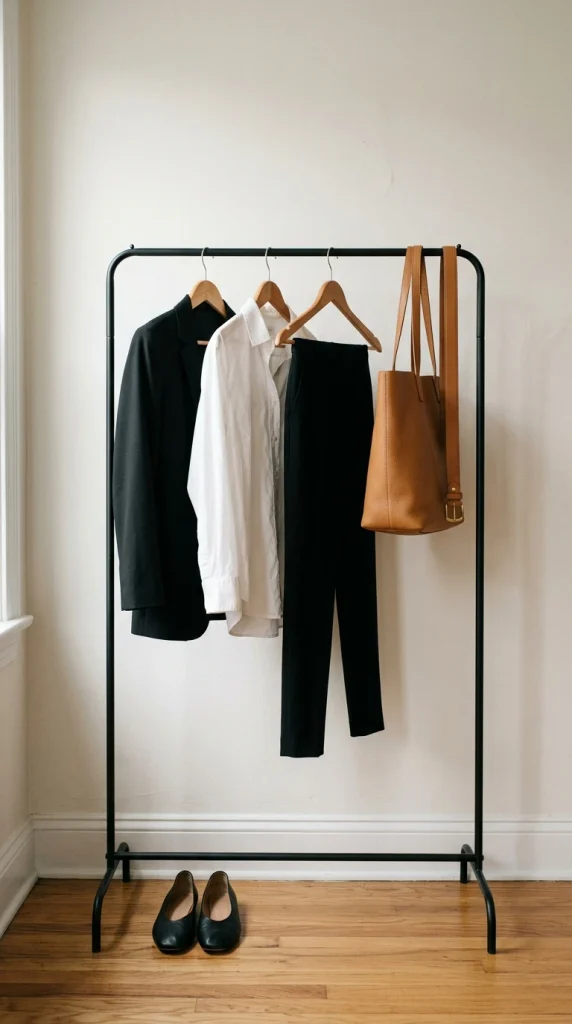
One bridge piece is enough. Two starts to look like a different outfit.
12. Sage Green and Taupe
Sage and taupe are the softest pair here, and that’s their strength. Both colors sit low and muted, so the outfit looks calm and considered.
Pair a sage knit with taupe trousers, layer a cream tee underneath, and finish with taupe suede loafers.
It’s the color version of speaking softly. People lean in.
The 12-Combo Cheat Sheet
Screenshot this table before your next shopping trip. It holds every one of the color combinations for clothes above, with the lead shade, the accent, and the metal to wear.
| # | Lead color | Partner | Metal | Best season |
|---|---|---|---|---|
| 1 | Ivory | Camel | Gold | Year-round |
| 2 | Navy | Camel | Gold or silver | Fall, winter |
| 3 | Chocolate brown | Icy blue | Gold | Fall |
| 4 | Charcoal | Soft white | Silver | Winter |
| 5 | Black | Chocolate brown | Gold | Fall, winter |
| 6 | Burgundy | Blush pink | Gold | Fall |
| 7 | Olive | Cream and cognac | Gold | Fall, spring |
| 8 | Dove gray | Plum | Silver | Winter |
| 9 | Denim | Tomato red | Gold | Year-round |
| 10 | Oatmeal | Texture, not color | Gold | Year-round |
| 11 | Black and white | Camel | Gold | Year-round |
| 12 | Taupe | Sage | Gold or silver | Spring, fall |
Outfit Color Combinations Frequently Asked Questions
How many colors should you wear in one outfit?
Three is the sweet spot, and neutrals count toward that number. Give one color about 60% of the outfit, a second color about 30%, and save the last 10% for an accent like a bag, belt, or shoe. Prints can carry extra colors, as long as one shade in the print repeats somewhere else in your outfit.
Which colors make an outfit look expensive?
Deep, muted shades usually read richer than bright ones. Camel, cream, ivory, navy, charcoal, chocolate brown, burgundy, and olive all look polished in plain fabrics. How you pair them matters even more: one undertone, two textures, and no more than three colors. A budget knit in oatmeal often looks pricier than a designer piece in a loud shade.
Can you wear black and brown together?
Yes. Let one color lead and give the other a large, deliberate piece, like a black knit and trousers under a chocolate suede coat. Keep the brown deep, close to espresso or chocolate, because pale tan beside black can look like a mismatch. Avoid switching between the two on every piece, which reads as a checkerboard.
Do navy and brown go together?
They do, and the pairing has worked in classic tailoring for decades. Navy with chocolate or cognac looks warm and polished. Try a navy sweater with brown trousers, or a navy dress under a brown or camel cardigan. Gold jewelry and cognac leather shoes help tie the two shades together so they look planned.
What colors should you not wear together?
No pairing is truly off-limits, but some need care. Two mid-tone colors at the same strength, like medium brown with medium blue, tend to muddy each other. Two different reds in one outfit look like a near miss. Red with green can read as holiday wear. If a pair feels off, deepen one color or add a neutral between them.
Do these color combinations work year-round?
Most of them do with a fabric swap. Ivory with camel, black and white with camel, and all-oatmeal work in every season. Change the fabric weight instead of the colors: linen and cotton in summer, wool and suede in fall and winter. Chocolate with icy blue and gray with plum lean colder, so save them for the cooler months.
What goes with gray in an outfit?
Gray works with almost anything. Plum and burgundy give it depth, soft white makes it fresh, navy keeps it crisp for work, and blush pink softens it. Wear silver jewelry with cool grays and gold with warmer, greige shades. Charcoal can stand in for black in any combination on this list when black feels too harsh.
Your Next Outfit Is Already in Your Closet
You don’t need a new wardrobe to look more expensive. You need two or three colors that agree with each other, a mix of textures, and one clear lead.
Pick the combination you already own. For most closets that’s navy and camel, ivory and camel, or black and white with a camel bridge. Wear it this week, and run the squint test before you walk out the door.
Then add one new pairing a season. Chocolate with icy blue makes an easy fall start, and these outfit color combinations will carry you well past it.
Save this list to your Pinterest board so the cheat sheet is there the next time you’re standing in front of your closet.
Keep reading

8 Ways to Wear Black for Plus-Size Women
Plus-size women tend to get black handed to them as a hiding place. Dark leggings, a long black tunic, a black cardigan...

8 Black Outfits for Women Over 50 That Look Fresh, Not Tired
Somewhere around 50, the black sweater that always looked sharp starts making you look tired. Same sweater. Same mirror. Different result. Nothing...

8 Black Outfit Ideas (and What to Pair Them With)
Black is the color most closets have too much of and still can’t make work. You grab the black sweater and the...
2 Comments