
How to Do a Color Analysis Test at Home (No Kit Needed)
A color analysis test sounds like something you have to book, drive to, and pay $300 for. You don’t. Everything the test actually measures lives in three simple questions, and every tool you need is already in your closet, your jewelry dish, and your printer tray. By the end of this you’ll know your undertone, your value, your chroma, and the season those three answers add up to. Then you’ll know what to buy first.
Here’s the part nobody says out loud. Most home color analysis fails for one boring reason, and it isn’t your eye. It’s your bathroom light.
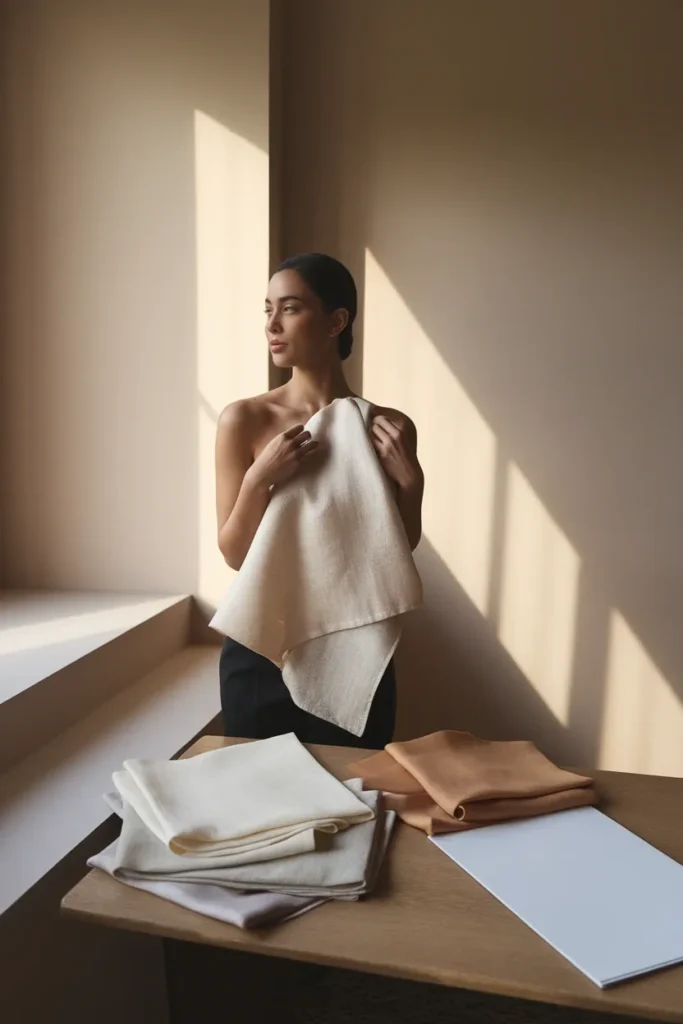
What a Color Analysis Test Actually Measures
Forget seasons for a minute. A color analysis test is measuring three dials, and the season is just the label you get when you read all three at once.
Dial one is undertone. Does your skin sit warm (golden, peachy, yellow-based), cool (pink, rosy, blue-based), or neutral (a bit of both, which is more common than the internet admits)?
Dial two is value. How light or deep is your overall coloring when you squint at yourself? Value is about the contrast between your skin, hair, and eyes, not about how tan you are this week.
Dial three is chroma. Do you look better in clear, saturated color or in soft, dusty, muted color? This dial gets skipped constantly, and it’s usually the one that explains why a “correct” color still looks wrong on you.
Every seasonal system, the classic four and the expanded twelve, is just a different way of slicing those same three dials. Four seasons gives you a broad zone. Twelve seasons splits each zone into three by leaning harder on value and chroma. Neither is more “real.” One is faster, one is more precise, and for a home test the four-season zone plus a soft or clear read gets you 90 percent of the practical benefit.
So when a quiz asks you fourteen questions about your personality and hands you a season, be skeptical. If it never asked about contrast or saturation, it measured one dial and guessed the rest.
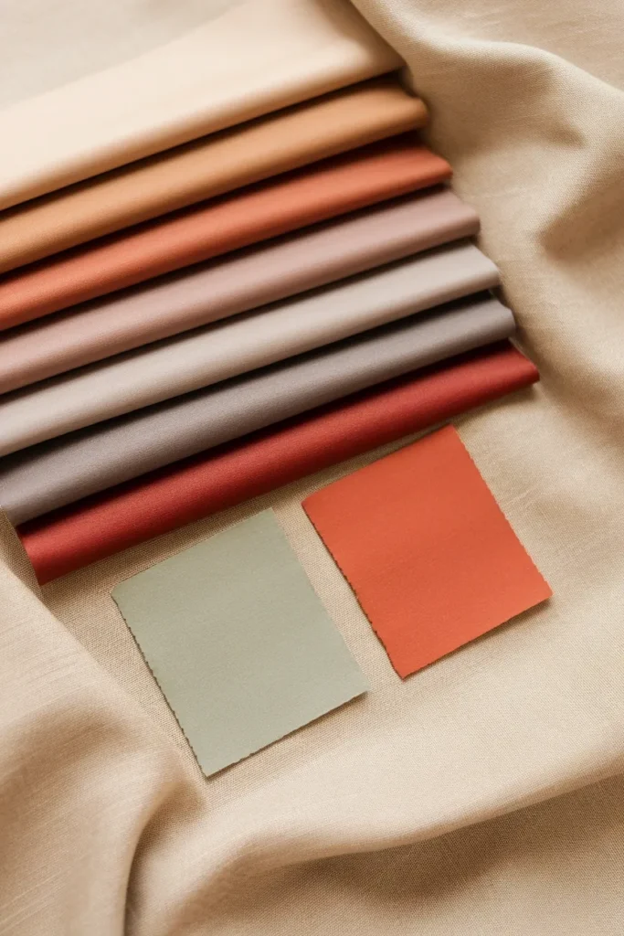
Set Up Your Room Before You Set Up Your Face
This is where home tests go sideways. Your overhead bathroom bulb is almost certainly casting a warm or cool bias onto your skin, and you will read that bias as your undertone.
It isn’t a small effect. NIST research on how lighting changes color perception found that a light source scoring 95 on the color rendering index made the viewer look washed out, while a warmer bulb scoring only 70 looked far more flattering. The technical score and the human read didn’t match. If a federal metrology lab can’t get a bulb to tell the truth about skin, your vanity light isn’t going to either.
So do this instead:
- Find a north-facing window if you have one, or any window that gets bright indirect light with no direct sun beam coming through.
- Test between 10 a.m. and 2 p.m. Early and late daylight runs warm and will push you toward a false warm read.
- Turn every artificial light off. All of them. Overheads, lamps, the little LED under the cabinet.
- Sit or stand facing the window, not beside it and not with your back to it. Light on your face, window in front of you.
- Clear the color noise. No makeup, hair pulled fully back off your face and neck, and a white or off-white towel over whatever you’re wearing.
- Check the wall behind you. A sage green wall three feet behind your shoulder will bounce green onto your jaw. Neutral wall, or hang a white sheet.
That setup takes six minutes. It’s the difference between a result you trust and a result you re-take four times.
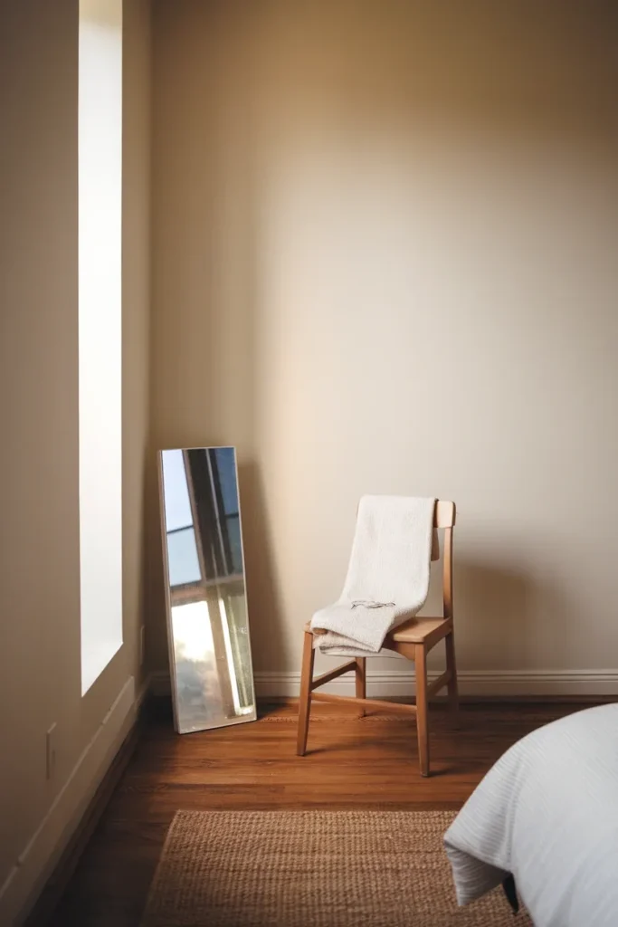
Skip the Drape Kit, Your Closet Already Has One
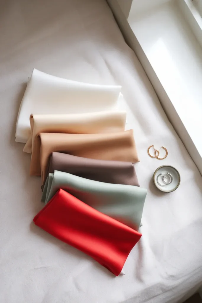
Professional drapes are just large fabric rectangles in calibrated colors. You need approximations, not calibration, and you almost certainly own them.
Pull these out and lay them on the bed:
- A pure white item (a crisp white button-down, a white pillowcase, a sheet of printer paper)
- A cream or ivory item (an oat sweater, a cream scarf, an unbleached tea towel)
- A camel or tan item
- A soft charcoal or true black item
- One dusty, muted color (sage, dusty rose, muted denim blue)
- One clear, saturated color (tomato red, cobalt, true fuchsia)
- Gold jewelry and silver jewelry, one piece each
Scarves work best because they drape close to the jawline without adding shape, and you can swap them in two seconds. If your scarf drawer is thin, learn how to style a scarf so it works as a drape and you get a styling piece plus a test kit out of the same $20.
One rule: the fabric has to come up to your collarbone and sit flat. A pattern, a sheen, or a shiny satin will bounce light and lie to you. Matte, solid, flat.
Step 1: Find Your Undertone With Three Fast Checks
Run all three. Two out of three agreeing is your answer. One check on its own is a coin flip.
The white paper test
Hold a plain sheet of printer paper up under your chin in your window light. Look at your face, not the paper.
Against true white, warm skin reads yellow, golden, or peachy. Cool skin reads pink, rosy, or slightly blue. Neutral skin looks mostly like itself, maybe a touch beige, with no strong pull either way.
Now swap the white paper for cream fabric. If your skin looked healthy against white and slightly sallow against cream, you’re leaning cool. If cream made you glow and white made you look drained or ruddy, you’re leaning warm.
The metal test
Gold hoop against one ear, silver against the other. Look at your jaw and the skin just under your eye, not at the metal.
Gold lighting up your skin means warm. Silver sharpening and brightening your face means cool. Both looking fine means neutral, and neutral is a real answer, not a failure to decide.
This one has an unfair advantage: metal sits right where a camera focuses. If you’ve ever wondered why one necklace photographs beautifully and another one makes you look tired, it’s the same mechanism at work in what to wear for headshots as a woman.
The vein test (and why it fails so often)
Turn your wrist over in daylight. Blue or purple veins point cool. Green veins point warm. A mix points neutral.
Here’s the honest caveat. Vein color is filtered through skin thickness, melanin depth, and how bright your light is, and on deeper skin tones it frequently reads as inconclusive. Plenty of people get green veins and a clearly cool face. Treat this as your tiebreaker, never your verdict. If the vein test contradicts the other two, the other two win.
Record your answer: warm / cool / neutral.

Step 2: Find Your Value on a Light to Deep Scale
Value is the single most useful dial and the one most quizzes ignore.
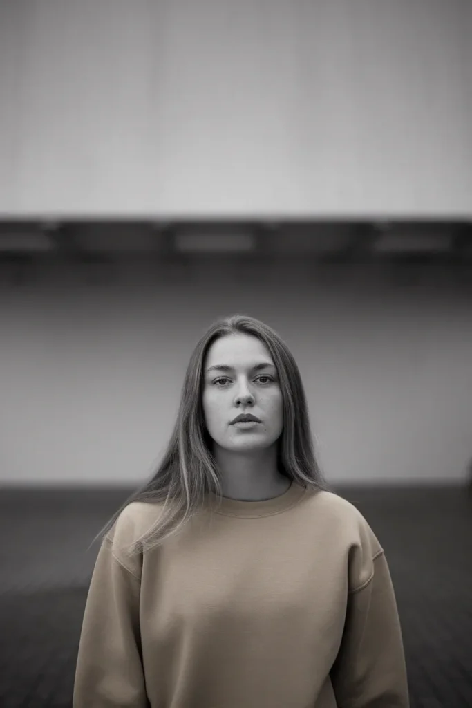
Stand at your window, look in the mirror, and squint hard until detail blurs. What you’re looking for is how much your hair, skin, and eyes separate from each other when the detail drops out.
Light value: everything blurs into one soft pale mass. Fair or light skin, blonde or light brown hair, light eyes. Think Light Summer or Light Spring territory.
Medium value: clear separation but no drama. Medium hair against medium skin, distinct but not high contrast.
Deep value: your hair or eyes stay strong and dark when everything else blurs. Deep brown or black hair, dark eyes. Deep Winter or Deep Autumn territory.
Then read contrast, which is related but not identical. High contrast means your features stay sharply separated when you squint, dark hair against fair skin being the classic case. Low contrast means everything stays close together in tone.
Why it matters practically: high-contrast coloring can carry a stark black and white outfit without being erased by it. Low-contrast coloring usually gets swallowed by that same outfit and looks better in tonal dressing, one color family from shoulder to shoe.
Record your answer: light / medium / deep, plus high or low contrast.
Step 3: Find Your Chroma, Muted or Clear
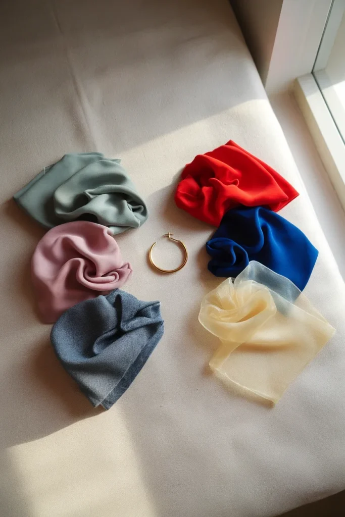
Take your dusty color and your saturated color. Hold each one up in turn.
Muted coloring next to a vivid tomato red gets overpowered. The color arrives in the room first and your face follows. Muted coloring next to dusty sage looks harmonious and calm, and your skin looks even.
Clear coloring does the opposite. Dusty sage makes clear coloring look slightly grayed and tired, like the color forgot to turn up. Saturated tomato red snaps the whole face into focus.
This dial is the reason two women who are both technically “cool with medium value” can need completely different closets. One is a Soft Summer and lives in dusty rose, muted navy, and sage. The other is a True Winter and needs true white, pure black, and clear cobalt to look like herself.
It’s also worth knowing what the year is actually selling you, because saturation trends move. Pinterest’s own 2026 color palette leans on Persimmon, Wasabi, Plum Noir, Jade, and Cool Blue, and three of those five are high-chroma. If you’re muted, that palette is going to be everywhere in stores this year and most of it will fight you. Buy the one that suits you, wear it as a bag or a shoe, and let the rest go.
Record your answer: muted / clear.
Step 4: Drape, the Part That Actually Decides
The three dials narrow it down. Draping confirms it. Everything before this was a hypothesis.
Work in pairs, never alone. Comparison is the whole mechanism, because your eye is far better at spotting a difference than at judging a single color in isolation.
Round one, temperature. Cream against your collarbone, then true white. Hold each for five seconds. Look at three specific places: the shadow under your jaw, the skin under your eyes, and the line where your neck meets your chest. The wrong temperature deepens that jaw shadow, adds a gray or yellow cast under the eyes, and makes any redness on your neck jump out. The right one flattens all three.
Round two, value. Camel against soft charcoal. Watch whether your features hold their shape or go flat and washed.
Round three, chroma. Your dusty pick against your saturated pick. Same three checkpoints.
You’re never looking for “which fabric is prettier.” You’re looking for which one makes your face look rested.
The One Photo, Three Drapes method
If you can’t read your own face in real time, and lots of people can’t, do this instead. Same window, same setup, phone propped at chest height, flash off, no filter, no portrait mode. Take one photo per drape with a completely neutral expression. Then close your eyes for ten seconds, open them, and scroll the photos fast.
The bad one is obvious at speed. It’s the one where you think “oh, I look tired in that.” That instinct is the test working.
Same principle applies when you’re coordinating more than one person, which is why picking what to wear for family pictures is really just group draping with a photographer waiting.

Read Your Three Answers as a Season
Line up your three dials. Here’s the grid, and it’s the whole system on one screenshot.
The 3-Dial Grid
| Undertone | Value | Chroma | Your season zone | Your core neutrals |
|---|---|---|---|---|
| Warm | Light | Clear | Light Spring | Ivory, light camel, warm beige |
| Warm | Medium | Clear | True Spring | Warm white, tan, golden brown |
| Warm | Deep | Muted | Deep Autumn | Espresso, olive, deep camel |
| Warm | Medium | Muted | True Autumn | Camel, olive, warm chocolate |
| Cool | Light | Muted | Light Summer | Soft white, dove gray, light navy |
| Cool | Medium | Muted | True Summer | Cool gray, soft navy, taupe |
| Cool | Deep | Muted | Soft Autumn / Soft Summer border | Mushroom, slate, muted navy |
| Cool | Deep | Clear | True Winter | Pure white, true black, charcoal |
| Cool | Light | Clear | Bright Winter | Optic white, black, icy gray |
| Neutral | Any | Muted | Soft Summer or Soft Autumn | Greige, mushroom, soft navy |
| Neutral | Any | Clear | Bright Spring or Bright Winter | Crisp white, navy, true gray |
If you land on a border, you’re not doing it wrong. Border results are common, and they’re good news: two adjacent seasons share most of their palette, so you get a wider workable range than someone sitting dead center.
Write your result down somewhere you’ll see it. A note on your phone beats a screenshot you’ll never find again.
Turn Your Season Into a Capsule Wardrobe, Not a Swatch Card
Here’s what almost every color analysis article leaves you holding: a pretty grid of thirty swatches and no idea what to do Monday morning.
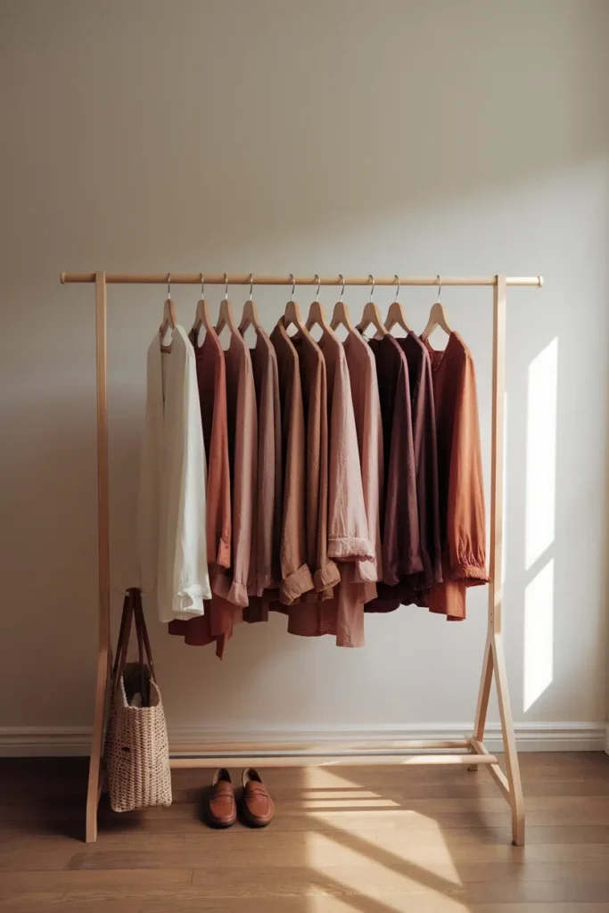
A season is only useful once it becomes a buying rule. Use a 60-30-10 split.
60 percent, your neutral base. Pull these straight from the grid above. Three to four neutrals, and they must all work together, which is the entire point. A True Summer building on cool gray and soft navy has a base where every piece talks to every other piece. Trousers, a blazer, a knit, a coat, all in that family. This is where your money goes because these pieces earn their hanger space every single week.
30 percent, your supporting colors. Four to six pieces in your season’s mid-range shades. Tops, knits, a dress. Mass and mid tier are fine here: Uniqlo and Old Navy typically run $15 to $50, Quince and J.Crew usually land in the $50 to $150 band.
10 percent, your accents. One or two pieces in your season’s boldest shade. A scarf, a bag, a shoe. Small surface area, maximum effect, and the easiest thing to swap when you get bored.
The reason this matters more than the swatch card: your neutrals decide whether your closet works, and your accents decide whether it feels like you. Get the base right and a mediocre accent still looks intentional. Get the base wrong and no accent saves it.
One warm-season note worth calling out. If your grid put you in Autumn or Spring, brown is a core neutral for you, not a fallback, and it will do more work than black ever did. These outfits that prove what to wear with brown boots show how far a warm neutral stretches once you stop treating black as the default.
Cool seasons, run the same play with charcoal, navy, and soft gray.
The 14-Day Wear Test That Confirms Your Result
Every ranking article treats the home result as final. It isn’t. It’s a hypothesis with decent odds, and you can verify it for free in two weeks.
Do this before you spend a dollar on new clothes.
Days 1 to 7. Wear only pieces you already own that sit inside your season. Every morning, note two things in your phone: what you wore, and whether anyone commented on how you looked. Not on the outfit. On you. “You look rested,” “did you do something different,” “you look great today.” Those are the sentences that count.
Days 8 to 14. Deliberately wear the colors your test ruled out. Same notes, same log.
Then read it back. If week one collected three or more face comments and week two collected zero, your result holds. If both weeks look identical, you’re probably neutral-undertoned with a wide range, which is genuinely good news and means you should stop chasing a precise season and just avoid your two worst shades.
If week two outperformed week one, you misread a dial. Nine times out of ten it’s chroma, and the fix is to slide one step in the muted or clear direction while keeping your undertone and value where they are.
Gray is the fastest place to run this test, because it exists in warm, cool, light, and deep versions and most closets already hold two or three. Working through how to style grey pants across a full week gives you seven data points off one piece you already own.
One more thing the other guides skip. Your result is not permanent. Go significantly lighter or darker with your hair, let gray come in, or hold a deep tan through August, and your value shifts even though your undertone doesn’t. Undertone is fixed. Value and contrast move. Re-run the squint test twice a year and you’ll stay current.

Five Mistakes That Wreck a Home Color Analysis Test
Testing in bathroom light. Already covered, still the number one cause of wrong answers. If you take one thing from this article, take the window.
Leaving makeup on. Foundation is undertone in a bottle. Testing with it on measures the foundation, not you. This is also how people end up loyal to a foundation that was never their match.
Draping one color at a time. Your eye needs a comparison. Alone, every color looks fine after eight seconds because your brain adapts to it.
Trusting a single test. The vein test alone, the jewelry test alone, or a five-question online quiz alone. Run all three undertone checks, take the majority, move on.
Confusing “my favorite color” with “my color.” These are separate facts and both are allowed to be true. If you love a shade that fights your coloring, wear it below the waist or carry it, and keep the shades near your face inside your palette. That’s the actual workaround, and it’s why the right way to style white pants matters: optic white can be brutal at the collarbone and completely fine from the waist down.
When Paying for a Professional Analysis Actually Makes Sense
Home testing gets most people a reliable answer. There are three situations where it’s worth booking someone.
You’ve run the test three times and gotten three different answers. Usually this means you’re neutral-undertoned or sitting on a border, and a trained eye with calibrated drapes resolves it in twenty minutes.
You’re about to spend real money. A wedding wardrobe, a full work capsule, a big investment coat. If a season call is steering a four-figure decision, a professional consult is cheap insurance.
You have no usable daylight. Basement apartment, north wall blocked, winter in a dark climate. Sometimes the room just can’t give you an honest read.
Expect virtual consultations to run in the low double digits to around a hundred dollars, and in-person draping sessions to run from roughly $150 into the $400 range depending on your city and how established the stylist is. [VERIFY current local pricing before quoting a figure to readers.] Ask two questions before you book: which system they use (four season or twelve season), and whether you leave with physical swatches. Swatches in hand are the thing that makes it stick.
Otherwise, run it yourself. Free, repeatable, and you can redo it whenever your hair changes.
Frequently Asked Questions
How do I do a color analysis test on myself at home?
Set up in bright indirect daylight with no artificial light, no makeup, and hair pulled back. Then answer three questions: is your undertone warm, cool, or neutral (white paper test, metal test, vein test), is your value light, medium, or deep (squint in the mirror), and is your chroma muted or clear (dusty color versus saturated color). Confirm each answer by draping fabrics in pairs and watching the shadow under your jaw. Read the three answers against the 3-Dial Grid above.
How do I know if my undertone is warm or cool?
Run all three checks and take the majority. Warm skin looks golden or peachy against white paper, glows next to gold, and often shows greenish veins. Cool skin looks pink or rosy against white, brightens next to silver, and often shows blue or purple veins. If you split two to one, the majority is your answer. If all three disagree, you’re neutral, and that’s a real result.
Is the vein test accurate?
On its own, no. Vein color is affected by skin thickness, melanin depth, and your lighting, and on deeper skin tones it’s frequently inconclusive. Use it as a tiebreaker only. When it contradicts the white paper and metal tests, believe the other two.
Can I do a color analysis from a photo?
Yes, if you control the photo. Shoot in indirect daylight, flash off, no filter, no portrait mode, no makeup, hair back, and take one shot per drape with a neutral expression. Scroll them quickly and the wrong ones stand out immediately. Photos taken under mixed lighting or with any beauty processing will give you a false read, and that includes most existing photos on your phone.
What is the difference between 4-season and 12-season color analysis?
Four seasons sorts you by undertone and general warmth into Spring, Summer, Autumn, or Winter. Twelve seasons splits each of those into three by adding value and chroma, giving you results like Soft Summer or Deep Autumn. Twelve is more precise and more work. For building a capsule wardrobe, your four-season zone plus a muted or clear read covers nearly all the practical decisions.
How much does a professional color analysis cost, and is it worth it?
Virtual consultations generally sit in the low double digits up to around a hundred dollars, and in-person draping typically runs from around $150 into the $400 range depending on city and stylist. [VERIFY current pricing.] It’s worth it if you keep getting inconsistent home results, if you’re about to spend significantly on a wardrobe overhaul, or if you have no reliable daylight. Otherwise the home test plus the 14-day wear test gets you most of the way for free.
Does my color season change over time?
Your undertone doesn’t. Value and contrast do. Going noticeably lighter or darker with your hair, letting gray come in, or holding a deep tan all shift how much your features separate from your skin, which can move you between a light and deep version of the same season. Re-run the squint test twice a year and keep your undertone answer as your anchor.
Start With One Drape
You don’t need a kit, a quiz, or an appointment. You need a window, a piece of white paper, and about twenty minutes.
Start with the white paper test tomorrow between 10 and 2. That one check narrows your entire closet from every color made to roughly half of them, which is the biggest single cut you’ll ever make.
Then run the 14-day wear test and let your own face confirm it. Once you know your season, building the capsule around it stops being guesswork and starts being math.
Bookmark the 3-Dial Grid. You’ll want it the next time you’re standing in a fitting room holding two sweaters, wondering which one is actually yours.
Keep reading
13 Ways to Wear Sage Green for Plus-Size Women
Sage green is the color women buy on impulse and then leave on the hanger. It looks calm and expensive in the...

Sage Green Outfits for Women Over 50: 10 Ways to Wear It Well
Sage green is the one color women keep asking me about and then leave hanging in the closet. It looks calm and...

10 Sage Green Outfit Ideas for Fall (and Exactly What to Pair Them With)
Sage green outfits look easy on a pin and confusing in a closet. The color sits right between a neutral and a...
One Comment