
How to Build a Spring Color Palette for Your Wardrobe
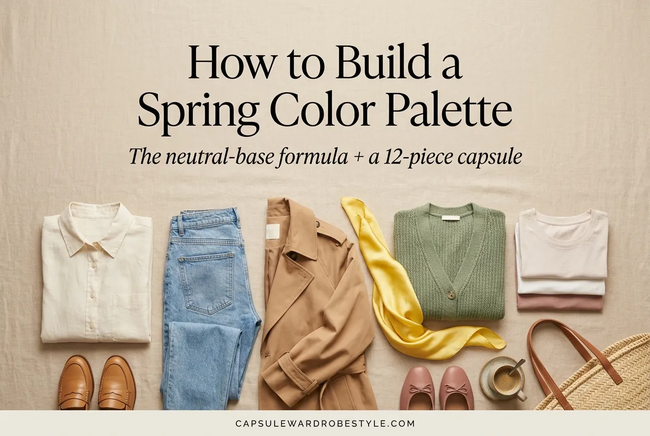
Your closet is full. You still feel like you have nothing to wear. And every spring, the same thing happens: you buy three new tops, none of them go with anything, and you’re back to the same two outfits by April.
A spring color palette wardrobe fixes that. Not by adding more. By making the pieces you already reach for finally work together. When your colors agree with each other, getting dressed stops being a decision and starts being a reflex.
Here’s the promise: by the end of this guide you’ll have a simple formula for choosing spring colors, a 12-piece palette you can actually shop, and the confidence to walk past the rack of “cute but pointless” without a second look. No color analysis appointment required.
Let’s build it.
Start With Your Neutral Base, Not the Pretty Colors
Most people build a spring palette backwards. They fall for a coral blouse, buy it, and then own one coral blouse that matches nothing.
Flip it. Your neutrals are the foundation everything else stands on. Get two or three right and the fun colors have somewhere to live.
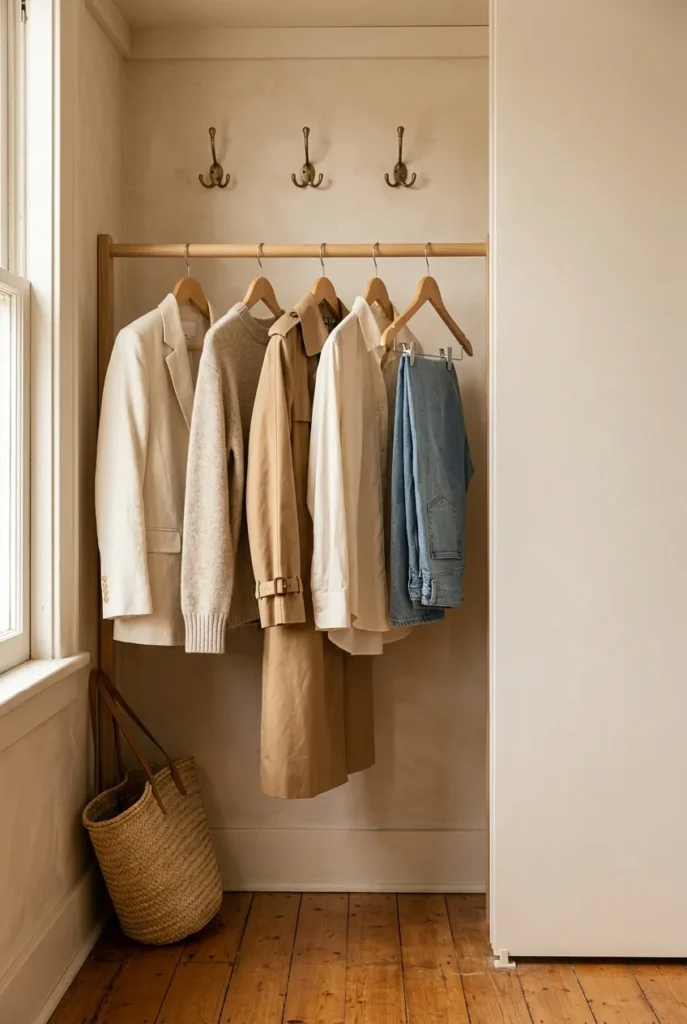
For spring, the neutrals that carry the season are cream, oatmeal, camel, soft taupe, and a warm-leaning white. If you love a darker anchor, reach for soft black or navy rather than harsh jet black, which can feel heavy against spring light. These are the pieces that should earn their hanger space first: trousers, jeans, a trench, a knit, a good tee.
The trick is to pick neutrals that already agree with each other. Camel and cream are friends. Cool gray and warm beige are not. If you want the deeper logic behind pairing tones, our color coordination guide walks through it, and if you want to see a base built out fully, here’s how to build a neutral capsule wardrobe you’ll actually wear.
The 60-30-10 Color Formula (Your Whole Palette in One Rule)
Here’s the framework that makes this repeatable. Designers use it for rooms. It works even better for closets.
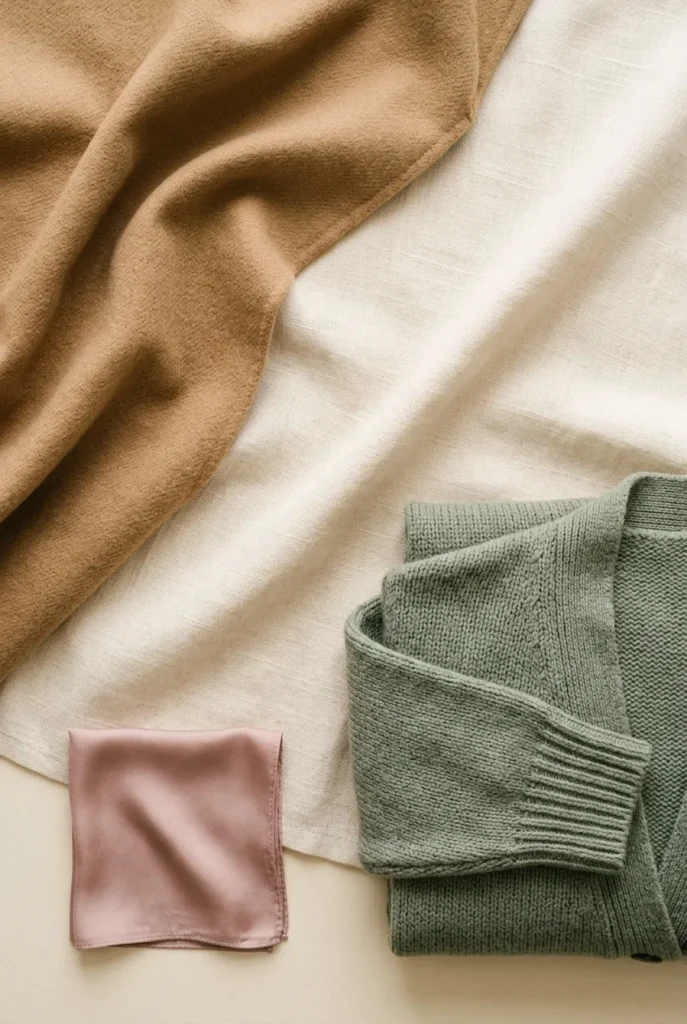
Sixty percent of your palette is your neutral base. Thirty percent is a secondary color that supports the base, think a soft denim blue, sage, or warm gray. Ten percent is your accent, the color that makes people say you look pulled-together without knowing why.
So a spring version might read: 60% cream and camel, 30% sage green, 10% dusty rose. That’s it. That’s a whole cohesive wardrobe expressed in one line.
Why it works: the ratio keeps you from the classic mistake of buying five “statement” pieces that all fight each other. Statements are the ten percent. When everything is a statement, nothing is.
Screenshot this and use it as your shopping filter. Before anything goes in the cart, ask which slot it fills. If you already have your ten percent covered and this is a fourth accent, it can wait.
Your Spring Accent Colors (The Fun Ten Percent)
This is where spring gets to be spring. After the neutrals do their quiet work, the accents bring the season alive.
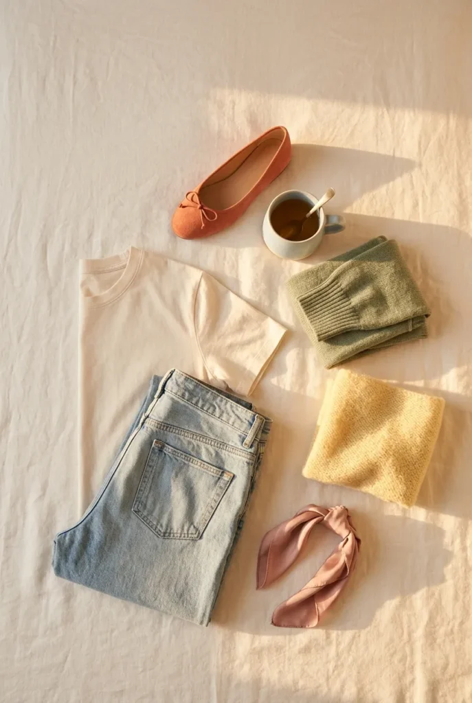
The spring accents that read fresh without trying too hard: dusty rose, butter yellow, sage green, warm coral, pale sky blue, and soft terracotta. These are the shades that show up again and again in this season’s most-saved looks, and it’s no accident, they flatter a huge range of complexions and they layer beautifully over neutrals.
Pick one or two accents per season, not six. A single butter-yellow cardigan you actually wear beats a rainbow of colors you’re scared to combine. If you want to see how this year’s specific shades are trending, we broke them down in spring fashion trends worth adding to your capsule.
One quiet tip: an accent doesn’t have to be a garment. A dusty-rose crossbody or a sky-blue scarf delivers the same color hit for less money and less commitment.
Warm Spring vs Cool Spring: A Quick Gut Check
You don’t need a professional color analysis to make this work. But a rough sense of your undertone helps you shop faster.
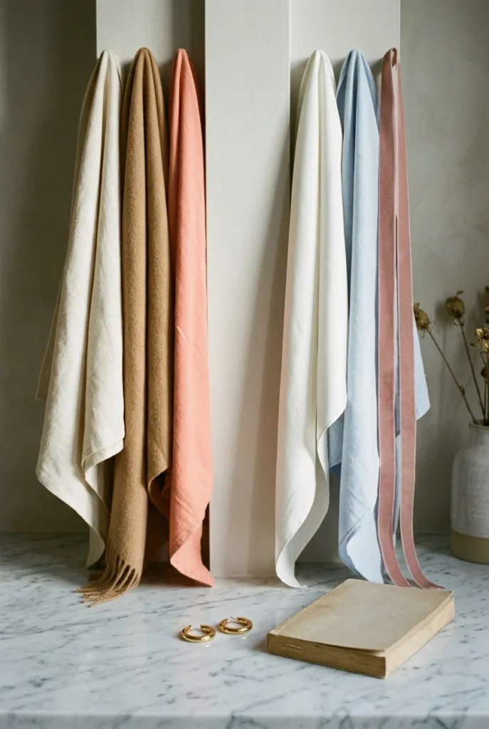
Warm-leaning spring colors have gold in them: cream instead of stark white, camel instead of gray, coral instead of cool pink, warm sage instead of minty green. Cool-leaning spring colors lean crisp: soft white, pale blue, dusty lavender, cooler rose.
A fast home test: hold cream and pure white up to your face in daylight. If cream makes you look healthy and white makes you look a little drained, you probably lean warm. If it’s the reverse, you lean cool. It’s not a lab result, just a nudge in the right direction. For a deeper primer, the basics of how color undertones work are worth ten minutes.
Either way, the neutral base holds. You’re just choosing whether your accents skew golden or crisp.
Build the Palette Into Real Outfits
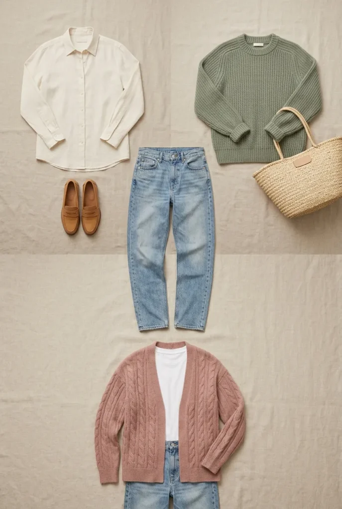
A palette on paper is useless until it’s on your body. So let’s turn the colors into outfit math, one base, three looks.
Take light-wash jeans (your 60%). Add a cream button-down and camel loafers for an easy weekend look. Swap the shirt for a sage knit and a tote for errands. Then layer a dusty-rose cardigan over a white tee for something softer. Same jeans. Three outfits. That’s the whole point of a capsule: one piece, three outfits, minimum.
Fabric matters in spring too. Lightweight cotton, linen, and fine knits carry the season’s colors better than heavy wool, which can dull a fresh palette. If you’re leaning into linen, our roundup of the best linen shirts for spring is a good shortcut.
This mix-and-match logic is exactly how disciplined dressers keep their closets small, and it’s the same principle behind our tested summer capsule wardrobe color palette if you want to see the ratio applied to a warmer season.
A 12-Piece Spring Color Capsule (Copy This)
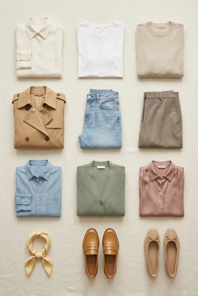
Here’s a ready-made palette you can build from. Adjust the accent to your undertone.
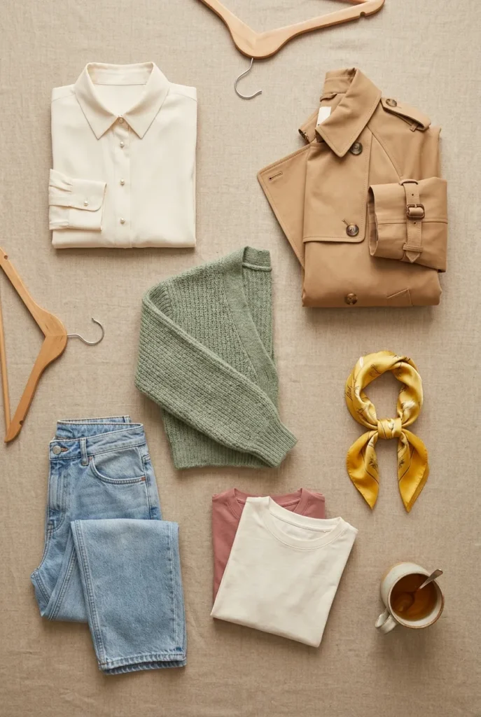
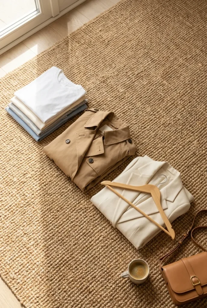
Base neutrals: cream button-down, warm white tee, oatmeal knit, camel trench, light-wash jeans, soft taupe trousers. Supporting color (the 30%): a chambray or soft denim-blue shirt and a sage cardigan. Accents (the 10%): a dusty-rose blouse and a butter-yellow scarf. Grounding pieces: camel loafers and ballet flats.
That’s twelve pieces that generate dozens of outfits because every item was chosen to agree with the others. Nothing here is a one-outfit orphan.
If you’d rather not count, that’s the beauty of working from a palette instead of a wish list, the coherence is baked in before you buy.
Where to Shop Your Spring Palette by Price Tier
You can build this at any budget. Here’s roughly where each tier lands, always confirm current prices, since they move.
Mass ($10 to $50): Old Navy, Target’s A New Day, Uniqlo, and H&M cover tees, basic knits, and light-wash jeans in spring neutrals. Great for the pieces you’ll wear hard.
Mid ($50 to $150): Madewell, J.Crew, Quince, and Everlane are where a good trench, quality linen, and better denim live. Madewell jeans typically run around $98 to $138.
Contemporary ($150 to $400): Sezane and COS for that elevated cream blazer or a trench with real structure.
One dupe rule worth remembering: if you’re eyeing a $300-plus camel trench, Quince and Uniqlo both offer versions well under $100, the trade-off is usually fabric weight and lining, not looks. For the disciplined-neutrals mindset that makes cheaper pieces read expensive, see how New Yorkers build a disciplined neutral palette.
Spring Palette Mistakes to Avoid
A few traps quietly wreck an otherwise good palette.
Buying accents before neutrals. The coral blouse with nothing to wear it with. Build the base first, always.
Chasing every “it” color of the season. If you rebuild from scratch each spring, you don’t have a capsule, you have a rotating impulse pile. Keep your neutrals, refresh one accent.
Ignoring undertone. A gorgeous cool lavender on someone warm-toned can wash the whole outfit out. When in doubt, let the accent be a scarf or bag you can experiment with cheaply.
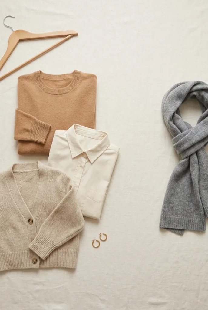
And the sneakiest one: mixing warm and cool neutrals in the same base. Warm camel with cool gray reads slightly “off” even when you can’t name why. Pick a lane for your foundation.
Make It Yours
The palette is a starting point, not a rulebook. Your spring color palette wardrobe should look like you on your best, most effortless morning, not like a formula.
So take the base, borrow the 60-30-10 ratio, and choose the one or two accents that make you feel most like yourself. Then wear them until you’re bored, and only then swap.

Frequently Asked Questions
What colors are best for a spring wardrobe?
Warm-leaning neutrals like cream, camel, and oatmeal as your base, plus fresh accents such as dusty rose, butter yellow, sage green, and pale blue. Choose one or two accents, not all of them.
How do I build a spring color palette without a color analysis?
Use the 60-30-10 rule: 60% neutral base, 30% supporting color, 10% accent. A quick cream-versus-white face test tells you whether to lean warm or cool. No appointment needed.
How many pieces do I need for a spring capsule?
Usually around 10 to 15 well-chosen pieces generate dozens of outfits. Our copy-this version above uses 12.
Can I wear a spring palette to work?
Yes. Keep the base neutral (taupe trousers, cream shirt, camel trench) and let the accent be small, a scarf or blouse, for an office-appropriate, polished look.
Is a spring color palette worth the investment?
The value comes from cohesion, not price. When every piece coordinates, cost-per-wear drops fast because you actually wear everything. Build the base in mid-tier fabrics and save the splurge for the trench.
What’s a cheaper alternative to a designer camel trench?
Quince and Uniqlo both offer camel trenches under $100. The trade-off is usually lighter fabric and simpler lining, not the overall look.
Does a spring palette work year-round?
The neutral base does, absolutely. You transition seasons by swapping the 10% accent and the fabric weight, lighter linens in spring, heavier knits in fall.
Ready to build yours?
Pick your two neutrals, choose one accent, and try the one-base-three-looks trick this week. If you want the whole thing mapped out for you on a single printable page, grab the free 30-piece capsule checklist and start dressing in ninety seconds flat.
Keep reading
13 Ways to Wear Sage Green for Plus-Size Women
Sage green is the color women buy on impulse and then leave on the hanger. It looks calm and expensive in the...

Sage Green Outfits for Women Over 50: 10 Ways to Wear It Well
Sage green is the one color women keep asking me about and then leave hanging in the closet. It looks calm and...

10 Sage Green Outfit Ideas for Fall (and Exactly What to Pair Them With)
Sage green outfits look easy on a pin and confusing in a closet. The color sits right between a neutral and a...